Seeing the Forest: Using Treejack for Multi-language Navigation Testing
Brandon Dorn, Former Senior Product Designer
Article Categories:
Posted on
Thoughts on how to use Treejack to test navigation iterations across different languages.
Internationalization approaches have evolved to make it increasingly easier to display content in visitors’ native languages without overhauling (or duplicating) source code. And browser webpage translation features and plugins are getting better by the year. Yet neither of these strategies are particularly useful when trying to improve the navigation of a website used around the world. How might one go about quantitatively testing multiple navigation iterations across multiple languages with an international user base?
I faced this problem when we worked with Rotary International to redesign their global member portal, My Rotary. Rotary’s members, Rotarians, use the portal to communicate with members in their district, learn about and register for events, find out about Rotary goings-on, and perform other account and club management tasks. It’s a behind-the-scenes utility that helps members stay organized and informed. Yet its content and features had outgrown its design, so we set out to give it an overhaul. Our first step to that end was a research effort comprised of a variety of methodologies that informed the updated strategy and design. In addition to facilitating moderated interviews with Rotarians around the world, we also wanted to test new navigation concepts against the existing navigation system.
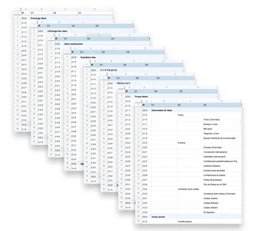
Treejack is an ideal tool for testing the structure and language of a navigation system for a content-heavy website. It allows you to quickly create a navigation tree and define tasks for test participants to perform. We asked participants to indicate in the navigation trees where they would expect to find different types of features and information through questions like:
- “Say you wanted to get advice from other Rotarians about how to organize a water sanitation project. Where would you go to discuss this topic?”
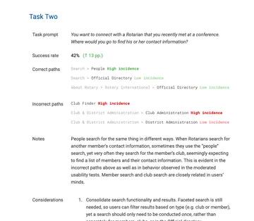
- “You want to connect with a Rotarian that you recently met at a conference. Where would you go to find his or her contact information?”
- “You are interested in attending the annual convention organized by Rotary International. Where would you go to register for this event?”
MyRotary
View our workIt’s easy enough to set up and run a Treejack test in English. Yet the Rotary website is presented in eight languages: English, German, Italian, Japanese, Korean, French, Portuguese, and Spanish. And we knew that the only way to provide thorough recommendations for a new system would be to run tests in each language, first using the existing navigation, to serve as a benchmark, then testing a revised navigation in a second round. Treejack isn’t exactly designed for this kind of comparative testing, so we had to get creative. But we were able to study our results in a way that helped us discover patterns across the languages that allowed us to make changes that accounted for language-specific tweaks while maintaining consistency for all users.
After we created trees and tasks in each language, we worked with Rotary’s translation team to distribute the test to members in relevant countries. Once we reached our response targets, we began to look at the results. Using Treejack’s data export feature, we created a spreadsheet that consolidated results from each language to compare them for each task. Some obvious patterns emerged across languages. For example, participants who erred when looking for information about the annual Rotary convention tended to look under “Learning and Reference” rather than “Events.”
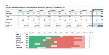
We also began to note language-specific issues with navigation terminology. German participants often mistook “Give to Rotary” for a history of their own donations, which were separate views in the portal. They were both labeled “Spenden,” (German for “Giving”), causing ambiguity. A number of terms had been translated literally from the English, which led to confusion in Rotarians’ native languages.
In addition to reviewing task-by-task statistics, we also wanted to compare pietrees across languages in order to visually observe variation among navigation paths to see patterns that may not have been evident in the numbers themselves. We could see, for example, that participants regardless of language incorrectly chose “Online Tools” when looking for the member directory. We could also see the spread of incorrect paths in each language, indicating vagueness in the IA and uncertainty on the part of the participants.
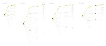
Zooming out of the board, we can see a forest of pietrees showing either confusion or confidence. And by zooming in on any of the trees, we could better understand the behavior behind each task’s success rate.
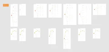
After reviewing the results with Rotary’s translation team, we worked with them to document the revised navigation in each language, taking care to account for regional idioms. We distributed the tests to a new group of Rotarians, asking them to perform the same tasks, then collated the results in a spreadsheet and exported pietrees to our Figma board. We then faced the problem of analyzing across another vector: not just comparing results for each task in each language, but results for each task for each version of the navigation in each language. To do this, we compared overall success rates for each task, documenting language-specific outliers, and again visually compared navigation paths to identify patterns in correct and incorrect choices. We documented our interpretations of the results with the Rotary team, since outright task success rate, while useful, doesn’t explain why people are navigating the way they are.
The size and diversity of Rotary’s membership was a primary reason for multiple research methodologies: hour-long moderated research sessions, a global member survey, and rounds of navigation testing. Each of these approaches informed our recommendations for the navigation, layout, and content strategy for a redesigned My Rotary. Any of the approaches in isolation would have given us only part of the picture we needed. But taken together, the multifaceted data formed a clear picture and path forward.