Say Viget Behind the Scenes
Joseph Le, Former Designer
Article Category:
Posted on
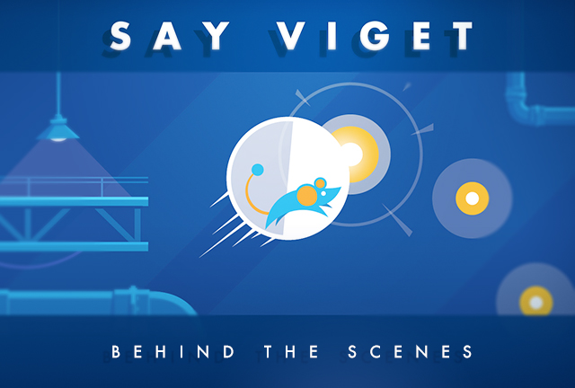
A few months ago, I was thrilled to have the chance to redesign the Say Viget site. The goal was to teach people how to pronounce "Viget" correctly in a "sicky gnar gnar" kind of way that would impress the web community. Several crazy ideas were tossed around by the team: a music remixing site, how-to-pronounce video(s), a talking animal farm, and a platform game.
If an idea didn't scare us, then it wasn't big enough!
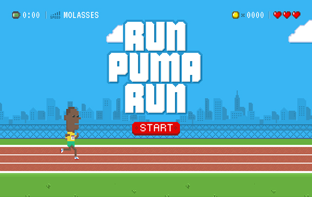
Out of all of the concepts, making a game was the best way for us to showcase our skills in HTML5 canvas, animation, illustration, and game design. After Dan Tello and Owen Shifflett's "Run Puma Run" HTML5 game came out, I knew that this feat was possible. Another big influence was the rising phenomenon of indie platform games like Limbo, Fez, and Dustforce.
FOUNDATION
At the time, I had zero experience making games, but I was committed to learning the foundations of game design. There are many things to consider when making a game: story, characters, level design, sound, animation, timing, physics, and, of course, entertainment value. Kevin Vigneault showed me an inspiring interview with Shigeru Miyamoto in which Miyamoto explained how he thought up the first Mario game.

Miyamoto’s insights made us really think about the psychology of creating different game elements for a platform game. Every object -- like a piece of brick or mushroom -- has a function and purpose that can change the dynamics of the gameplay. The design has to be simple yet descriptive enough for the user to know if an object is an upgrade, weapon, enemy, etc. Also, the placement of these items plays a big part in determining the rhythm and pacing of the level.
GENERAL GAME CONCEPT
For the Say Viget game, we decided that the user would play as a hero character and try to reach the end of the level without falling off or running into dangerous obstacles. The user would also learn how to say "Viget" along the way by collecting items that activate sound bites to achieve the real goal of the site: teaching players to say “Viget” correctly!
PROJECT SCHEDULE
We finished the project within five months under a loose project schedule. The game was a labor of love for us; making time for it was almost as big a challenge as the actual development. Illustrations were squeezed in between client projects. Code was written over lunch breaks. Midnight oil was burned. The team was too excited about the game to let it fall by the wayside.
CHARACTER DESIGN
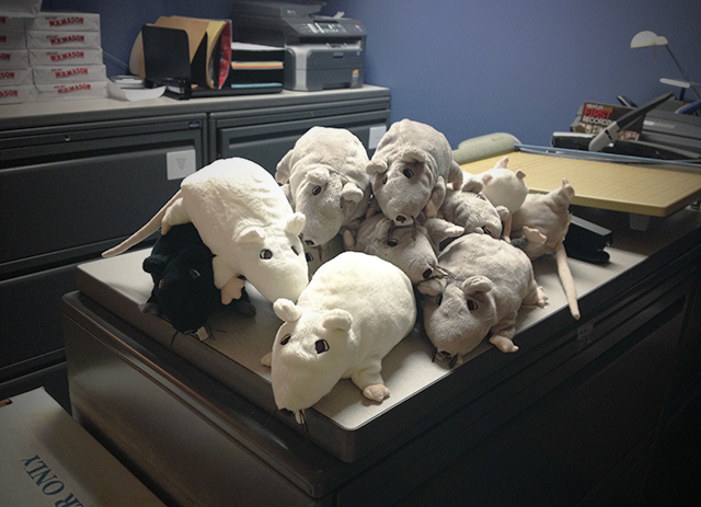
The team decided that the hero character should to be a lab rat, which is the company's mascot. We also felt that the character had to look timeless and unlike any other video game character. I included the Viget logo into the character design just as Doug Avery did with the Pointless Corp bear logo. Using Illustrator, I designed the rat in a minimalistic style around the two Viget circles while making the fewest possible anchor points. Numerous circular shapes were used to create the rat's body. It was a challenge to make the design simple while still clearly conveying that it's a rat. I decided to put the rat in a luminescent white ball so that its colors would pop and stand out against any background color. An additional advantage of this approach was that having the plastic ball around the character saved me from animating the rat's actual body colliding onto different surfaces in various angles.

Naming Our Hero
We named the rat "Junior" to reflect the fact that this project was our first time designing a platform game as well as Tommy Marshall's first time coding something in HTML5 canvas. The name "Junior" also plays with the notion that we went into this project eager to learn with a beginner's mindset. Plus, the name sounds cute and friendly.
ANIMATION
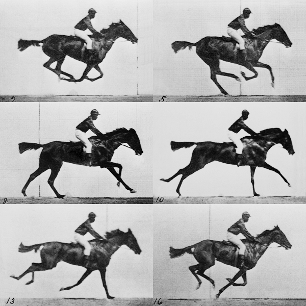
We wanted Junior's animations to look fluid and natural. For reference, I looked at Eadweard Muybridge's "Horse in Motion" 1878 piece and tried to emulate the horse's leg movements.
JUNIOR ANIMATION PROGRESS

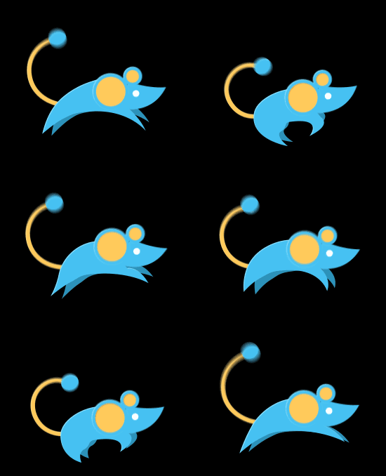

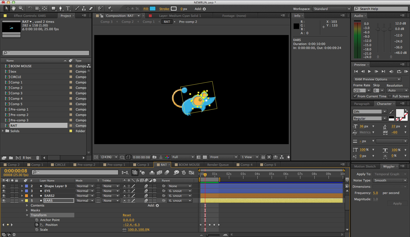
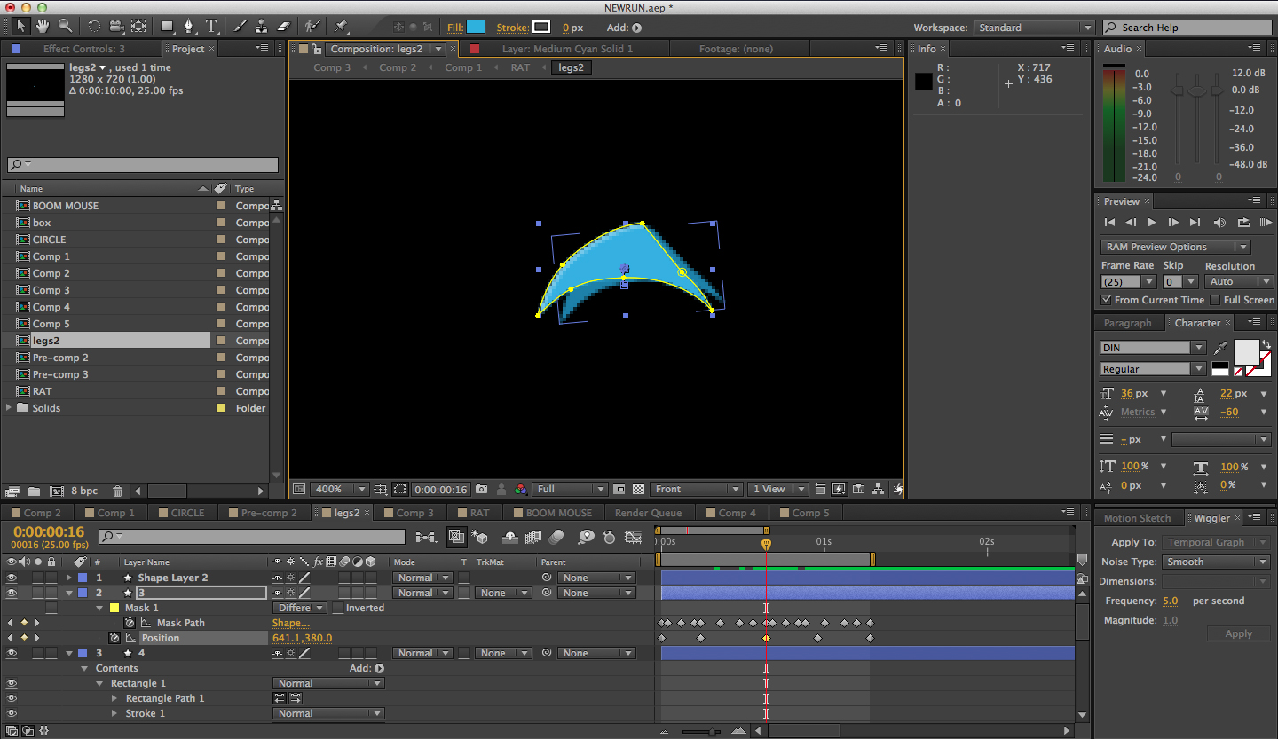
In After Effects, I created an animation loop for the running, jumping, resting, and run-stop movements. The rat was made out of vector masks created manually in After Effects. First, I imported an image of the rat design onto the After Effects composition. Then I traced over the image with the pen tool onto different shape layers containing mask paths. After animating the rat, I exported the composition into separate PNGs for Tommy to create sprites. He recommends using Sprite Cow.
LEVEL DESIGN
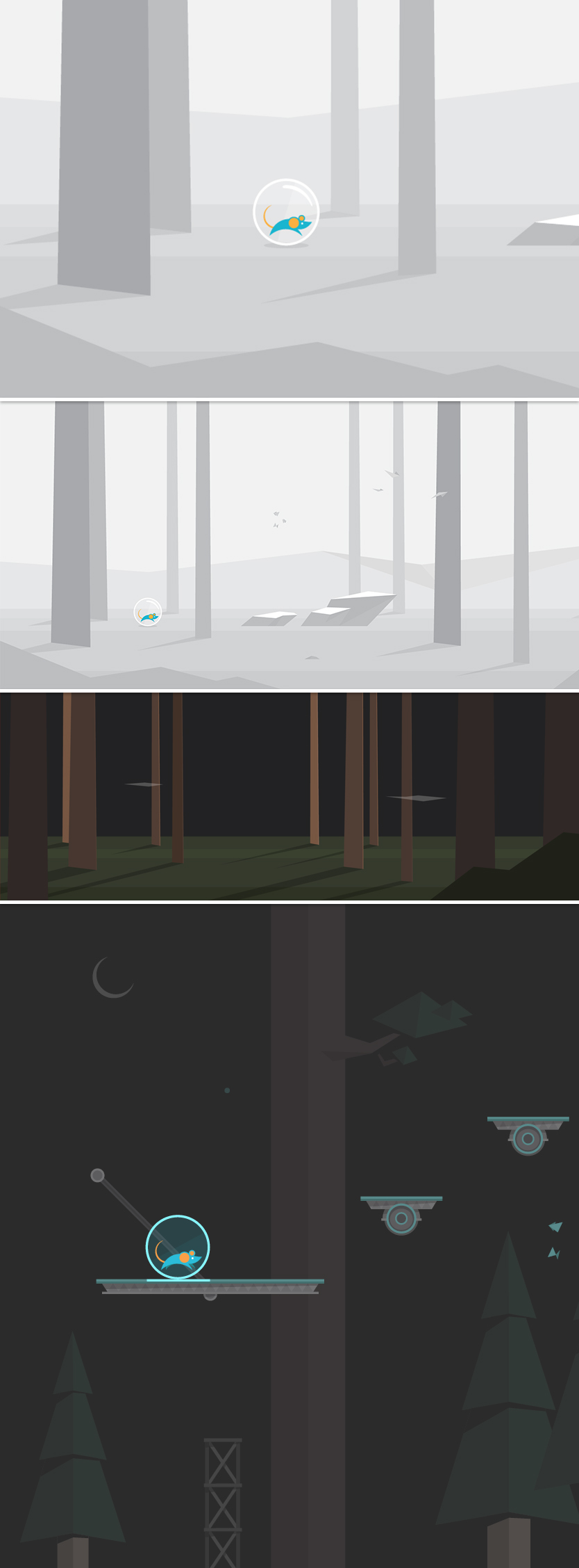
We generated quite a few different ideas for the level's environment: a forest, a low-poly geometric land, a laboratory, and a factory. I created a few "moodboards" for each level concept to get a general idea of the level aesthetics. Out of all of these concepts, the industrial factory allowed for the most fun level interactions like swinging platforms, cranes, rotating gears, sliding crates, levers, enemy robots, spinning saws, etc.
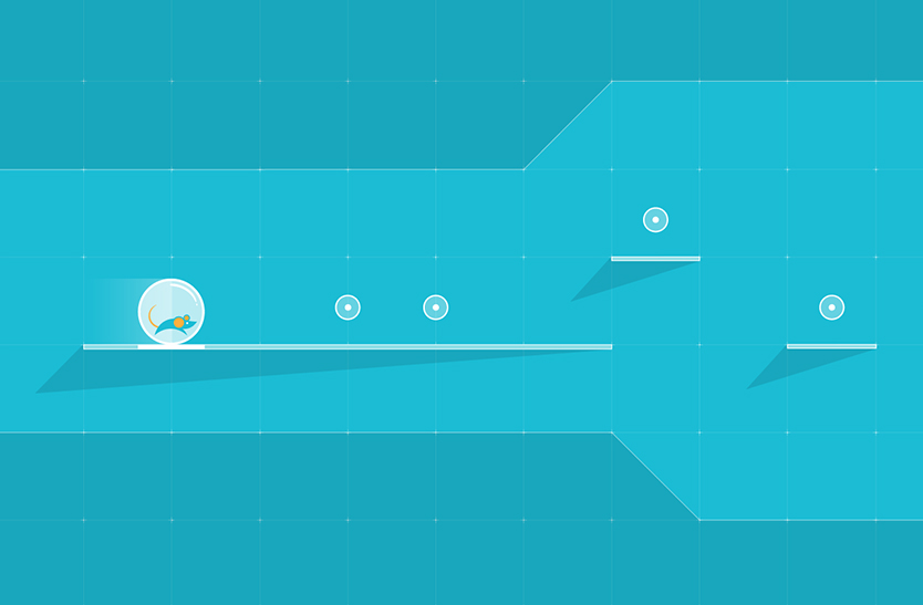
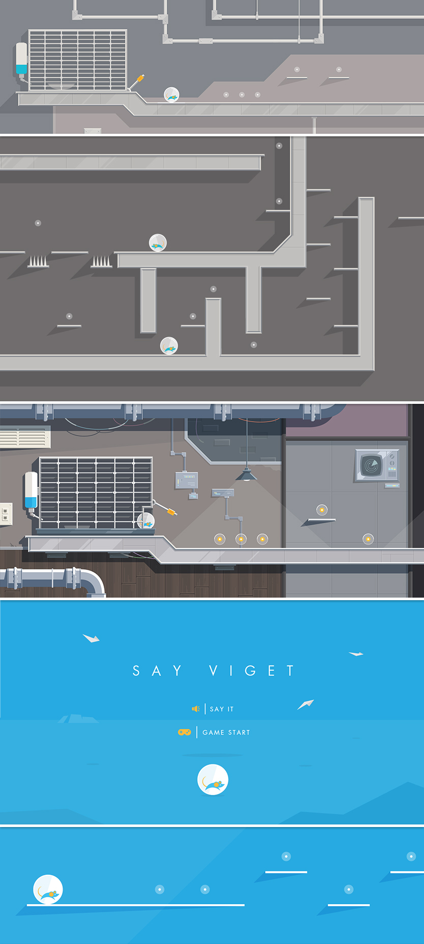
The team realized that making a highly detailed level in Illustrator would take too long to meet the deadline. Therefore, I broke down the design elements from the detailed factory level into simple shapes and silhouette objects. Vibrant colors helped create a playful and childlike tone throughout the game. Using blue as the dominant color conveyed a chill environment and harmonious vibe. The game's environment has a limited color palette to look more iconic and memorable. The result is a perfect marriage of the game's new simplistic look and the minimal character design.
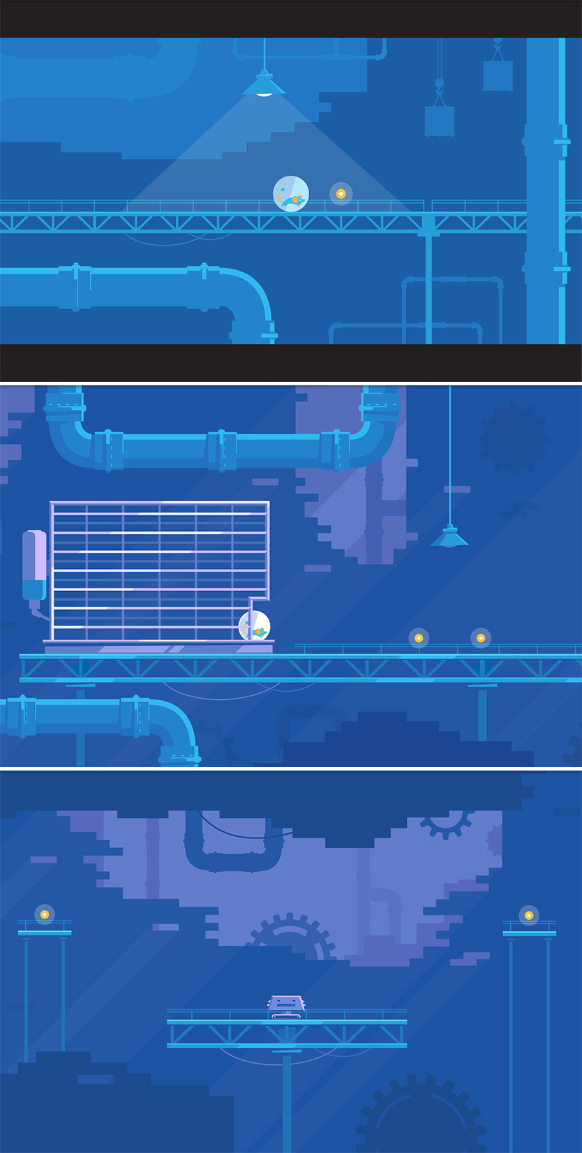
When designing the platform game, we varied the platforms' placements and added diagonal paths to add difficulty and intrigue as the player navigates through the level. Also, we made a special "pathway" for people who want to skip the coins and do a speed run (I finished the game in 19 seconds, come at me bro). As a result, the platforms are spaced out in a way that does not seem too overbearing or difficult to navigate. At the same time, we decided to increase the difficulty level near the end of the level so that the user would feel a greater sense of accomplishment once he or she finished.
Parallaxing foreground elements added more depth to the game's 2D background and flat design elements. No single object contains more than three shades of color to keep things minimal.
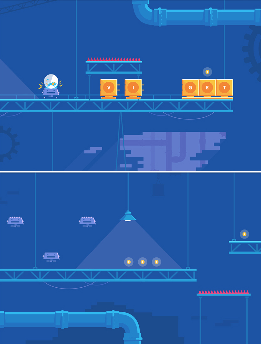
Many level interactions had to be cut from the final product because of the deadline and other client projects occupying our time. In the end, we simplified our ambitions to finish the project while sticking with the initial objective of the site.
SOUND
After listening to over a dozen different soundtracks on AudioJungle, we chose this song for the background music. It was a perfect match since it was cheery, light, childlike, and not too overwhelming. Here are a list of other sounds we used: celebration, pain shout, and game coin pack.
LEVEL BUILDER
Instead of laying out each individual platform in Adobe Illustrator, Tommy ingeniously created a drag and drop level builder that operates in the browser.
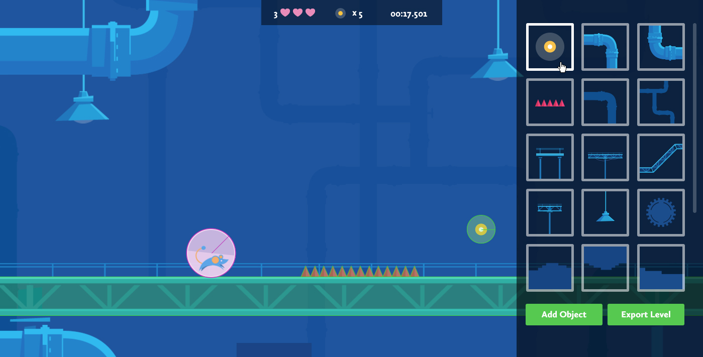
The user can easily drag, drop, and move around individual level pieces like pipes, platforms, red spikes, coins, and other goodies onto the game environment. Afterwards, the user can save a rough draft of the level and play through it with the rat. By doing this, we had a better feel for the timing and pacing of the level which helped us measure the gameplay's entertainment value. The level builder acted as a more efficient "guess and check" process than comping out an entire level design in Illustrator and then manually setting each object's position values.
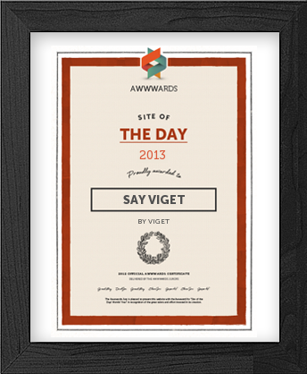
On June 18, 2013, Say Viget won the Awwward for "Site of the Day" in "recognition of the great talent and effort invested in its creation." Wahoo!
In the end, we're happy with the final product and had a lot of fun making it! Looking back, one of the most important lessons I learned is that it really is possible to seize upon a seemingly small opportunity to push your skill set and creativity far beyond their previous limits. Hopefully we'll be dreaming up more games in the future! In the meantime, play Say Viget!