Save For Web, Simply
Doug Avery, Former Senior Developer
Article Category:
Posted on
Since "The Mysterious Save For Web Color Shift," I've received 200 comments and weekly emails about the theory. Thanks to readers, I've learned a lot about the original issue, and (perhaps, more importantly) how to explain it.
TO RECAP: In the post, I suggested dumping some of Photoshop's color management settings (by choosing your monitor profile in Color Settings) and saving without ICC profiles. These settings make it hard to predict how your final colors will appear on the web, or even between browsers. The strongest responses pointed out that, in fact, ICC profiles are awesome, and they do a great service for photographers and illustrators who want to faithfully present their colors. I countered that from a practical web-design standpoint these profiles do more harm than good — and, well, things just kept going and going for a while.
I wanted to post a follow-up consolidating all knowledge on the subject and declaring my Lofty And Supreme Rightness (and perhaps immediately turning off comments, thus securing said Rightness), but the emails we've received have led me in a different direction. Most referenced difficulty applying the settings, testing them, or even understanding the original mechanics of the problem.
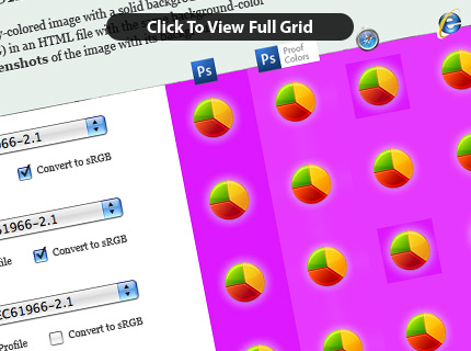
In writing my responses, I found myself testing more and explaining less, trying to show a simple list of results to clarify the problem. I started sending PSDs for readers to poke around with, then refining these into a single chart. The chart attempts to explain what differences the settings make, and what their advantages/drawbacks might be.
The Variables
I worked with mixes of the three settings I discussed in the original post: ICC Profile (which embeds your color profile in the image, and is only available on JPGs in CS3), Convert to sRGB, and the color profiles themselves. By default, CS3 had Convert and ICC options checked when I installed, but this may have changed in CS4 (let me know if you've tried it!). The left side of the grid shows settings I used, and the right side shows screenshots of the results from various contexts. "Proof Colors" means setting "View > Proof Setup > Monitor RGB" to use as a color preview.
On Embedding Profiles
Embedding ICC profiles shows a "true" copy of the original colors, but only in profile-aware apps like Safari and FF 3.5. As you can see in the first row, this shift won't apply to any CSS-set backgrounds or borders around the image. In a lot of cases, this doesn't matter, but when it matters it's a huge pain to work around. This is the main reason web designers might want to leave profiles out of images that need to match browser colors.
As you can see in the Safari column on Rows 5 and 7, sometimes an embedded profile might look perfect on one machine, but not on another. The two purples match locally because my calibrated view matches the embedded profile exactly — but on my neighbor's machine (see the footer), this won't be the case.
On Converting to sRGB
Converting to sRGB did nothing on the first 4 rows (they were being edited in sRGB to begin with, so it makes sense), but it didn't play so nice with my iMac profile. This setting doesn't seem too useful: Either it works but you don't need it, or it does more harm than good.
On Editing in sRGB vs. Monitor Profile
This comes down to a matter of taste. As you can see, Row 4 produced great, predictable results as long as you remember to turn on Color Proofing while you're viewing things (and in CS3, it's off by default every time you start Photoshop). This indicates that sRGB is workable, you just need to be careful that you understand what you're seeing.
I still prefer the monitor profile (Row 8), it simplifies the entire process and makes my results even more predictable. It also might makes things easier if you're in a hurry and need to mix screenshots into a comp without the colors mis-matching.
So Do I Just Dump Color Profiles?
Well, no. The truth is that color profiles allow users (with profile-aware applications) to see your original, intended image — with all the range, depth, and subtleties you labored over in Photoshop. This makes them perfect for photographs, which stand alone (away from backgrounds, borders, etc) and aren't expected to meld with the design the way structural images are. For photo editing, I still use the sRGB space and save my images with embedded profiles. This ensures that they'll be as close as possible to the standard color space for browsers and they'll be strong, better images in Firefox 3.5, Safari, and other apps that can correctly interpret ICC profiles.
Thanks to everyone who wrote in over the past year and helped us puzzle this out. Please let me know if you'd like the original files, or would like any other examples added to the chart. Hopefully, most designers should be able to play with each method and see what works best for them.
