Responsive Design, An Overview
Part of what I do at Viget includes talking with potential clients about projects we might work on together. I interact with people who range from having limited basic web knowledge to advanced technical backgrounds. When we write proposals, we often also have to account for a wide range of folks.
A question that has recently cropped up in almost every early project conversation is responsive design, whether we’re proposing it or the client is asking for it. Responsive design can easily be misunderstood or misinterpreted by clients for various reasons. In an attempt to clarify, in collaboration with the team here at Viget, I put together the following explanation for use in one particular proposal that you may also find useful.
Definition

Responsive design refers to an approach in web design that provides an optimal viewing experience across a wide range of screen resolutions and devices. This includes easy reading and navigation with a minimum of resizing, panning, and scrolling. (Simply resize your browser while here on viget.com and you’ll get the picture.) This is accomplished using the same codebase and content, instead of separate sites for different devices.
Responsive design is made possible with the use of three functions:
- Adaptive layout - Uses media queries to modify the design in ways that suit different screen sizes.
- Fluid grid - Uses relative units like percentages instead of fixed-width units like pixels.
- Flexible media/images - Images and other media (like videos) must also be scaled using relative units so they don’t expand beyond their containing element.
Misconceptions
“Responsive design is a new and unreliable technology.”
Responsive design is not a new technology in its purest sense. The use of a fluid grid and flexible media has been possible since the beginning of the web with the first version of HTML in 1992. The only new technology is the use of media queries to determine browser width, but only structural and stylistic changes (which make up just a part of responsive design) are made possible by this method.
W3C standards often take a long time to solidify, misleading the public that a particular feature or technology isn’t yet supported. The whole process of standardization can take 10 years. This does not mean features shouldn’t be used until there is a corresponding standard (in fact, the pinnacle W3C conference site is responsive). Such a mind-set is impractical and at odds with current industry best practices. Instead of relying on standards, we put our efforts into testing modern browser support. If a browser supports a module or feature, it doesn’t matter if it hasn’t been standardized by the W3C. As such, media queries are supported by 82% of modern browsers, and the use of “polyfills” makes width-driven styles possible in IE 7 and 8 (the only widely-used browsers that don’t support media queries).
“Responsive design is bad for performance.”
The techniques used in responsive design do not inherently bloat assets, file size, or overall performance. If done correctly, responsive design should have little to no effect on performance. If the implementation is done poorly, however, just like with a regular desktop or mobile site, performance will suffer.
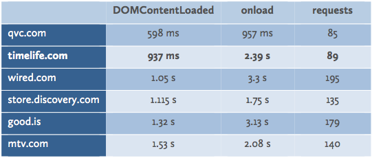
To test how responsive design affects performance, we performed load testing on one of our recent site launches, timelife.com. We compared the site to competitor and industry-related sites, which are all not responsive. The conclusions of the tests are below:

As illustrated, load time for the timelife.com responsively-built site is comparable or faster than related sites. This can be attributed in part to the approach we took that minimized the amount of code loaded at initial query.
“Responsive sites are inherently less creative, unpolished, or downright boring.”
It’s true that the easiest way to pull off a responsive design is to keep the design super simple, which is why this misconception exists -- a lot of responsive sites do end up looking boring. But it doesn’t have to be that way. Elegant and complex responsive sites exist, they just require harder thinking, more collaboration, and ultimately more work to get the site to both look amazing and function seamlessly.
Advantages
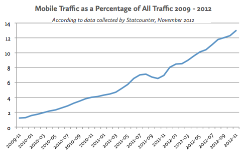
Three years ago, only 1.2% of Internet traffic was on mobile devices -- not enough to justify any additional attention or investment. But now with the exponential growth in the smartphone market and increased cellular network speeds, that number has reached 13%, which doesn’t even account for tablet devices.

A multiple device strategy is now a must. Not accounting for these users provides for a poor user experience and can cause a loss of conversions and chances for engagement. To capitalize on increased access to the web, companies should make strategic decisions on how to address and accommodate these users. There are three options: build device-specific dedicated sites, create a responsive design that adapts to every device, or do nothing and rely on the “pinch/zoom” experience, even though some interactions (e.g., hover states) will break down entirely on a mobile device.
The following are advantages for the second option over the first.
One codebase.
Since the code responds to browser size, it all pulls from the same codebase. Device-specific sites require separate maintenance and upkeep as updates are needed, which is often overlooked in favor of updating the desktop site.
Consistent user experience.
While a device-specific site might be called for in some cases*, often device-specific sites pare down content and functionality that the user may want to access. Increasingly, people use their mobile phone or tablet as their primary device for being online, so limiting their experience on these devices with the expectation that they will use a laptop/desktop if they want the “full” experience is misguided. Forcing this switch simply creates a frustrating user experience. Responsive sites make the same content available, but optimally displayed, across sizes and devices.
More cost-effective.
Building a responsive site tends to be more cost-effective than building separate device-specific sites because code, assets, and process are shared and reused. In addition, you’re getting more bang for your buck as responsive design accommodates all devices and a wide range of screen resolutions, whereas a device-specific site only supports certain sized mobile devices.
One responsive site is usually cheaper to build and maintain than two (or more) non-responsive sites.
Disadvantages
More effort.
Going through the extra steps that responsive design takes is more expensive than not worrying about it by designing one non-responsive site. There are extra deliverables to be produced, questions to be asked, and code to be written.
Change in process.
Executing a responsive design is a new way of doing things for most designers and developers. It requires a new process with more collaboration, different deliverables, and in some ways less pixel-perfect control. New processes can take time and cause some frustration between teams to figure out what the right mix is; but, if you’re innovative and can embrace change, this should be a welcomed shift.
These disadvantages compare in some ways to when we moved away from tables in favor of CSS -- it was more expensive and frustrating for some time as we all ramped up, but it was the right approach.
Examples
These are just a handful of examples, and the list is growing every day as responsive sites become the norm. These are meant to provide proofs of implementation for different industries and purposes. You can resize your browser to test responsiveness.
Publishing
eCommerce
Marketing
Applications
Higher Ed
For a more complete list of examples, refer to the following resources:
* There is internal debate (even some fun, public back and forth) on this point. There are good points on either side of the issue, but really the ultimate decision comes down to the specific project, team, and client.
Conclusion
The conclusion we've come to at Viget is that, in most cases, a responsive design approach is the right approach, particularly when the primary goal of a site is to present information (vs. tailored experiences). We're evolving our UX, design, and front-end development processes to accommodate this approach. In some cases, we find good reason to develop a parallel mobile site; but, this is a decreasing trend.
As always, we involve the client in these kinds of decisions and welcome continued discussion on the topic.

