Refrigerator Refresh: An Exploration

Brandon Dorn, Former Senior Product Designer
Article Categories:
Posted on
A human vision for the future of the fridge.
Is the refrigerator of the future just a door with a screen?
Next time you walk through a kitchen, look at the fridge. Chances are there’s something posted on it: maybe a photo, a kids’ drawing, a map, or a magnet from a plumber. Chances are there are many things posted on it. And if that’s the case, chances are these things both represent and help the people who use the kitchen in some meaningful, unique way.
Many refrigeration innovations are well-considered, improving energy efficiency, the use of storage space, and food preservation. But many refrigerator innovations show a lack of sensitivity to refrigerators’ extra-culinary meaning and usage–the alternative use that people have found for their refrigerators since the 1950s.
Contemporary refrigerator design for the most part disregards our habit of posting things, both in practice and in theory. In practice, by using non-magnetic surfaces that require people to find alternative ways to post physical objects (a search for “non-magnetic refrigerator” gives a sense of people’s desire and inventiveness). And in theory, by coming up with connected device concepts that mostly amount to embedding oversized tablets in the door.
Recognizing the disparity between reality and design, we decided to explore the user experience of the refrigerator to tease out interaction principles that could guide an evolution of the fridge based on people’s inventiveness rather than technology trends:
Refrigerator Refresh.
Research
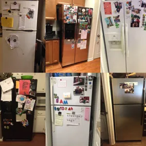
To see how people use the surface of their refrigerators–and whether they do so in any consistent way–we conducted a small survey and requested pictures of people’s refrigerators. The results revealed a few things:
- People post things. A lot. 95% of the people we surveyed (36 of 38) posted items on their refrigerator. Art projects, magnets, whiteboards, flyers, shopping lists, reminders, letters, timers, spice racks, receipts, photos, maps, postcards.
- Motivations for posting vary. Interestingly, some post critical information (e.g. pediatric care, emergency, plumber, doctors, vets, etc.) even though this info could easily be saved in a phone or found searching online. And as one respondent put it, “In heaven my fridge will have nothing on it. But right now it has this: [picture of kids’ drawings].” People have different reasons for posting things: some for reminders, some for sentimental value, some to show their kids they care. But the fact that they consistently post things is what is notable.
- People without magnetic fridges wish they were magnetic. The two survey respondents who don’t post had refrigerators with non-magnetic stainless steel surfaces, though each of them said they would if they could. As one said, “There’s nothing on my fridge – it’s not magnetic, and I hate that… :-(“ And the other, “I would have lots of cards, and save the dates, and magnets, and notes but our refrigerator is not magnetic.”
Looking at the pictures people sent, we saw that surfaces ranged from tidy to haphazard, a surface diversity afforded by the infinite flexibility of physical things.

Exploration
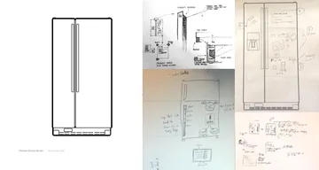
Curious how to improve the user experience of the refrigerator in a way consistent with people’s behavior, we held a design studio to explore design concepts for the refrigerator that would commingle digital information with physical objects. We wanted to take advantage of the affordances of each type of media–the automation and efficiency of digital objects, and the unique, personal, ambient nature of physical objects. Three constraints framed our exploration:
- Focus on the surface of the fridge. Feel free to think about the interior, but don’t design for it.
- Assume it’s an interactive surface. Assume it’s sensitive to touch, that objects can be attached to it, that it can display information, that it can connect with other objects and devices.
- Account for physical things. Not everything can be digitized, so think about how physical and digital objects might coexist.
Participants’ unique living situations brought diverse perspective to the exploration: some live alone, some with families, some with roommates. We sketched and discussed broad interaction patterns as well as implementation possibilities.

Our research and design studio led to concepts that allow physical and digital objects to interact on the same plane. Instead of digitizing people's physical behavior, we sought to preserve the spirit of their profuse posting by leveraging the affordances of physical and digital objects.
Commenting on the history of domestic design, and its increasing technologization, Jofish Kaye argues,
In creating technology for the home, in particular for the kitchen, technologists have forgotten that these domestic spaces are inhabited and used by people. These spaces function not as sites for technologists’ or technological in(ter)vention, but as sites where meaning is produced, as well as meals. These spaces are the places where we dwell.
The problem isn't technological innovation per se, it's technological innovation done without regard for the nuances of context. Take the Family Hub refrigerator, for example, presented at the 2016 Consumer Electronics show. Passing reference is made during the concept's introduction to refrigerators' traditional role as a "showcase" for the family. The concept seeks to improve this by integrating calendar, messaging, audio and video functionality into the fridge, essentially replicating smartphone technology, with some culinary twists. This vision–and the many like it–implies a future where all fridge surfaces look the same regardless of the home. Stainless steel and screens. The lists and photos will vary, but the form and function, and therefore experience, will be identical–completely at odds with the variety of refrigerator façades out in the wild. The attempt to digitize ends up prescribing, and therefore limiting, the product’s meaning and experience.
As a digital product designer, I appreciate systematic, interactive digital interfaces as much as the next guy. But what if before we put screens on things, we asked if a screen is the right thing? What if we considered the spectrum of interaction options? Or invented new ones? What if digital efficiency isn’t as meaningful as, say, affection? Or standardization isn’t as important as complete customization? Appropriateness of design ought to be our principle, especially when designing for our most personal space, the home.
Interviewing designer Anab Jain about contemporary kitchen design, Rose Eveleth writes,
“Jain is optimistic that designers will come around to reality eventually. ‘It's time to acknowledge that we are all whimsical, weird people,’ she says. ‘I think there are ways to design stuff that's more interpretive, more open to possibilities than just, ‘This is going change your life.’”
The best products, digital and otherwise, balance prescriptiveness and openness, and are iterated according to their usage–however unintended that usage may be. Their role isn’t merely to change people’s lives; it’s to preserve what already exists. Industry assumptions have to be continually questioned in order to make things that preserve the spirit of what people find valuable. Is the refrigerator of the future just a door with a screen? Or is it something more inventive and humanized? Any product can change someone’s life, but we have to think about the nature of that change.