The Red and Blue, Reimagined: the New UPenn.edu
Jillian Kuhn, Former Viget
Article Category:
Posted on
I've been bursting at the seams trying to keep this one a secret, but the time has finally come to announce the new upenn.edu!
This site serves as the primary web portal for the University of Pennsylvania, an Ivy League institution in Philadelphia. Founded by Benjamin Franklin more than 250 years ago, Penn has rich historical roots and a modern, forward-thinking philosophy that has helped it grow into one of the world's premier centers for education, scholarship, and research. It's also the best school in the world (although, as an alum, I am clearly biased).
Penn's previous site had been around since my freshman year (a long time ago, especially by web standards) and no longer accurately reflected the University's evolving personality and standing in the global community. UPenn.edu needed a modern design that showcased the University's friendly culture, top academics, and commitment to service ... And, that's where Viget came in.

From our initial on-campus workshop to final site testing before launch, this engagement ran the gamut of our web expertise -- including user experience and visual design, front-end development, and marketing services. We handed off our built-out files to the Penn team to integrate and then add content, and everyone's hard work culminated in a final product that truly does Penn justice.
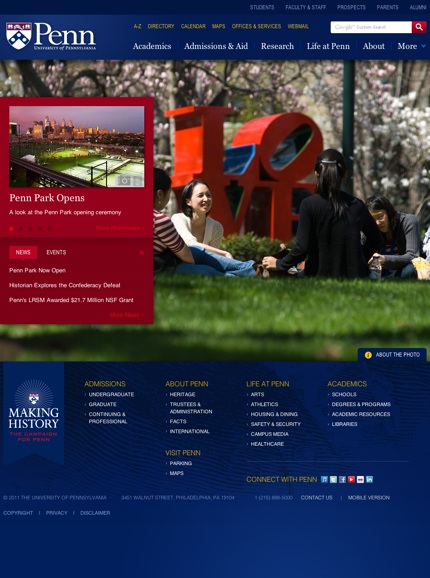
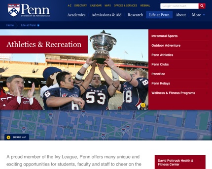
The new site, informed by extensive user research, shows off the University of Pennsylvania's unique features through beautiful campus imagery. These gorgeous images, many of which were taken by the talented Penn Web team, really make the site come alive. In particular, the simple yet eye-catching homepage uses striking visuals to tell the University's story in a compelling way. The large background image changes each time the page refreshes, and the red headlines sidebar is anchored to the left for maximum impact. The Life at Penn section, another storytelling tool, gives a great glimpse into campus culture -- particularly for off-campus audiences.

This main .edu site faces big challenges in that it needs to address every possible user group, from prospective students to staff to alumni, and it has to cover a ton of information. We used an audience-specific level of homepage navigation and carefully planned page layouts to point these diverse users toward the content they're seeking. This one site connects the different departments, schools, and initiatives in an intuitive, organized way.
Thanks for all the hard work @viget! The new upenn.edu looks awesome! - @PennWebTeam
As someone with a ridiculous amount of Red and Blue pride, working on this project has been a dream come true! My sincerest thanks and congratulations go out to the wonderful Penn Web and Communications teams and my talented Viget team members. I think Ben Franklin would be amazed at your work and at just how far his University has come. Here's a toast to dear old Penn!
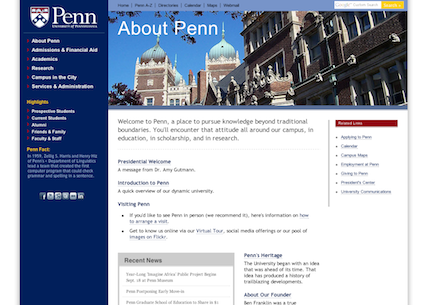
The UPenn.edu of yesterday (2002 redesign):

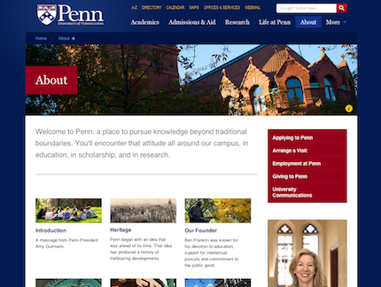
The UPenn.edu of today (2011 Viget redesign):
