Perspectives: Mood Boards, Love ‘em or Hate ‘em (plus a panel)
Tom Osborne, Former VP, Design
Article Category:
Posted on
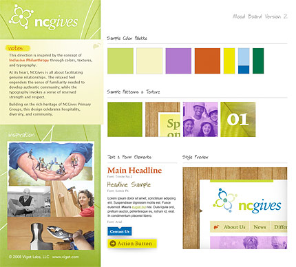
Sample mood board from Viget Labs. Embiggen
To mood board or not to mood board. Is that the question? Yes. At least amongst those of us that have ever used them as a means to jump start the design process. Personally, I've come to love mood boards as a tool in the web designer's design process tool kit. Are they always necessary? Not in my opinion. But I have found them to be quite useful when it comes to starting a project quickly and offering some stylistic options from which to pull from as goals and structure are being clarified. We use them quite often at Viget Labs and I'm seeing an increasing interest (or sometimes disgust) with their utility. With this post I wanted to share some thoughts on mood boards both for and against them.
Here are some favorable perspectives on mood boards from some industry notables:
Jenna Marino, Hunt & Gather
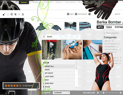
Sample mood board from Hunt & Gather. Embiggen
SBR: An established brand with a dated appearance, the look needed to be elegant and sophisticated, easy to navigate through and enthusiastic and passionate for the user. All being very diverse concepts, our 4 styles helped the client narrow their vision and focus on a new direction. The site was complex and to have designed a prototype to soon would have wasted a lot of time and effort.
On Mood boards: The purpose of a mood board is to set the tone & style of a design effort, without the distraction of flow and architecture. Design mood boards include color, pattern, photography style, typography and illustrative & graphic design elements to inspire and to build on the brand and establish a vision for the final site design. It is void of form & function intentionally, with a goal of circumventing issues late in the design process that may alter "skeletal elements due to a surface issue". They are solely to create an emotional impact and an environment in which to convey and relay information. In the end you have a visual toolkit or resource in which to build a foundation for a mockup in which you apply the elements to the framework created in the wireframes. Mood boards visually communicate where words fail, facilitate a faster design mockup delivery, & reinforce the client input and assist in their ultimate approval.
David Perel, Obox / From the Couch
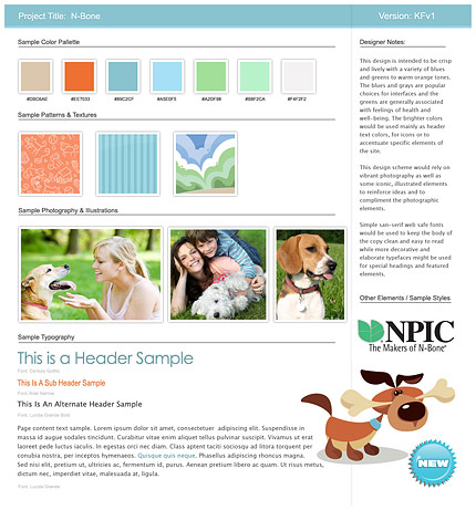
Sample mood board from Obox. Embiggen
David and his colleagues from Obox went as far as screen casting a mood board process on their regularly updated From the Couch video blog. David also had this to say:
“It saves you time and your client money. It also helps with your sanity when it comes to revisions because in the mood board phase your mental state is geared towards revising.”
Kevin Flahaut, Rocket Genius
Sample mood board from Rocket Genius. Embiggen
“I started incorporating mood/inspiration boards in my web design process in early 2007. Since that time, they've been an invaluable, saving me uncounted hours of design revisions and countless headaches. Mood boards are much easier to create and revise than full page compositions and really help the client to stay focused on the visual elements rather than being distracted by layout at that phase. In my experience, once the mood board has been approved, the client has some idea of what to expect in the next stage and the actual prototyping process goes much more smoothly with decidedly fewer revisions.
My personal approach to mood boards for web projects is a little different than that of some designers. I prefer a more structured approach to presenting the information over the more loosely arranged collage style. I've found that the consistency in presentation helps avoid confusion when presenting the client with several different mood board options.
While some designers like to include wireframes or page layouts in with their mood board presentation, I prefer to keep the structural portion separated completely and to focus solely on the visual elements and building blocks of the design. I do, on occasion like to take some of the proposed colors, typography and styling elements from the mood board and compose a "vignette" of sorts to illustrate how the elements could work together in a composition. This is usually just a small detail or two that doesn't commit to any particular layout, but helps to make the whole concept a little less abstract for the client.
I think that whatever approach you might take (none is really right or wrong) the key to success with mood boards is communication. Let the client know that your choices were deliberate and well thought out. Take the time to engage the client and explain the reasoning and psychology behind the colors and elements you're proposing and how they relate to the project's goals.”
In all fairness, mood boards aren't for everyone. Here's another viewpoint:
Milissa Tarquini, AOL / Mediaglow
“I don’t use mood boards and I cringe when I see them. Why? Because they are static and are the complete opposite of what an interactive experience should be. You can’t clip out a beautiful interaction, an elegant transition, or animation that supports the user goals and business strategy of an experience. You can’t pin on a board how a kick-ass data set and a laser-focused search product will elevate a mundane task into the sublime. All you can put on a board are pictures, or samples of textures and color. Which is fantastic if that is what your medium dictates. Interactive design demands more.
The boards themselves should be interactive, and therefore no longer boards. What would make more sense for a design team to use would be a little multimedia piece that can show pictures and interactions, transitions, etc. Things cut out and pinned to a board cannot describe interaction.
I’m not saying low-fi is wrong—low-fi is critical. For example, sketching is imperative to designing interactive experiences. But mood boards are meant to invoke “mood” and they don’t allow us to use the most powerful tools at our disposal to describe mood. Movement, sound, interaction clips, etc.
Now I’m wondering—what would a mood board for Google look like? Twitter? Ugh.”
 To explore this a little further, I've been working closely with Jenna Marino, David Perel, Kevin Flahaut and Jayna Wallace to try and assemble a SXSW 2010 panel to discuss this topic. If you find yourself intrigued, please vote for our panel in the SXSW 2010 Panel Picker.


