Organizing Your Stylesheet Using CSS Edit
Rob Soule, Former Viget
Article Category:
Posted on
One of the most daunting things about building and maintaining a design can be wading through huge, disorganized style sheets. Nothing is worse than opening up a style sheet someone else has worked on and thinking, "What the heck happened here?" On occasion I've opened up some of my old style sheets and shed a single tear. Styles were strewn throughout the page like I blindly copied and pasted code as if it was still 1999. Needless to say, I've learned the hard way why keeping styles organized is beneficial.

Through the years, I've waffled between various methods of organizing, but never found one that I could really subscribe to. Then I came across CSS Edit; a powerful CSS editor built exclusively for the mac. I immediately fell in love with its clean, simple, and functional interface. One of the best and most powerful features, in my opinion, is its ability to group styles into a folder structure.

2,300 lines of code in six folders. Rock on with your bad self!

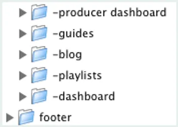
One of the things you might notice is that we use an equal sign "=" in our naming convention. This is to signify a folder is a parent and has at least one sub-folder. This makes visually browsing for a specific selector or section extremely easy and quick. Along the same lines, we use a single dash "-" to signify a sub-folder. It's also very important to indent, creating a visually hierarchy in your code.
The code to create a folder is simple and degrades gracefully in other editors.
/* @group footer */ ... /* @end */Here's an example of how to create a nested folder.
/* @group =pages */ ... /* @group -archive */ ... /* @end */ /* @end */It's important to develop consistency across your projects, especially if you work on a team where the style sheet changes hands multiple times. When we start a new project here at Viget, we use a basic template laying out the most commonly used selectors and properties. While our layout evolves from that point, the base is always the same, giving our team a great point of reference.
Our base layout looks like this:
- reset: Styles used to globally reset margins, padding, borders, etc.
- utility: These are commonly used classes for things like removing margin, padding, floating, clearing, aligning text, etc.
- =base
- -headers: Global header styles
- -links: Global link styles
- -navigation: Navigation styling
- -footer: Footer styling
- -form elements: Basic form styling including text fields, buttons, etc. that appear globally
- =pages: This folder holds sub-folders that have page specific styles
We found this model and nomenclature to work extremely well and be easy to understand. We're designers; let's spend more time doing what we love and less time wading through huge style sheets.