Running Online Divide-the-Dollar Studies using WebSort
Todd Moy, Former Senior User Experience Designer
Article Categories:
Posted on
Divide-the-Dollar is one of my favorite elicitation techniques. If you're not familiar, this technique is used to understand what people value – and in what proportion. Participants in the exercise divide a pool of money (or poker chips, sometimes) among a set of options, making judgments and trade-offs. The researchers, in turn, get three key data points:
- A ranked list of options
- For each option, its relative value compared to the others
- The degree of agreement among the people in the study
Here's an example.
Imagine you just presented three homepage comps to the project's stakeholders. Each design has merits and drawbacks, which spark debate about the best approach to take. Your goal is to identify which one has the most traction or, conversely, to see which ones should be killed outright.
Using Divide-the-Dollar, you would ask each stakeholder to independently divide $100 (or another arbitrary amount) among the comps. Once everyone is done, the results are compiled and analyzed.
From the data you might find that, in aggregate, people favored Homepage 1 the most. On an individual level, perhaps there's a rift in opinion: some love it, some hate it. Perhaps Homepage 2 is a close second and one that more people agree on. Maybe Homepage 3 performed so poorly that it can be taken out of contention altogether.
This insight won't tell you definitively which path to follow, but it does provide a launch point for informed discussion.
The Problem
I don't use Divide-the-Dollar as much as I could. Why?
First and most critically, there are very few online tools that can be used to orchestrate the exercise. Many of our clients and their customers are remote, so we tend to rely on online apps when we can. The main online app that is designed for this purpose – MindCanvas – is expensive and possibly unsupported. While it's possible to build a spreadsheet to manage the logic and capture the data, the experience is rough at best when working with end users.
Second, running onsite tests with a human moderator is expensive and incurs a lot of overhead. Scheduling, dealing with no-shows, and conducting the exercise all eat into budget and schedule. It doesn't scale well and discourages quick, guerrilla-style studies.
So the problem is technical: the tools aren't there. But on my commute in to work, I realized there was a way to do this if I thought about the problem differently.
A Solution
Despite the lack of dedicated DtD tools, you can quickly hack a passable alternative using the card sorting tool WebSort. Here's how I did it:
Basic Setup
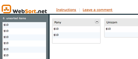
- Create ten cards that are each titled "$10." Collectively, these represent a $100 budget. You could choose another denomination, of course.
- Create one category for each of the options you want users to vote on. These could be features, design alternatives, or whatever.
- Change the instructions. WebSort's canned instructions are written (rightly) for card sorting. We're doing something different, so you'll need to modify those to reflect how your study is designed.

That's it. You can launch the study and start collecting results. Take the rest of the day off, champ; you've earned it.
Optional Configuration
There are two other settings you can change if they fit your study's needs: allowing unsorted items and allowing users to create categories.
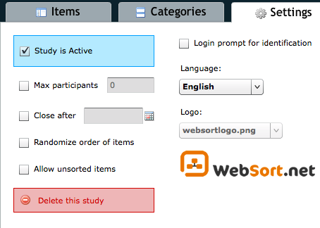
Disable "Allow unsorted items"
Forcing all cards to be sorted prevents people from submitting incomplete work. Depending on your study, this might be useful. Bear in mind that this adds complexity that must be explained in the instructions. And if you choose this, you should consider allowing users to create their own categories, explained below.
Allowing or disallowing unsorted items can be changed in the Settings tab.

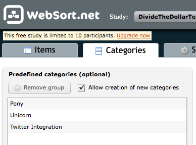
Enable "Allow creation of new categories"
Some users may not care for any of the options you've presented. Some may want something really cool that you hadn't even thought about.
If you plan to force all cards to be sorted, consider letting them add their own categories. This gives them an out if the options presented are uninteresting or irrelevant.
You can change this on the Categories tab.

Reviewing data
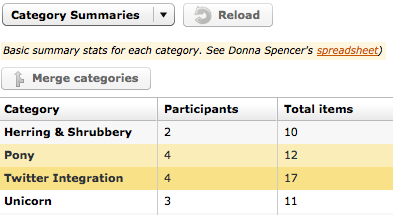
Since we're straying from WebSort's original intent, only one report is useful. The Category Summaries provides a tabular breakdown of how people have voted.
You'll want to pay attention to the Total Items column and ignore the others. This shows how the participants' budgets have been allocated. By dividing each row's value by the sum of the rows, you'll get each row's percentage. Calculating variance among participants is a bit more involved but can be accomplished outside of WebSort using a spreadsheet.

Parting thoughts
For you OptimalSort users, it's worth noting this technique will not work there. OptimalSort requires each card to have a unique label, which makes it impossible to create equally weighted cards.
Though this is not how WebSort is intended to be used, it's a passable solution. And it's that much more attractive because online DtD tools are scarce.