Of Note: Better Text Annotations for the Web

Brandon Dorn, Former Senior Product Designer
Article Categories:
Posted on
We’re accustomed to annotation patterns that discourage focused reading. FiveThirtyEight shows us a better way. Here’s why and how.
The Current Standard
People have annotated texts since they had texts to annotate. Annotations clarify, contextualize, and complement a subject. An Xiao Mina points out that “Annotation is motivated by the human need to talk and explain; in this way, annotation provides a structure for extending or depicting the meaning of things in the world.” At their best, they illuminate subtle meanings; at their worst, they distract from the drift of their referent.
Putting aside the question of when and how to use them, the way annotations are designed influences the experience of reading — for better or worse. This is as true for the Web as it is for print. Yet online annotations nearly always mimic patterns from print that are shaped more by the constraints of production than by the content and the experience of reading.
On the Web, annotation patterns solve a content problem (showing secondary text) yet create reading problems (context switching and hidden copy). The convention most often used — links in the body to a list of footnotes at the bottom of the page — may be WCAG compliant, yet it forces a tiresome context switch. Clicking an annotation link (usually a superscript) takes us from our scroll position in the viewport to the annotation at the bottom of the page where we have to glance around for the note.

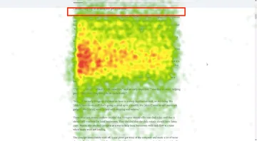
If enough scrollable space follows the note, it will display at the extreme top of the viewport, a kind of no-man’s land for reading text, as Curt’s eye-tracking study shows. Otherwise, the note will be some other less-than-predictable place in view. The same effect happens when clicking the footnote anchor to return to the original position in the text, which we find at the tippy top of the viewport. In both cases, the reader has to scan and scroll to reorient themselves.

At any rate, this pattern is a digital version of the endnotes printed in reference-heavy books. The reader who wants to read the notes faces a tedious journey. She experiences a physical context switch (marking her current position and moving to a new one), a visual context switch (finding the relevant note in the endnotes), and an intellectual context switch (removing herself from the flow of the present argument). Banishing these notes to the basement of the text hinders the kind of engaged reading that authors intend.
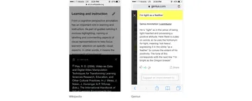
Widespread as annotations are on the Web, we still haven’t arrived at a standard that’s accessible, responsive, and makes for undistracted reading. Wikipedia has taken steps to soften this context switch. They show a preview of the footnote when hovering over the superscript in the text (these have been called “pop-up footnotes”), and highlight the footnote when clicked. Yet this pattern doesn’t aid the reader’s return to the main text, and their mobile implementation hides the primary text when the footnote content is visible. Patterns used on sites like Genius likewise attempt to show annotations in context, yet similarly hide primary text on mobile.

A list of discontinued Web annotation tools shows that it’s a problem no one has fully figured out. There are forums, even conferences devoted to the topic. Part of the issue has to do with the limitations of HTML: Joe Clark reminds us that unlike, say, paragraph or block quote elements, “In HTML...there’s no such thing as a footnote.”
Generally speaking (and ignoring questions of styling, API availability, etc.), an ideal Web annotation pattern follows these principles:
- Annotations appear in close visual proximity to the primary content.
- Their design neither distracts from nor hides the primary content.
- The preceding principles are followed regardless of screen width.
Reading between the Lines
The only pattern I’ve found that meets these criteria is FiveThirtyEight’s:

It’s elegant. A reader clicks a superscript link and an annotation expands into view just below. No jarring change of page position, no pop-up that hides content, just a straightforward presentation of secondary information. And it works just fine at all device widths.
As it turns out, FiveThirtyEight didn't invent this pattern. It likely originated in medieval illuminated manuscripts which contain “interleave notes” — comments written literally between the lines.

Below is an example implementation of their approach. (Cheers to Leo for the front-end help. He asked me to include a disclaimer about this not being production-ready code, so consider yourself disclaimed.)
It's worth pointing out that FiveThirtyEight's implementation allows a user to click annotation content to hide the annotation, so that they don't have to scroll back up the page to find the superscript. One thing to keep in mind, however, is that a user should still be able to interact with annotation content without accidentally hiding the annotation — when highlighting text or clicking a link, for example.
Interleave notes are one of many ways to annotate digital text. They aren’t a universal solution, particularly for the kinds of comments used in Genius, Google Docs, or Medium, where annotations are more like self-contained conversation threads. Neither are they ideal for unusually long, complex annotations. (Though exceedingly long annotations are questionable themselves. David Foster Wallace's “Host” barely survived the transition to digital, where the designers use our pattern admirably well.) Yet, used with discretion, interleave notes avoid the constraints of print production as digital media should.