Max Out Your Hit Areas (Everyday Techniques No. 1)
Doug Avery, Former Senior Developer
Article Category:
Posted on
Hi! This the first in a series of simple design & front-end techniques that you can put to use on a daily basis. OKAY LET’S GO!
“The time required to move to a target is a function of the distance to and the size of the target.”
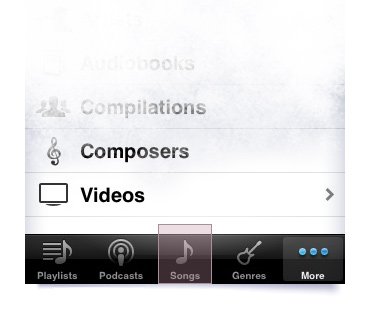
That's Fitt’s Law. Larger, closer targets make interaction faster, simpler, and friendlier. This is especially evident on an touchscreen device with no hover states — the bigger the hit area, the more confidently you can tap, and the better the experience feels. On the iPhone, Apple even extends the hit area of the bottom tabs and highly-used letters to reduce the likelihood of missed taps.

Bigger hit area = happier users.
If you work with CSS, you can use Fitt’s Law to solve problems almost every day. Here’s a quick example:
Set links to display: block and use padding to space the list - the result is a list that just feels better. The same trick can work for headers and buttons:
Header
Expanded Header
But when I’m working with interface elements that get a lot of mileage (like a nav), I like to push it a little further. Here’s an example of a recent sitewide header we implemented for a client:

Bigger hit area = happier users.
If you look at the links themselves, you’ll see that the link text barely covers 20% of the overall header. With a little work and forethought, we can push that coverage to 100% - a fun challenge and a great interaction for users. Here’s how I did it:
View the final buildout- Make the input big. The search box on the right is actually pretty huge, but I’m just using a lot of padding to center the user’s interaction with the field.
- Stretch big links horizontally — the header logo and the “search and browse” links start at the 980px mark on either side, and stretch until they meet in the middle.
- Stretch hit areas outside of their default containers — Targeting the list containers with a few extra styles, I’m actually making huge, wide lists with links that are padded to appear much smaller. The “first” and “last” LIs have special classes that pad the link tops and bottoms, and I took special care to z-index the H3s back behind the UL.
- Accommodate for change — since the final number of links in a list might be less than shown here, I’ve set a fixed height on the ULs and given them overflow:hidden. This allows me to pad the bottom link out a lot, ensuring that the last hit area will grow and fill space as the list shrinks.
Want to try it yourself? There are a few things to consider:
Give feedback
When your hit areas start to get extreme, it’s important to have a clear hover state - since users eyes’ fixate on their target, an obvious state change on the target itself indicates that they’ve hit it, even if their cursor is 50px away.
Wrap elements in links
If you’re using the html5 doctype, you can throw A tags around block-level elements. This gives you the opportunity to make huge hit areas with very little code, simply by wrapping divs, headers, and images in large links.
Alternatives
For a faster way to turn big blocks of content into clickable objects, try something like Newism’s BigTarget jQuery plugin. Leevi’s plugin lets you specify a parent element to use as the target area, and provides solid feedback by throwing a hoverclass onto the parent (great for IE6).
With a little work, you can use a similar technique to extend the hit areas of buttons, checkboxes, and text inputs.