Making It Work : 7 Things I Learned About Design From Project Runway

After an agonizingly long wait, Project Runway is finally FINALLY! back on the air. That means a whole new season of tight deadlines, crazy challenges, and design drama. Sounds more than a little familiar. Although it's about fashion, designers of all make and model can identify all too well with Project Runway. There's a lot of real life mirrored in the reality show: you get a project and you need to hit the ground running with an idea, you then have a limited time and budget in which to realize it, and before you know it you're presenting something that you hope is presentable. Over the years Project Runway has inadvertently illustrated a number of lessons that apply to graphic and web design just as much as they do fashion. Here are a few that have stuck with me:
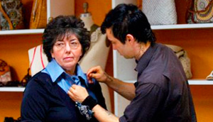
Don't Lose Your Own Aesthetic For A Client - This is one I think about often, trying to get the perfect balance between the tastes of both client and designer. The best end result is always a marriage between the client's ideas and your own. On Project Runway, designers often have clients that are exacting down to the last detail, fancying themselves the designers. The client may end up happy, but the judges and everyone else almost always aren't so impressed. On the flip side, when designers do their own thing, completely ignoring the client, they end up with a miserable client who didn't get what they wanted and who lets the judges know just how unsatisfied they are.
If you have no consideration for the client's own brand or needs, you end up with a design that's all you and doesn't accurately represent or sell them, which was the primary goal. Besides, an unhappy client likely won't recommend you to anyone anytime soon. But don't forget that your style and skills are what make you the designer and what you were hired for either. Aim to create something both the client and you are equally madly in love with.

Just don't be Jeffrey and make a client cry - BravoTV.com
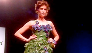
Make It Work - There's always constraints we have to work in for any project. Maybe minor, maybe not. Some of the Project Runway challenges take constraints to the extreme: only use flowers to make a garment, only paper, only things in the room, etc. Some designers on the show spend their time complaining and fighting their unusual materials, while others embrace the unique challenge and use it as a chance to try something new. Try to look at working within constraints as an opportunity to do something different and get out of your comfort zone. Let constraints stretch your creativity, not squelch it.

Design with plants! - BravoTV
Make It Work In Time - Have the confidence to commit to your concept. Too often on Project Runway, someone will completely trash their design half way through and start over with half the time left. (Someone just did it on last week's episode, for goodness sakes!) Sometimes it's tempting, but I've learned the hard way that repeatedly starting over and re-thinking my entire concept for a project after a certain point in execution is just exhausting and frustrating. Don't waste your time and energy, both physical and creative, when you'll end up with something that is rarely as strong as your original piece could've been.
Details, Details, Details - They're the last thing you want to worry about and the first thing others notice. On the runway, it's the kiss of death if Nina notices a shoddy hem or a loose thread. You always gotta watch for the little, minor, last-minute details. And if you can make them something special instead of merely presentable, you rock.
"It worries me." -Tim Gunn
Get a Second Opinion - Ideally from Tim Gunn, but I know that's probably not feasible. You're usually so close to your own project, so deep in it, that you can miss the forest for the trees. Or the trees in the forest. Or something. Getting a fresh set of eyes to take a look and give you a quick critique can only help your design.
That's a big talk...you just had...'da-da-da-da-da-da-da'. The talk doesn't match the dress. -Jay MacCarrol
Your Work Should Speak For Itself - You can have a lot of ideas and a solid concept, but it's equally important that you can translate it into the design and explain it in a way that any client can digest. Like Kara Janx in season two with her New York inspiration dress. She had put plenty of thought into it: she wanted to convey caution, danger, and "like, bam!" but all we saw was a plain black dress with a yellow stripe. You can't give a five minute speech about what you were trying to achieve to everyone who looks at your design; your work needs to be able to do all the talking for you.

A dress that doesn't match the talk - BravoTV.com
Inspiration Can Come From Anywhere - If a beautiful dress can come from a dirty street puddle or a vase of orchids or candy wrappers, so can a beautiful website.
