Make Wireframing Easier, Faster, Stronger with Whimsical

Dave Scherler, Former Senior User Experience Designer
Article Categories:
Posted on
How can we organize our work in a way that lets us move from exploration to presentation and back again?
Let’s Make a Mess
Quick, low-fidelity design (i.e. wireframing, grayboxing, etc.) is important to the design process. I start wireframing early, during the exploration phase of a project, when research is fresh and different directions are still in front of me. Wireframes take on two meanings during this phase: a method for actualizing free-form ideas, and a format for organizing design decisions to solicit feedback.
When I’m exploring, it’s imperative that ideas come freely and cheaply. The goal is to generate as many different ideas as I can, iterate on what works, and learn from what doesn’t. Rinse and repeat. The faster I can do this, the more ideas I consider, and the more learning opportunities I have at my disposal.
When I’m seeking feedback from a fellow designer or communicating a strategy to a client, it’s helpful to present wires with some level of discernable, consistent structure. Adding polish can help others understand what’s being put in front of them and help me lead to a more focused discussion. But I don’t want to spend undue time and over-polish. After all, the point of these discussions is to correct assumptions and help me iterate on the next round of work.
A Balancing Act
Knowing when and how to strike the right level of fidelity in this phase of the project can be tricky, especially when the timeline is short and the requirement list is not. Iterations should be fast and messy and presentations should be thoughtful and clear. How can we organize our work in a way lets us move seamlessly from exploring to communicating and back again? How can we avoid this tension?
Enter Whimsical. Whimsical is a new design tool that’s become my favorite for exploring ideas quickly (full disclosure: one of the founders of Whimsical is a Viget alum). It strikes a level of fidelity perfect for soliciting feedback and communicating direction. It’s easy to learn, built for speed, and a valuable asset for any exploration phase.
3 Tools in 1
Whimsical bills itself a “visual workspace” but it’s really three separate tools: one for wireframing, one for flows and diagrams, and the other for project notes. When you sign up for an account you get access to all three but for the purposes of this post, I’ll be focusing on the wireframing tool.
Boards
Let’s dive right in. In Whimsical, you organize your work in “boards” which contain an infinite canvas and function as your files. Boards are akin to files in Sketch and Figma. The main difference being that boards can’t be subdivided into smaller units of organization (i.e. you can’t organize a board into different “pages”). So when you’re starting out it’s helpful to treat each board as if it were its own project.

Components
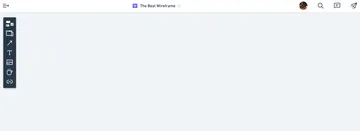
When you open your first board, you’ll see a single floating menu on the top left of your screen (more on these later). This is where you’ll find and add components to your board. Components are super powerful and one of Whimsical’s greatest selling points. There are seven different types of components: elements, frames, connectors, text, images, icons, and links; and the tool has already defined mutable attributes for each type.
Let’s take a closer look at the type of component you’ll use the most, elements. Elements are things like buttons, form fields, sliders, and drop downs; they're the most common patterns for adding interaction. With over 22 different elements, you’ll have everything you need design a modern and complex wireframe. But it’s not the variety of elements that's impressive, it’s how they’re built.
Elements come built according to atomic design principles, some as individual atoms and others as pre-assembled molecules, both of which can be grouped together to create larger organisms. All components have some pre-defined overrides but this feature is especially handy and evident when working with elements.
Take the drop down element. You can add the selected value, alternate options, a label, and even change the state. As you change the size of the drop down, the text and padding automatically resize and the label's alignment remains unaffected. You'll notice that even with all these changeable overrides the drop down element is still treated as entirely one element. No more nesting symbols within symbols within symbols.
Have a need for primary and secondary calls to action? Just add two buttons, set one as “fill” and the other to “outline.” If the hierarchy doesn’t feel right, change one to a “link” instead. Like many elements, buttons and links are instances of the same element so either change takes just one click.
Contextual Menus
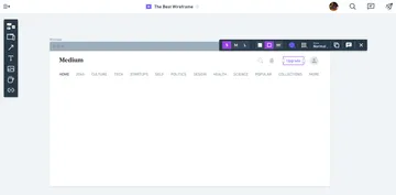
By adding components, I showed how the contextual menus change to support different actions. I said there would be more to explain later but the beauty of it is, there really isn’t much else to it. At any given time, there’s really just the your canvas and a single menu. You won’t see any editing panels to toggle or hide. The only actions you see are the only actions you can take. As you add more elements, the contextual menus will appear over the selected element and will change to support related actions. Everything else gets out of your way. I find that really refreshing.

This is one of the key difference that separates Whimsical from my other tools. Anything you can do to edit or manipulate something are always provided in context with the element you’re working on. Yes, I know what you’re thinking: "But our other tools do this too. They have panels and action sheets that dynamically change to support relevant actions. What’s the big deal?" Oh, they do. Ten fold. They have everything you could need and them some. What they don’t have, is a sense of focus. In Whimsical, you won’t waste time peering through different menus or scrolling through panels wondering what you need. You’ll have it right in front of you. This brings me to my next point.
Inflexibility. What a concept.
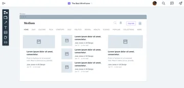
Whimsical isn’t as flexible as other tools. For instance, you can largely only work in six different colors, and there are no free form shapes outside of squares, pills, and circles. Adding typical UI elements like buttons, form fields, and links, requires use of their pre-styled components. What this amounts to is creating a wireframe using Whimsical’s design system, which is baked into the tool, and something you will gladly embrace.
I’ve found that by Whimsical making all those decisions for me, I can focus more on the mechanics of my data models and spend more time thinking about where certain information should live. Furthermore, since I haven’t spent any time setting up colors, text styles, or grids, I don’t have an attachment to my existing work. Even when I’ve articulated a complete thought, I still feel like my wires are expendable. I can toss them away and start from scratch or duplicate screens and iterate in a different direction.

Presentation Ready
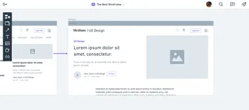
What I love about working in Whimsical is that when I find a direction that’s working, I’m never that far off from something that resembles a deliverable. I have a digital version with a discernible hierarchy and definable parts that can be shared with other designers for critique or developers for clarifying functional limitations. For smaller projects, I’ve used Whimsical to lead design review discussions with the client by sharing an entire site built out on a single board.

Other Features
In case any of the above hasn’t raised any eyebrows, here’s a quick, high-level list of other useful features:
- Nearly all actions and Whimsical elements have keyboard shortcuts that were thoughtfully mapped so you can keep one hand on the keyboard and the other on a mouse. This can really supercharge your workflow.
- The commenting feature lets you show or hide the comments as needed. Resolved comments are hidden by default but you can elect to show them as well.
- The exporting feature will let you export multiple frames at once (without treating them or stitching them into a single file) which is really handy for building prototypes.
- When creating a shareable link you can enable or disable comments, require a password, and even set the board position to ensure the recipient is looking at the right thing.
Conclusion
Obviously, each project and designer is different and I don’t advocate for a process that’s prescriptive to any one set of tools or methods. What works well for one project won’t necessarily work well for another.
Regardless, exploring and discussing different ideas is an important part of any design process and one that should have as little barriers for entry as possible. When that’s my focus, Whimsical has helped me create wireframes quickly, cheaply, and with a level of fidelity that can facilitate discussion. I hope you consider working Whimsical into your exploration process!