It’s the Little Things: Why Copywriters Should Care about Microcopy

Elyse Kamibayashi, Former Senior Brand Strategist
Article Category:
Posted on
As interfaces become more complex, good microcopy is more important than ever.
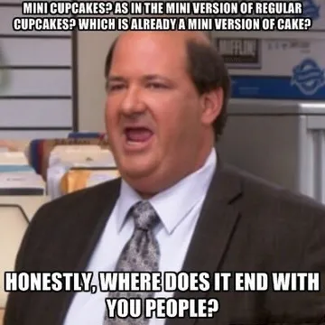
If you’re a fan of The Office, you might remember the scene in which resident soothsayer Kevin Malone expresses his disapproval of mini cupcakes:

Personally, I’ll accept any type of cake, provided it’s generously frosted and appropriately moist. But Kevin has a point — we live in an age of shrinkage. Everything seems to be growing shorter, slimmer, and quicker, conforming (arguably) to our ever-dwindling attention spans.
So, when copywriters first hear the term “microcopy” we may be tempted to respond like Kevin. Microcopy is generally defined as small pieces of copy on an interface that help guide the user (think: error messages, buttons, contact form explainers, etc.). But, you might say, isn’t copywriting already a form of micro-writing? We copywriters have so few words as it is — why take away more? Why strip us of all but three words hovering above a form field? Honestly, where does it end with you people?
Outrage can only be avoided by understanding what microcopy really is, and in my opinion, by never, ever calling it “microcopy” unless it’s absolutely necessary.
The word makes it sound like a new invention. It is not. Think about Hemingway, or haiku. Microcopy, like all good copy, meets the need of the moment. Sometimes the moment calls for pith. And that doesn’t mean microcopy has to be boring. You may not get to craft an elegant, serif-font headline, or a witty tagline, but you can do a lot with a 404 page, a loading message, or even a form field.
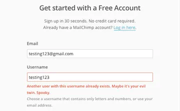
Companies like MailChimp and Tumblr have proven microcopy’s creative potential with tasty tidbits that reinforce their branding while also delighting their users.


Bottom line: microcopy can be entertaining. But, as responsible writers, we also have to consider the possibility that users don’t always want to be entertained.
In a recent article for InVision’s blog, Jackson Noel said:
“Microcopy is like a mother’s reassuring reminder that there are no monsters under the bed before turning off the lights. It’s perfectly timed, addresses a real concern, and is effective in getting its audience to comply.”
After all, why should users trust you? For all they know, you could be a robot, or a scammer, or possibly the robot of a scammer. How do they know you aren’t asking for their credit card info so you can run out and buy a drone? How do they know you won’t spam their inbox three times a day? Or plunder your data and sell it to shady organizations for drone money?
Microcopy can't ensure trustworthiness — but it can help. Good microcopy plays an essential role in creating clarity and consistency, and eliminating worry and confusion.
But how do you know when to be entertaining and when to be clear? Thankfully, copywriters don’t have to make these decisions alone. The copywriter/UX partnership is a lot like the time-honored copywriter/art director relationship — just with a few more spreadsheets. By working with a UX designer, a copywriter can help shape an incredibly complex system into something that seems incredibly simple. Together, they create a structure that is logical, intuitive, and human.
Take, for example, buttons. Buttons are not toys — no matter how much we copywriters want to play with them. Users just want to know what’s on the other side of the button. It would be like trying to get creative with street signs, which is never a good idea. That said, just because you can’t be clever with button text doesn’t mean that you can’t be creative around the button. In the sample below, Google combines clear navigation with fun copy.

In the end, can I honestly tell you that microcopy will be the most creative writing you ever do? Probably not. Chances are you won’t be putting helper text in your portfolio, unless the helper text is written in iambic pentameter — which is generally frowned upon in UX circles. At the end of the day, copywriters need to be committed to providing value to users in whatever form that requires. Sometimes we get to inspire our audience with a page of Steinbeck-esque longform. Sometimes we get to make them laugh with a headline. Sometimes we get three words to make them feel safe. Whatever we’re given, let’s make the most of it.
Special thanks to Dan Brown and Brandon Dorn — UXers extraordinaire, whose brilliant ideas are baked into this article.