In Defense of the Humble, Often Overlooked Contact Page
For awhile now, I've been obsessed with contact forms and contact pages. When I happen upon a site that looks nice, one of the first pages I check out is the contact page. Not because I'm just that eager to tell someone how lovely their site is, but because I'm always on the lookout for what designers are doing with contact pages.
Why? It seems, more often than not, that the contact page gets ignored in the design process and in the end it's nothing but a plain form and a brusque list of ways to contact a company or person. It does its job, but it doesn't look particularly appealing while doing it. It's the vegetables of the website dinner plate. Not even fun, tasty vegetables; it's squash.
As a designer, I understand how that happens. Often the contact page is one of the last pages to be put together. It's an after-thought. It gets lost in the shuffle of all the higher-level, more exciting, seemingly more important pages that need to be designed.
But the contact page deserves better treatment than that. If the page has a contact form (most do, these days) you hope that users are stopping and spending a decent amount of time on the page, filling out the form. It's not like a quick, factual form; name, email, address, done. Hopefully they're there to open up and share their thoughts, ask about your product, offer you work, etc. So you want them to feel comfortable and welcomed, and like what they're saying will be read by an actual, living person.
The contact form is where a user is reaching out to get in touch with you. A thought-out contact page and form is meeting them halfway. Caring about the contact page conveys that you care about what users are sending from said contact page. It's a way of reassuring them that you want them to contact you, their message won't just be shuffled away into some anonymous email account, and they will get a response.
That's not to say that a contact page should be ostentatious; it still needs to be a straight-forward, easy to use page. But I'm always impressed with a contact form or page with a little extra thought put into it, a fun design touch, a delightful interaction, a bit of a twist, some fun, conversational content. These are the contact pages that show that a site truly was thought out, down to the last detail.
Okay, enough talk, let's look at some well-done contact forms and pages!
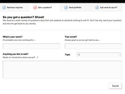
Fi's contact page gives you different form options, based on why you're contacting them. Then they add some fun personality with a note for each input. Nothing like telling me name's "nice and beautiful" to instantly get on my good side!
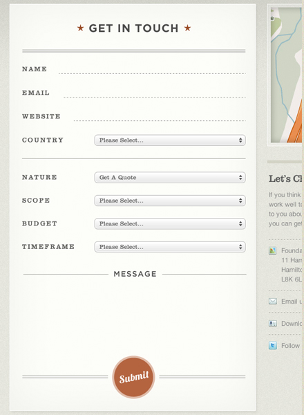
Foundation Six's contact form is elegant and different. Bonus points for the handwritten typeface they use when a user writes in the form.
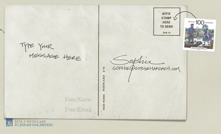
The contact form on Sophie Hardach's site is already plenty fun to look at; it's a really nice, seamless postcard-style form. But there's no traditional button to submit it; you send the form in by moving the stamp onto the postcard! This one's admittedly out there, but it fits nicely with the rest of the site. And it's a fun change of pace.
Honorable Mentions
These aren't actually contact forms, but they're fun and engaging and worth mentioning.
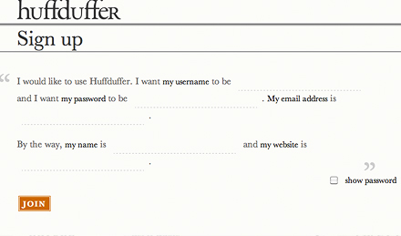
Huffduffer's sign up page uses a sentence-style form, rather than the usual list of input fields. It definitely feels more personal.
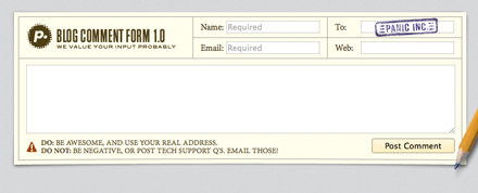
Panic Blog's comment form is almost reminiscent of an old telegram form. Plus it instructs users to "be awesome" which is, in fact, awesome.
So what are some of your favorite contact pages? Or am I ridiculous for caring about this? Or do you just want to flame me for besmirching the noble squash?
