Illustrating for Online: Know Lupus
Illustration is often a big aspect of our work as designers. More and more illustrations – big and small, elaborate or simple, as primary features or supporting roles – are seamlessly integrated into sites and apps. Whenever possible, I like to share the thinking, process, and work that went into some of our illustration work at Viget.
Know Lupus
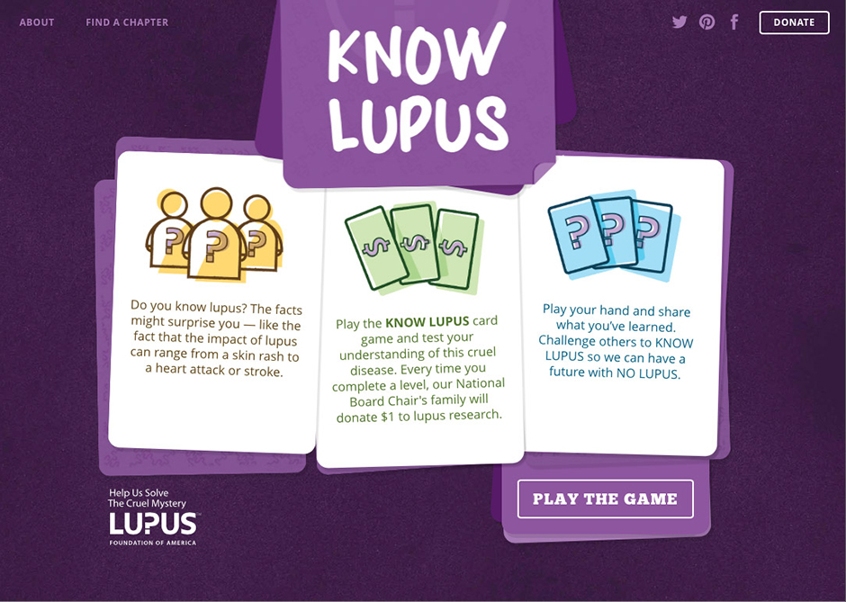
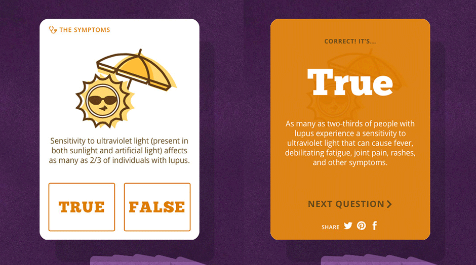
We were thrilled to work with the Lupus Foundation of America on their Know Lupus campaign. Our small part of the larger campaign: create a game that would educate people about lupus while keeping them entertained and engaged. We came up with a card game that tests what you know and educates you on what you don’t. Highly interactive, illustrated cards for each lupus fact make the game enjoyable and memorable to play, and hopefully fun enough you'll even want to share it and spread awareness about lupus to family and friends.


Being Serious While Being Seriously Cute
The Know Lupus card game illustrations created a unique challenge. On the one hand, the tone of the game is meant to be fun and enjoyable. Cute, even! We want you to want to keep playing this game through all three levels. So lighthearted and totally adorable were high priorities.

On the other, the game raises awareness about a serious disease. The cards illustrate serious, sometimes painful, facts. Or facts that are very medical and technical. How do you reconcile "fun" with "kidney inflammation"? How do you illustrate medical concepts like chemotherapy and infection without looking like a textbook?

A simple, cartoonish, heavily stylized family of illustrations keeps the serious nature of some of the facts from feeling too personal. Meanwhile, the illustrations themselves are mostly serious and straightforward. Pictures of organs, an IV drip, medications. The fun aspect comes from the over the top style, with fun, bright colors, funky offsets, and cutely chunky weeble wobble-looking human figures.
27 Illustrations
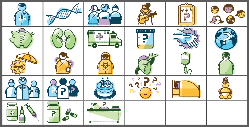
The other challenge that came up on this project was the sheer quantity of illustrations. Nine illustrations per level with three levels equals twenty-seven unique illustrations. Sadly I didn't have weeks upon weeks to dedicate to illustrating. Keeping the quality up and the style consistent while still finishing on time was tough, but following a set of rules I made for myself as I went kept me on track:
Keep yourself constrained to a strict system.
Only two line weights could be used. Only three colors maximum per image. Each category: basics, symptoms, and impact, is color coded. An illustration could have that category color's darkest shade for lines and shadows, a brighter shade for filling in, and a tint of the Lupus Foundation of America's trademark purple as a finishing touch. (The only time an exception was made for this system: a question about urine tests. Blue pee just doesn't send the right message.)

Recycle.
It creates consistency and makes everything go faster, win win! If an illustration is based around a human figure, I used the same basic human template I created early on. Hair styles were created for one illustration, then used across three or four more. For illustrations like these, ones that are practically pared down to icons, the repetition built a visual shorthand and created a nice flow from card to card.

Balance discipline and fun.
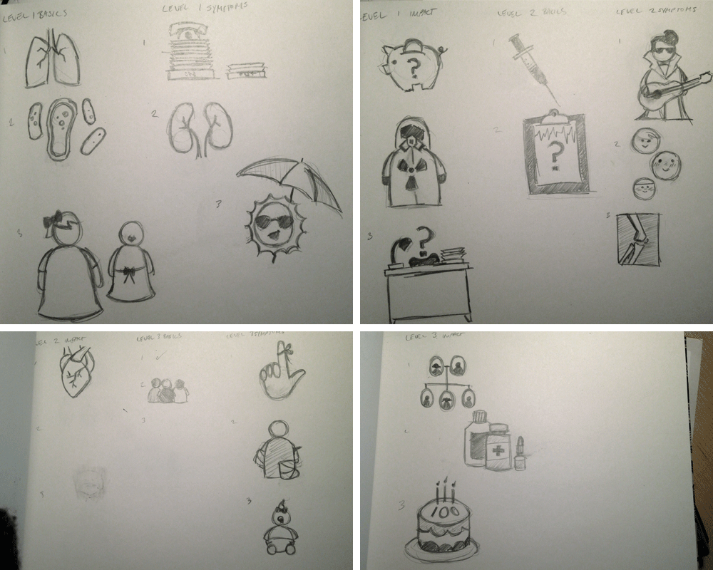
The first phase of illustrating was to create the idea and polished contour line drawing for each illustration. That meant coming up with the clearest idea for every fact and then drawing it to make sure it visually made sense and would easily come across to users. (To put it another way: we all debated what arthritis looked like.) Research, planning, and all the technical illustration work were done in this phase. Only after that time-consuming part of the project did I get into phase two: colors, funky shapes, and fun tweaks to give each illustration a little personality. If I had agonized about making each illustration 100% before moving on to the next one, I think I'd only just now be getting halfway through.

Step One: Ideas

Step Two: Refining

Step Three: Repeat 26x
Check out:
The PostScript of Misfit Illustrations
A card asking, "True or False: Lupus is known as the Great Imitator" hit the cutting room floor. With it went this illustration of an Elvis impersonator. Enjoy.

