How to Make Your Web Content Accessible

If you create web content, even if you never write a line of code or log in to a CMS, you have a role to play in accessibility.
Do you know the difference between decorative, informative, and functional images and what that means for writing good alt text? Are you aware that audio descriptions are required for all live and pre-recorded videos?
Making your content accessible means more than just relying on your web developers or checking off a box for video captions and alt text. It means that content creators, including writers, graphic designers, photographers, and video editors, understand the guidelines and, more importantly, what those guidelines mean for how the content is implemented on your website.
Because accessibility is everyone’s responsibility.
What are the guidelines for creating accessible web content?
The World Wide Web Consortium's Web Accessibility Initiative developed the web content accessibility guidelines, or WCAG, to make the web more accessible for people with a “wide range of disabilities, including visual, auditory, physical, speech, cognitive, language, learning, and neurological disabilities.”
The first set of guidelines – WCAG 1.0 – was released in May 1999. They were updated to WCAG 2.0 in December 2008 and WCAG 2.1 in June 2018. WCAG 2.2 is scheduled to be published in June 2022 and WCAG 3.0 is scheduled to be published in a few years.
Something to know about WCAG updates. They are always backwards compatible. So, if you meet WCAG 2.1, you will have also met WCAG 2.0 guidelines.
For each version of WCAG guidelines, there are three levels of success criteria – A, AA, and AAA.
Level A: Minimum requirement
Level AA: Usual requirement
Level AAA: Enhanced requirement
Success criteria are assigned a level after taking factors into consideration, including:
Whether it’s possible to meet the criteria for all websites and types of content
Whether the criteria would impose limits on look, feel, or function
There aren’t workarounds if the criteria are not met
Most government standards currently require websites to meet the WCAG 2.1 Level AA criteria. At this time, all Viget projects with a design or development component are committed to achieving WCAG 2.1 Level AA compliance.
Now that you understand a little about the guidelines and their history, let’s see what that actually means for your website.
Making Multimedia Content Accessible
Most people already know that captions are required for all videos. To meet the AA requirement, you have to provide captions on all pre-recorded and live video. To meet the AAA enhanced standard requires sign language interpretation.
What most people don’t know is that audio descriptions are also required for all pre-recorded and live video to meet the AA standard. To meet the AAA enhanced standard requires extended audio descriptions for all videos.
But what are audio descriptions? They are narrations that provide information about visual elements in a video to aid blind and visually impaired users.
Here’s an example of the difference an audio description can make in understanding what is happening in a video.
Close your eyes and hear the difference.
Something else you should know about videos is that they should have controls, even on your background videos. To meet the minimum Level A criteria requires pause and stop buttons on all auto-play audio and video. To meet Level AAA requires the ability to control background audio.
It’s not only videos where you have to think of controls. For motion animations triggered by interactions, like an image that moves when you hover or scroll, to meet Level AAA standards, you have to provide a way for those animations to be disabled.
Finally, flashing lights are also something to be aware of since they can cause headaches, nausea, dizziness, or even photosensitive seizures in people who may not even have a seizure disorder. For Level A, you can’t have more than three flashes below the general flash and red flash thresholds in any one second period. For Level AAA, you can have nothing that flashes more than three times in any one second period at all.
Making Images Accessible
One of the best practices when using images on the web is to not use images with text or text-heavy graphics when possible. In fact, to meet Level AAA standards, all images with text have to be decorative.
What is a decorative image? For accessibility purposes, there are 3 basic types of images:
Decorative: Don’t add information to the content of a page
Informative: Convey a simple concept or information that can be expressed in a short phrase or sentence
Functional: Are used to initiate actions rather than to convey information
Decorative Images
According to the W3C, images may be decorative when they:
Are used as part of a page design, like an image of a section dividing line to break up content on a page
Are a decorative part of a text link, like a link that includes the Twitter logo and text that says Twitter
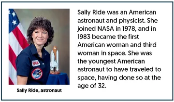
Have an adjacent text alternative, like a photo with a caption that details what’s in the image
Are used to add visual interest to the page, basically eye candy, like a photo that makes the page look pretty but doesn’t add any information
For decorative images, because they don’t add any information to the content, you should use an empty alt attribute (alt="") in place of alt text.
EXAMPLE OF AN IMAGE WITH AN ADJACENT TEXT ALTERNATIVE

Informative Images
According to the W3C, images may be informative when they:
Are used to label other information, like an image of a telephone next to the telephone number
Are used to supplement other information
Are used to convey succinct information, like an image that shows which direction to turn to remove a bottle top
Convey an impression or emotion
Convey file format, like a PDF or Word icon next to a link to a PDF or Word download
Alt text for informative images should convey the meaning or content that is displayed visually, but not usually a literal description of the image.
EXAMPLE OF AN IMAGE USED TO CONVEY SUCCINCT INFORMATION

Functional Images
According to the W3C, images may be functional when they:
Are used alone as a link, like when the Twitter logo links to Twitter without accompanying text
Are icons that convey information in a link, like a new window icon that indicates that the link will take you to a new window
Are a stand alone icon that has a function, like a printer icon that tells the user that if they click on it they can print
Are used as a button, like the magnifying glass icon used to initiate a site search
Alt text for functional images should convey the action that will be initiated (the purpose of the image), rather than a description of the image.
The W3C also has a great alt text decision tree that can help guide you through the process of determining what type of image it is and what kind of alt text is required.
Icons and Symbols
To help people with cognitive and learning disabilities, you should use the standard icons and symbols that people already know – like play, print, email, calendar, the magnifying glass for search – so they don’t have to learn new ones.

But even if you use these recognizable symbols, you should at least include functional alt text, or better yet, include a visible text label.
Writing Alt Text for Images
Knowing when you need to write alt text is great, but knowing what to write for that alt text is even better. When deciding if you should include “alt” text, surrounding context makes a difference.
You can try using Alex Chen’s object — action — context method, where the alt text you write describes the main focus of the image, what that main focus is doing, and the environment surrounding the main focus.
Understanding the context of the content surrounding an image is also important. It can help you decide what the best alt text is for your image.

If you are writing a story about different types of breakfast foods, perhaps the “good” alt text of pancakes is enough to describe the image. But if you are talking about the different types of pancakes, then you should probably use the “better” description of a “stack of blueberry pancakes with powdered sugar.”
The same is true for this image of a rooster. If you are talking about different types of barnyard animals in general, then saying the image is of a rooster may be appropriate. But if you are talking about the different sounds that the barnyard animals make, then using “rooster crowing” may be better. And finally, if you are talking about different types of rooster, then using “red-crested rooster crowing” might work best.

While you may have the time and ability to describe every image in detail, if you don’t, then you should provide the level of detail that fits with the context of the surrounding content.
THINGS TO DESCRIBE IN ALT TEXT
Placement of objects
Image style like a painting or graph
Colors
Names of people
Clothes
Animals
Emotions like smiling or crying
Surroundings
THINGS NOT TO DESCRIBE IN ALT TEXT
Descriptions of colors
Image type like “image of” or “logo of”
Obvious details such as someone having two eyes, a nose, and a mouth
Details that are not the focus of the picture or not in the context of the related copy
Overly poetic or detailed descriptions
There is debate about the maximum number of characters you should have in alt text. Some accessibility recommendations suggest using fewer than 125 characters for alt text because screen readers may stop reading if it’s longer than that. But some users have tested that theory and found it incorrect, so that limit may only be for SEO purposes.
Regardless of whether there is an actual cut off at 125 characters, you should try to keep your alt text as short and concise as possible. If you need more than 200 characters to explain the image, you might want to adjust the content around the image to provide better context.
Describing People in Alt Text
When it comes to describing people in alt text, you need to be careful. You might be able to accurately describe someone’s clothes or hair style, but you may not be able to tell specifics about a person. Appearances can be deceiving. You may not be able to accurately know someone’s race, ethnicity, gender identity, or ability based on appearance alone.
Unless those specifics are relevant to the context of the surrounding content, you should probably avoid including them at all. If you do want to include them, then you should always try and ask the person specifically how they would describe themselves.
Making Text Accessible
Language
To make your text accessible, you need to use simple and clear language. Use easy words in short sentences and blocks of text. To meet the Level AAA standard, the reading level should not be above the 8th grad (lower secondary). This helps users who may have cognitive impairments or learning disabilities.
It also helps users who rely on screen readers. Screen reader users take in significantly more words per second than sighted readers. The average reading time for a sighted reader is 2-5 words per second (or 10-12 syllables), while for a screen reader user it’s 35 syllables per second.
That difference in speed means that a screen reader user needs to be able to comprehend your content much faster than a sighted user, so making your content simpler works better. Using simple words also means they are less likely to be mispronounced by that screen reader.
In that same vein, you should also avoid using technical terms or acronyms unless they are explained or spelled out. Level AAA guidelines require that unusual words are not used unless explanations are provided.
Also don’t use language like “on the right” or “on the left,” since screen readers read from top to bottom so there is no right or left. That can also be a usability issue because with responsive design, things that appear on the right or left on a desktop may be on the top or bottom on a different device.
Try to use periods when the letters of an acronym should be read out individually (U.S.A. and C.I.A.), so that the screen reader understands they are separate letters and doesn’t try to read them as a word, think U-S-A vs. oosa or C-I-A vs. seeuh.
You should also use PascalCase or camelCase in hashtags, again, so that a screen reader knows that they are separate words and doesn’t try to read the entire hashtag as a singular word. PascalCase is when the first letter of every word is uppercase and camelCase is when the first letter of the first word is lowercase, and the first letter of every subsequent word is uppercase
Text Sizing and Spacing
To meet the Level AA standard, text can be resized up to 200% without the loss of content or functionality, meaning you can still see all of the text, even if you have to scroll horizontally to see it. However, to meet Level AAA standards, the text has to be able to be resized up to 200% without having to scroll.
The Level AAA guidelines also say that the width of your content blocks should be no wider than 80 characters and text should not be justified, meaning it is aligned to both the left and right margins.
Headings
Headings are a great way to organize and break up content when used properly. Think of them like a table of content or an outline of your page, which is a requirement for Level AAA compliance. When you use the correct heading structure (H1, H2, H3, H4, etc.) with text that describes the topic or purpose of a section, sighted and screen reader users can quickly and easily find the specific content they are looking for..
Screen readers have the ability to navigate the page using only the headings, so they can read all of the H2s until they find the content they want, then read all of the H3s as they narrow down the information to the specific content they want.
Because headings are more than a visual element, your headings shouldn’t be used to style text. Don’t use them just to make something appear larger on the page, and don’t avoid them by just making the copy bold.
You should also respect the heading hierarchy, like you would in an outline. So, don’t jump from an H1 to an H3 or from an H2 to an H4. However, you can reset the outline by going from an H4 to an H2 when the content goes from specific back to being broad, like going from the third level of an outline back to the first or second level.
EXAMPLE OF PROPER HEADING STRUCTURE
United States (Heading 2)
This information is about the United States.
Oregon (Heading 3)
This information is about the state of Oregon in the United States.
Portland (Heading 4)
This information is about the city of Portland in the state of Oregon in the United States.
Canada (Heading 2)
This information is about the country of Canada.
British Columbia (Heading 3)
This information is about the province of British Columbia in Canada.
Lists
If you have more than three items in a list, consider making those items into a list. In addition to drawing the eye for sighted users, lists provide screen reader users with information about the lists that help them decide how to proceed.
When adding lists, make sure to use proper bulleted (unordered) or numbered (ordered) list formats and not just symbols or numbers. Screen readers understand the list HTML and use it to provide the number of items in the list to the user, as well as identifying any nested lists and the number of items in those lists as well. They also allow a user to skip over a list rather than forcing them to listen to your entire list if it’s not something they’re interested in.
Links
Like using lists benefits sighted and screen reader users, using proper links helps both groups as well. Links draw the eye for sighted users and a screen reader user can navigate a page using only the page’s links. To make it easier for both, you should use concise and descriptive text for all of your links.
This is actually the Level AAA standard. Users should be able to know the purpose of the link from the link text alone. If you read just the actual link text without any surrounding context, do you know it’s purpose and where it will go? That’s why things like “click here” and “read more” are examples of bad link text. They require the user to understand the surrounding content to be able to decide the purpose of the link.
EXAMPLES OF BAD LINK TEXT
To see a list of Viget’s services, click here.
Visit Viget’s website to see a list of services.
Tell me more about Viget.
EXAMPLES OF GOOD LINK TEXT
See a list of Viget’s services.
For more information, read “Is Your Website Accessible?”
Tell me more about Viget.
Some additional notes about links. Don’t put punctuation inside a link unless it is part of the link description and don’t use raw URLs as your links, screen readers will read it out to users, no matter how long it is. Finally, don’t ever underline anything that isn't a link. Because the standard design pattern for links has underlining, if you underline non-link text, the user can become confused and no longer understand what is or isn’t a link on your page. While this is an issue for all users, it is especially a concern for users with cognitive or learning disabilities.
Colors
Colors are an area that can affect both content and design.
From a design standpoint, you should always check to verify that there is sufficient color contrast for all of your text. The Level AA standard requires there be a contrast ratio of at least 4.5:1 for all regular-sized text or 3:1 for large-scale text (at least 18pt or 24px at normal weight or at least 14pt or 18.5px at bold weight). The Level AAA standard increases those ratios to 7:1 for regular text or 4.5:1 for large text.
For user interface components, including all of their states and boundaries, and graphical objects should have a color contrast ratio of 3:1 to meet the Level AA standard.
There are a lot of programs to help you determine whether you meet color contrast requirements. There are plug-ins in Figma and standalone apps like the Color Contrast Analyzer.
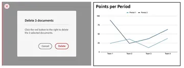
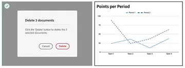
From a content standpoint, you should never use color as the only indicator of importance or functionality. That is the minimum Level A requirement. That means you can’t tell someone to click the “red” button, or have a chart or graph that only shows information based on color alone.
EXAMPLE OF INCORRECT USE OF COLOR

EXAMPLE OF CORRECT USE OF COLOR

When it comes to content, knowing the WCAG guidelines is an important first step in making your website accessible. But that only gets you so far. It requires time and effort to understand those guidelines and how to implement them.
Hopefully, you now know a little more about some of the things you need to do to improve accessibility because making your content accessible is not just your web developer’s responsibility. Even if you never write a line of code or log in to your CMS, the steps you take as content creator play a role in accessibility. Because when you make your website accessible, it makes it usable for everyone.
