How to Create UX Documentation Developers Will Love

Samara Strauss, Former User Experience Designer
Article Categories:
Posted on
Want developers to love you? Learn how to create UX documentation that will make buildout a breeze.
One of the first constructive criticisms I received at Viget was that I needed to understand more about development. I was totally game to learn, but no one could get me a straight answer about what this meant besides that I didn’t need to learn how to code
I was frustrated that I couldn’t get a direct answer to my question. Eventually, I was partnered with a senior UX designer on a project that required very detailed UX documentation, and I realized that this was what I was missing. Up until that point, I had not been adequately defining the design and functionality in my wireframes for our front-end and back-end developers (whom, from here on out, I will refer to as FEDs and Devs).
If you’re like me and have found yourself doing some head scratching as to what FEDs and Devs need from you, then read on. Creating great UX documentation will not only make the lives of your FEDs and Devs much easier, but it also makes it more likely that you’ll create user-friendly AND developer-friendly designs from the start.
Caveats
A few things before we get started:
We work primarily with Craft and Rails at Viget, so my methodology may show some bias towards those tools.
I primarily work on content-focused websites with little functionality. My thoughts may not be as applicable to more complex applications.
I will specifically address what UX designers should include in their documentation, but I will not be addressing visual design documentation or parts kits.
Alright, let’s get started!

What to Document
Data
First, document any data points that need to be catalogued on the back-end. If you’re not sure what to include, think of information in the wireframes that may appear in multiple places.
A common example is a list of staff or team members. For Viget.com, we have every team member catalogued on the back-end, including their names, photos, and titles. This information needs to appear in multiple places — the About Us page, in Articles, and in the job listings on our Careers page — and we don’t want people entering the same information manually on each page.
When you’re creating documentation, make sure to clearly model data like this for the developer. “Model data” sounds scary, but it can be as simple as creating a list. Continuing with the above example, you’d document that staff members are a data point and that each person has a name, headshot, and title associated with them. That’s it! Not rocket science, but helpful to have it clearly written down so you and your FED or Dev are on the same page.
Modules
Next, I recommend documenting wireframes at a modular level. This especially makes sense if you use a CMS like Craft, Wordpress, or Drupal, which allows pages to be built modularly.
The goal is to clarify where everything in a module comes from. Will an editor write something in the CMS? Will a FED hard code it in the template? While this may be obvious to the UX designer, it’s not going to be obvious to the developer without well-written documentation.

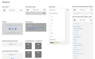
This is a single-page document of all the modules I created for some work we did with PBS. While I wrote the actual documentation in a separate place, I uploaded this one-pager to InVision and was able to link to the resource from multiple places within my written documentation.
For each module, document:
- Form fields — Make a list of all the form fields that someone can edit from the CMS, the names for each field, and in what order they should appear.
- Field type — For text fields, include whether an end user can format text in the CMS or not (i.e., is the field a WYSIWYG or not?). For images and videos, include what image and video types are acceptable, and if there are specifications for dimensions or orientations (you may need to get input from the project’s visual designer on this one). For menus or lists, specify things that may not be immediately clear from a wireframe, like whether a dropdown is single- or multi-select, or whether the list is static or managed in the CMS.
- Required fields — Note which fields are required and optional for the end user.
- Field validation — Do you want to avoid clients entering way too much copy in a space you had only intended to fit a couple of lines? You can do this by enforcing character limits. You may also need to specify non-text related validation, like what kinds of image and video formats are acceptable. If you want to go that extra mile, you could specify error message copy for these validation cases that could be programmed into the CMS.
- Functionality — If there is functionality, like sorting or filtering, make notes on how it works.
- Additional specs — Include anything else that isn’t immediately apparent from looking at a wireframe. Remember, these should be things that are page-agnostic.

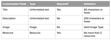
This is an example of a table I created to document form field specs. I find tables are more scannable than lists for organizing field requirements.
Pages
Finally, you’ll want to create a set of page specs even when your design is largely modular.
For each page, document:
What modules go on each page — This also includes if some modules are not allowed to be added to certain pages.
The order of modules — Also include if modules, for whatever reason, can’t be moved to a different position on the page.
Whether a module is required — All modules may not be required on all variations of a given page template, so let your developers know so they can communicate that to your end users.
Any page-specific specs — This may include things like where a link leads or what happens when a button is clicked.
Tools
If you’re looking for documentation tools, here are some thoughts on ones I’ve used:
Google’s G Suite
Pros
If you’re like me, the tools in Google’s G Suite are already a regular part of your workflow. It feels natural to keep documentation here along with all of your other project resources.
Assuming your company already uses G Suite, there’s no additional cost to use Google’s products. If your company does not, you can use Google’s products free from a personal Google account.
Inline comments allow for easy collaboration.
Cons
Google Docs doesn’t have versioning functionality that lets you alert people when an update has been made to the documentation. This can cause problems if developers don’t know that something has changed.
Confluence
Pros
Confluence includes a powerful versioning feature that makes it really easy for everyone to see when/how documentation is updated. This can be especially useful if you have a lot of cooks in the kitchen.
Confluence also has useful permissions. I’ve only used the tool on one project, but our client was able to let us into their account without giving us access to projects we didn’t need to see.
Cons
I’ve heard mixed feedback on Confluence as a documentation tool, and I think one of the main reasons is that you’re responsible for constructing the navigation for your documentation. I could see the tool being hard to use if this was done sloppily.
Confluence is not free, and it requires a per-user subscription.
InVision
Pros
You can link up wireframes to show functionality.
InVision’s commenting feature allows you to associate comments with a specific part of the page, making it easy to know exactly which part of the design a piece of documentation refers to.
Cons
Like Confluence, InVision requires a paid account.
It’s harder to write modular documentation if you’ve uploaded full page templates, as InVision intends.
You can only open one comment at a time, which makes it impossible to get a high-level overview of documentation. To be fair, this makes sense if you’re using comments as a conversation tool, but the limitation is worth noting in this particular use case.
Lengthy comments are hard to scan, and some specs may be lost within them.
Above all else, I recommend talking to your FEDs and Devs about their expectations with regards to documentation. Think of them like any other end user: you want to consider their goals, needs, and workflows before diving in and creating a product for them. Understanding their expectations will help you to get all the details right and write documentation that they love.