Hidden Complexities of a Simple Idea: The Making of CrushCoverCut
Jing Xiao, Former Viget
Article Category:
Posted on
This summer at Viget's Durham office, I had the opportunity to work on a group project with an absolute dream team of rockstar interns: Curt Arledge for UX, Corwin Harrell for design, and Sid Reddy for rails dev. As the FED intern of the group, many of my tasks required me to interact closely with the intern from each lab, so I felt lucky to be amidst such talent.
After much indecisiveness about what to make, our group finally settled on building CrushCoverCut, a rock paper scissors Ruby on Rails web app. The intent was to create a 2-player game that mimicked the real-life gameplay of RPS as much as possible. Our vision was clear: something simple, lightweight, slick, and stylish. We didn't want to mess with the rules or revolutionize the game; we just wanted to do one thing really really well.
My thoughts at this stage: Awesome. Doable. Let's start.
Not So Simple After All
But, as it goes with most things in life, behind the apparent simplicity of our idea lay a host of hidden complexities. As I dug in deeper, a gazillion unanticipated issues seemed to emerge on the front end. Many of these complexities arose from two major aspects of our application: the need to maintain state across clients and a particular animation that had to occur when the two players' choices were revealed. They were the most challenging, but also the most interesting problems that I had to tackle.
The Pains of Integration and Refactoring (and the Joys in the Aftermath)
In the planning phase of our project, we had decided to make our web app a realtime 2-player game, justifying its feasibility by throwing around words like "websockets" and not really thinking about how much work would actually go into crafting a realtime app. In the end, we didn't even use websockets at all; Sid and I eventually used long polling AJAX requests to enable communication between the server and client. This turned out to be a great learning experience, albeit quite complicated.
Deferreds and Promises: A Newfound Love
Perhaps my favorite takeaway from this was learning about jQuery Deferreds and Promises. A Promise, in my own crude and unscientific understanding, is an object that you can return from an asynchronous function that essentially keeps track of the state of that asynchronous task. Promises begin as Deferreds, which are just Promises that you can resolve or reject. The point is, a Promise is useful because it allows you to bind callbacks to it that will only fire after it has been resolved or rejected, which allows you to hold onto something in the meantime while the actual task finishes executing, and makes sure that you only use the outcome of that task once you know it has been completed. Bonus: Super awesome example of recursion + Promises by Nate
In my case, Deferreds/Promises came in handy when I polled for match and player data to determine if both players were ready to play. First, I created a Deferred object to which I attached a callback that would advance the state of the app to begin the match. Then, inside my polling function, I would resolve this Deferred after a request returned that both players were ready. As a result, that callback from earlier would fire automatically, both players would be guaranteed to be ready at this point, the screen would advance, and all would be dandy.
If You Can't Learn It in Time, Fake It
In order to hook up the communication between the backend and front end in a seamless manner, I also needed a way to keep track of changes to the states of particular objects stored in the database like the match and the two players (and amongst them, the current player for each client), and then update elements on the screen accordingly. Initially, my entire setup was one huge, impossible-to-manage jQuery soup. It was too late to switch to Backbone.js and to have to learn all the ins and outs of a new library, but Backbone wizard Nate helped me restructure my app with my own homemade pseudo-Backbone models and views using EventEmitter2.
Aside from instantiating individual models for each player and the match, some neat things I got to implement -- also suggested by the Backbone wizard -- were a "state machine" model that would emit different change events depending on which screen state got set, and a parallel "director" view that would listen to these state changes and render the various templates associated with each state. This arrangement gave me an easy way to control the different screens in the app and to show them whenever I needed. I pared down my setup to a more simplified example that I illustrate here:
 //State Machine model
var StateMachine = Model.extend({
 setState: function(state) {
 for (var key in this.attributes) {
 if (key !== state) {
 //first set all other states to false
 this.attributes[key] = false;
 } else {
 this.attributes[key] = true;
 this.onChange(key);
 }
 }
 },

 onChange: function(state) {
 this.emit('change:' + state, this);
 }
});

//Director view
var Director = View.extend({
 //listens, .on(change:X) -> render X
 init: function() {
 this.model.on('change:lobbyState',
 this.renderLobby.bind(this));
 ...
 },

 renderLobby: function() {
 var data = {};
 var markup = this.templateLobby(data);

 //Cached element
 this.ui.$panel.html(markup);

 this.controllerLobby.init();
 },
 ...
});

var stateMachine = new StateMachine({
 lobbyState: false,
 ...
});

var director = new Director({
 model: stateMachine,
 el: window.document.body,

 templateLobby: HandlebarsTemplates['lobby/main'],
 controllerLobby: 'lobby',
 ...
});
Navigating the backend code and maintaining this channel of communication between clients was a new and quickly overwhelming challenge for me. Ultimately, and despite all the headaches, I'm glad I took the time to refactor my code midway through to respect this MVC design pattern. The experience taught me the great value in separating data from the user interface, and also probably saved me from drowning in my would-be soupy code further down the line.
The Longest Three Seconds Ever
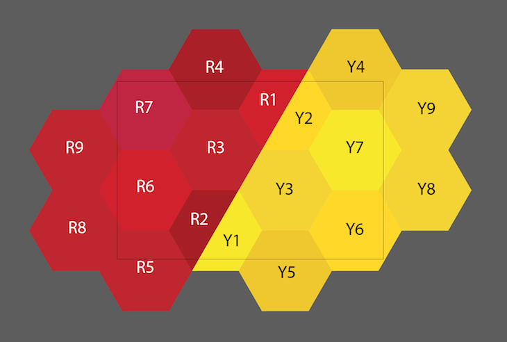
I also faced huge challenges on the more front-end side of the front-end development, one of them being recreating a beautiful 3 second animation that Corwin had simulated with Adobe After Effects. There were a lot of moving parts, literally, with 18 hexagonal pieces flying into the screen at varying times with motion blur. How does one even begin to tackle something like this? By consulting her brilliant advisors of course. My all-star mentors, Jeremy and Nate, gave me some invaluable tips to approaching the animation. First, they helped me break the problem down into more manageable, discrete steps: Create a rough prototype on CodePen, just as a proof of concept type thing. Start with animating boxes, or divs with just a background color, and start with only a few. Give each box its own attributes like durations and delays. Read about requestAnimationFrame, but use setTimeouts for now. Basically, test the waters, show that a simplified version can be done, and don't make it into a huge ordeal upfront. Sage advice, mentors.
Remembering High School Math
One of the coolest solutions that Nate suggested to me was using an inverted parabola with CSS blur filters to model the motion blur. As a front-end developer, the point, he said, is not to get the physics 100% right all the time, but to simulate it in such a way that the end product looks cool, as if it really is behaving like the real thing. What a motion blur looks like is essentially a small amount of blur towards the beginning of the movement, more blur in the middle, and no blur when it stops. Because the tiles in my animation were sliding in horizontally from both sides, I could plug in these changing x-values into an equation for a parabola, and use the y-value to proportionally determine the amount of blur at each step. After momentarily forgetting how to write a quadratic function, I recalled some basic algebra knowledge from way back when and simulated this on CodePen: http://codepen.io/notajingoist/pen/zwsoJ.
Achieving Pixel Perfection (Almost)
After the prototyping phase, I moved on to constructing the actual animation. Corwin provided me with a labeled visual of the tiles and a corresponding list of tile frame numbers.

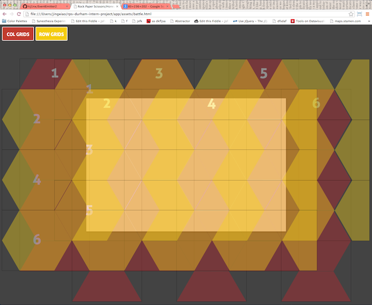
Instantly, I knew that positioning each tile in the animation individually would be hell if I didn't have a plan. My approach was to create a visual grid system by setting the background of one div to the image of a single hexagon tile and repeating it horizontally and vertically. This way, I could guesstimate the pixel positions one time for the grid using just a blank canvas, and have a convenient frame of reference that I could show and hide at my whim to more easily guesstimate the positions of each of the 18 tiles.

With these end positions and my prototype from earlier, the rest of the task magically didn't seem so hard anymore. Timing was simply a matter of some elementary-level math, and setting the background images for each of the 54 different hexagon images (3 item choices * 18 tiles) on their corresponding classes was easily done by writing some SASS mixins. I hooked up the animation to the rest of the app, wrote some code that would swap out the classes on each tile's div based on the players' choices, and voilà, a fully functional animation. The 3 seconds of pain were over.
This whole process was certainly somewhat overwrought, but it did eventually lead to a decent imitation of the original After Effects video. I can't say that this was the best approach, nor would I recommend that others move pixels for a living as I did for those few days, but I do endorse starting small and building up, maintaining an eye for detail, and keeping an attitude of persistence throughout the struggle.
After the Blood, Sweat, and Tears
Who would have thought that rock paper scissors, the simplest game of them all, could end up being so complex? In spite of the challenges (or maybe because of them), working on this group project has been one of the most rewarding experiences I've ever had. For me, this project served as a great introduction to a number of different technologies that I had never worked with before, and thanks to both my amazing team members and my genius, selfless advisors, this journey has been pretty darn extraordinary.
Finally, check out the fruits of our summer's labor at www.crushcovercut.com! (We recommend you use Chrome or Safari.)