Staying Connected with Glimpsee

Margaret Gerhardt, Former Recruiter
Article Category:
Posted on
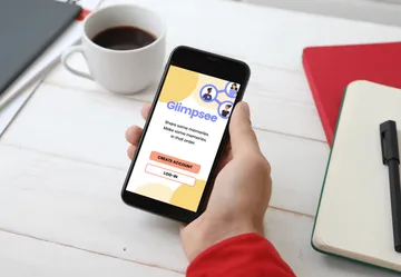
Inspired by the game telephone tag, a Viget team spent this year’s Pointless Weekend creating an app to help folks stay connected with friends and family by sharing a photo “glimpse” into their lives.
Beginning Pointless Weekend
If you’ve heard of Viget, you’ve probably heard about Pointless Corp. This February, we held a virtual 48-hour hackathon dubbed Pointless Weekend. Participants were assigned to one of three projects based on their skills and interests, and had basically 1.5 days to plan, design, build, and launch an app or website. You can tell that our project ideas were heavily inspired by a year of living through a pandemic and a desire to use digital products to help keep us safe and connected with people from afar; one team worked on helping people keep track of their “COVID bubble,” another team designed a virtual board game, and our team created an app to help friends and coworkers get to know each other better.
Our team thought of our app idea as a mix of the game “telephone” and a kind of free association in a distributed, asynchronous format. Friends or coworkers would reply to a prompt one at a time by sharing a photo glimpse into their life, and at the end of a round would be able to get a peek into other people’s lives through the photos they shared.

Our Team
Dylan Lederle-Ensign (DEV)
Emily Bloom (Emily came up with the original idea for Glimpsee, and provided feedback and encouragement throughout the weekend)
Lexie Garcia (Copy/Branding)
Margaret Gerhardt (Copy)
Meira Shuman (Design/UX)
Shannon Maylath (PM/UX)
Solomon Hawk (DEV)
Approach
When we met Thursday evening, we dove into the details of the purpose of the game and how it would be played, as well as what we could conceivably get done in just a couple of days’ time. After getting a solid handle on the fundamentals, we jumped right into outlining the user flow to make sure we were all on the same page for both the design and development workstreams. Sol and Dylan worked on a data model so they could get started on development, getting us to a working starter app as quickly as possible. Concurrently, Meira led us in translating user flows into wireframes in Whimsical.
Working in collaborative software like Figma and Whimsical enabled the whole team to both contribute to and work from a unified vision of Glimpsee. While everyone played certain roles on our team based on their skillset, we all contributed to brainstorming and providing feedback on one another’s work. Lexie and Margaret worked on microcopy to be added to screens as they were designed by Meira, Solomon and Dylan worked on developing and deploying the designs, and our PM Shannon kept us on track and communicating effectively throughout the weekend.
The Game Concept
Although we had lots of ideas for the direction the game could go, we decided to keep things simple to start. Here are the basic instructions we came up with:
To play Glimpsee:
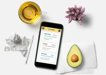
Create or join a group
- Someone starts a game. That person selects a prompt and a time limit and then shares a photo or opts to have another group member randomly selected to go first.
- When it's your turn, you'll receive a photo and caption from one group member and then you'll respond to the prompt by sharing your own photo and caption.
- When everyone has shared (or when the time's up), all the photos will be shared with the group.
Tech Notes
On the tech side, we decided to use the Elixir framework Phoenix, and its UI tool LiveView. We wanted to experiment with using the latest version and found it to be a good, productive platform to work on. Our biggest challenge was the time pressure and having to scope down all the great ideas the team was coming up with. It’s just not very long to work! We made extensive use of Phoenix’s code generators to rapidly model the domain our designers were coming up with. One other challenge we had was deployment; we couldn’t get the project up on the internet quickly so we scrapped that and just did a local demo. It was disappointing, but the right choice for the time we had to work.
One of the cooler things we did manage to get working was the direct to S3 file uploading. At the core of this app was the photo sharing feature. We decided to store them on Amazon’s Simple Storage Service (S3). Following the example in LiveView’s docs, we got a nice upload form working that sent the files straight to S3 from the user’s browser, avoiding our server entirely. It also displayed a nice progress bar as the upload loaded up, and a preview after it was done.
We also wanted to evaluate Alpine but ran out of time. Using LiveView, the state for your UI is moved from the client to the server and the framework JavaScript updates the browser UI for you. This is a very productive programming model, but there are still some interactions that need custom JavaScript. Alpine is one of several options for a minimalist framework that wants to fit in with LiveView-like HTML over websockets frameworks. Unfortunately we didn’t get an opportunity to really push it. We made one small modal that closed with Alpine, but didn’t get to try it out otherwise.
Naming our App
It was tough to settle on a name! We used some individual and small group activities to generate a wide variety of ideas, and after much deliberation, we landed on a few top options. We decided to move forward with Glimpse, which then became Glimpsee. We liked that the name added a touch of whimsy, and we saw potential in it for a logo design.
Design Process
Once we’d decided on a name, Lexie created a moodboard to provide a little guidance for branding elements, including some of the copy and colors. It was helpful and time-saving to work within the palette constraints of Tailwind CSS. Meira used Whimsical to create user flows and low-fidelity wireframes late into Friday night, buoyed by Shannon’s moral support and design input. With all the work accomplished Friday, we had time to create a couple higher fidelity designs on Saturday before the afternoon deadline, getting input from the entire team about their preferred snacks (avocado toast was a team favorite). We wrapped up the day by sharing our process, design direction, and a demo of the app.

Final Thoughts
It’s invaluable to have experiences like this that shake up the typical workflow and allow people to experiment with other tools and roles. While the time constraints created some stress, they also challenged us to hustle and lean on our teammates for support. This probably isn’t sustainable for a weekly workflow, but it was an incredible opportunity to participate in Pointless Weekend. Can’t wait for the next Pointless Weekend in 2022!