Give And Take: Rails Rumble 2009
Doug Avery, Former Senior Developer
Article Category:
Posted on
Last Friday, I joined Tony, Patrick, and Rob in the conference room here at Viget for the kickoff of Rails Rumble 2009. It started a long (yet, very short) weekend of frantic coding, last-minute fixes, and awesome breakthroughs. The Rails Rumble rules (all files must be created within 48 hours) have an element of drama built in, and even while detached from the development process I had my share of terrible and great moments before the 8pm Sunday deadline.
In 2008, our team (with Nick Schlueter in place of Tony) took home second place with Qflip, a little Netflix app that still sees some action today. Qflip came out of the same set of parameters we used for this year's idea:
- No login/pass — Rumble judges and users need to go through 150+ apps, don't make them create logins to remember. Logins also add complexity — is there a "Remember me" checkbox? What if I lose/change my password? What if I enter my email wrong? Huge pain.
- Instant results — Don't make users wait until they've completed ten actions before the app starts to pay off. The first action a user takes should have value.
- No friends required — Some apps are at their best when your buddies are already using them. Rails Rumble is not a great place for these — users need to be able to enjoy RR apps without large, existing communities.
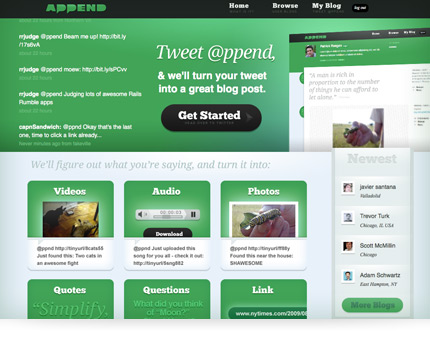
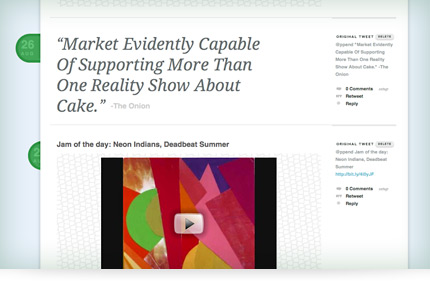
Out of these simple rules (and an idea from Pat) came Append, a way to create a content-rich blog through Twitter. Tweet @ppend, and we'll figure out if you tweeted a link, a quote, a picture, a video, etc, and do our best to make it into a cool post with comments, an RSS feed, a yourname.ppend.to address, the whole deal. It's a fast way to share cool stuff from anywhere at any time, without cluttering your Twitter stream or bothering with some new interface.
Rails Rumble voting starts tonight and ends Saturday, August 29, so if you're interested in checking out all the apps and voting, get started!


The biggest difference between Append and Qflip for me was the conceptual clarity (or lack thereof). Qflip is a simple idea that takes a few words to explain, and its potential use becomes immediately apparent. Append is more like Twitter itself - the first time you hear about it, it might take a minute or two before you can imagine what you actually want to do with it. In the end, this became a focal point of our post-launch discussion (and quick tutorial screencast Pat put together), which I will now share with you in the form of:
Give & Take
In 48 hours, everything comes down to balance — it's not enough to say "I should've made A better," you need to pick a B to let go of. If I got to do last weekend over, here's what I would take more of and what I would exchange it for:
Take: More Writing

Not quite descriptive enough.
Early on, we knew we had a difficult concept to explain. On top of that, we had big some interaction questions: How do I start an account? How do I post to it? What's my blog's address? I punted on a lot of these by writing mediocre filler content and pushing the homepage off until the last minute — big mistake. The app needed a clearer explanation and demonstration of how (and why) to use it, and writing that explanation should've been the first thing I did.
Give: Typekit.
I spent a little too long trying to get Typekit to work with our subdomains, not thinking to just a) drop it or b) Google the problem and find that Typekit specifically addressed the issue on Get Satisfaction.
Take: Static Views

It's hard to test styles without the right content!
Since dynamic apps depend on data to generate the markup, they can be a pain to design live. If the devs implement categories before you style them, you then need someone to add fake entries to the DB and rake just so you can see'em. We get around this by using static views sometimes, special files just for designers to test ideas in, but it seemed like too much of a hassle this time. In reality, it cost me a lot of time, because I had to take devs off of more important tasks just to get little pieces of the app working locally.
Give: The Logo.
The truth is that the the Append logo got finished up in about 30 minutes, but the polishing dragged into early Saturday afternoon. I showed Tony and Mele a few variants, and they both picked the same one, but I juuuust didddddn't knowwww if it was done. Even worse, once I had it, I wasted lots of time making an interlocking, repeating background out of it.
Take: Better Location
Heat make development director sad!
On the weekend, they turn the AC off here at Viget HQ, and it's hotter than a thousand suns. This ratcheted up the stress level on Sunday.
Give: Free sodas.
No Viget, no fridge full of free sodas - but it's a sacrifice I'm willing to make.
Take: Flexible Content Descriptions

Making these fancy also meant making them harder to change later - when we needed to.
On the header of your blog (log in to see it) and on the homepage, we have some descriptions of exactly how to interact with Append. They got compressed to save space, but they're so critical to the app that they should've been given more space and more room for editing.
Give: Fancy Content Descriptions
By locking descriptions into images (homepage) and little rounded pills (blog header), I shot myself in the foot. Once it became clear that they needed more work, it was too late to fix. Next time: cleaner content, less flash.
More Contests
Judging finishes early next week, but I think most Rumble participants will agree that the best part is already over: launching a working app in 48 hours is great fun, and teaches you a lot about balancing the time you spend on projects. If you're interested but don't work with Rails folks, check out:
If you know about any similar contests, let me know in the comments and I'll add them to the list.
(Please note, another great Rumble post heavily inspired this one: check out Michael Bleigh's write-up of his awesome entry Thingivore)
