Five Practical Uses for Dribbble for Designers
Dribbble. Maybe you love it; maybe you loathe it. Since its launch in 2009, it's become a popular way for designers to share peeks at what they're working on, or just promote their latest projects. Whether you think it's a good or bad thing for the design community, I wanted to share some of the aspects of the site that I've found useful, beyond just checking out others' work, stalking my favorite designers, and sharing my own work on occasion. You don't even need a coveted invite to take advantage of these Dribbble features.
1 - Find new and unusual color schemes
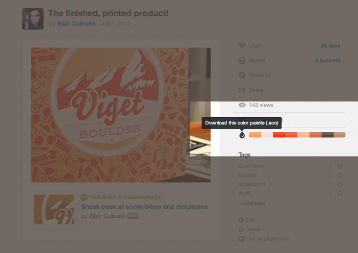
When you upload a shot, Dribbble automatically generates a color scheme from that shot. The results are often surprising. Dribbble picks up colors that aren't directly from the designer's exact color scheme. Or if the shot is a photo of a screen, or shows something like a table behind a printed design, it picks up those colors that are completely unrelated to the actual design. The result is unexpected color schemes that are often good starting points for branching out and creating your own surprising color schemes for a project.

2 - Find color schemes for a color you're not used to working with
Let's say you don't have the freedom to completely create a color scheme from scratch. The client already has a brand color you're working with. If that color is one you never work with, you might not immediately know how to best use it, or what colors to pair with it. You can search Dribbble by color, down to the exact HEX number, making it easy to see what other designers have done with that color, and quickly getting an idea of what other colors work and don't work with it.

3 - PSD autopsy
We've all spent a lot of time in Photoshop. A lot. Over the years we've developed our own methods and tricks for accomplishing what we want in it. Consequently, we've all developed our own blind spots in terms of some of Photoshop's features. One of the great things about working on a team with other designers at Viget is that I've often had a chance to work with another designer's PSD and learn how they use the program. A lot of designers on Dribbble attach PSDs with their shots, often as freebies for others who want to use their designs. I wouldn't suggest grabbing their UI designs and dragging them into your own comps. But if you see something you like and want to know how a designer achieved an aesthetic, it can be educational to crack open their PSD and find out what they did. Maybe they're using layer styles in ways you never thought of, or masks in a way you didn't know was possible.
4 - Refine your critiquing skills
Articulating constructive criticism is difficult. The most useful critique to receive identifies the problem with a design, why it's a problem, and offers the designer inspiration for fixing it, without dictating exactly what you think the solution is. Critiquing like this is a skill and takes practice. Designers often post their work on Dribbble because they want feedback and critique. By giving critique on shots, you're helping them out, and you're keeping your own articulation and critical thinking skills sharp. These are good skills to have, not only when critiquing others, but when discussing design with clients.
5 - Study processes
Studying processes over finished products has been a recurring theme with me this year. Because it is not a portfolio site, Dribbble is one of the best places to see the process designers go through, refining their work over time and incorporating feedback as a project progresses. Through projects and designers rebounding their own work, you can get an educational peek at what goes on behind the scenes that you probably won't see on a designer's polished portfolio piece.
What about you? Have you found Dribbble useful beyond being a place to look at cool work and to have your own cool work looked at?
