Figma Workflow on the Viget Product Design Team

Tyler Berg, Former Senior Product Designer
Article Categories:
Posted on
Looking for granular Figma organization methods? You’ve come to the right place. Here’s how our team structures our Figma files to increase efficiency and collaboration.
Like many other designers these days, at Viget we’re big fans of Figma for reasons you’re probably already familiar with: its highly collaborative nature, the fact that it lives in the cloud, all-in-one prototyping capabilities, and its convenient plugin library located within the application.
That being said, our design team realized that each of us had different ways of organizing our files, which could be problematic when approaching different types of projects – with multiple people working in the same file.
As our Figma files continued to get larger and larger with multiple levels of comps and components (and multiple teammates contributing to UI design), we set up a few guiding principles for how we structure our work. Though these are a work in progress, we found that this increased our efficiency and ability to collaborate quickly with one another.
File Organization
Branching
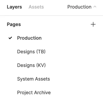
By following an organization method inspired by version control systems like Git, we found that this was an effective way to make sure developers always know where the source of truth lives – and alleviates potential confusion when designers may be working at a different pace than devs.
The individual boards (in this case, “TB” and “KV”) are the playground that comps are created from scratch in. Once comps have been reviewed, the finalized designs are copied and moved to the “Production” page. This is the source of truth for the development team, so we always know where the most recent frames live. It’s also helpful for project managers and other team members looking to see progress in the UI.

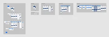
This method also separates the workflow when multiple people are working on the same file. A downside of this is that on large projects, less page categories can mean your frames might get messy and out of control – taking up a lot of space and making the application slow down.

When this inevitably happens, we’ve used two methods to clean up the file. One, you could move old concepts to the “Project Archive” page while maintaining your naming conventions so it doesn’t feel like a comp trash can.
But that method doesn’t really solve the problem, it’s just moving the mess into another messy page. So we’ve utilized Figma’s version history feature, which allows you to remove pieces of the working file while archiving them in the cloud – giving you the option to restore at any point if need be. This should only be used with parts of the file that you know you won’t immediately need anymore. More info on that here.
System Hierarchy
We’ve already spent some time arguing in favor of the necessity of design systems, so I won’t spend too much time harping on that. Assuming you’re in favor of having a system or parts kit in place, we’ve had success breaking up our system elements into 7 categories:
- Standard Components: reusable, standardized pieces that are applied in many places. Buttons, toggles, dropdowns, alerts, tabs, etc.
- Custom Components: elements you’ve created from scratch that also appear in multiple places. This could be something like a navigation bar or a sidebar. Basically anything with custom content that appears in multiple locations.
- Assets: This section typically contains the most granular design elements, like icons, logos, and images.
- Styles: The granularity of UI. Defining color palettes, contrast ratios, transparencies, border width, border radius, etc.
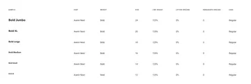
- Text: Defining the granularity of type. Font family, font weight, font size, line height, letter spacing, paragraph spacing, and case.

- Sizing and spacing: This defines the grid system for the application and how key elements translate across key breakpoints – accounting for both horizontal and vertical changes in size and space.
- Depth: We realized that much of the discussion around UI focuses on the X and Y axes of the application. But the Z-axis, or depth, should be more of a focal point. This section can define different shadow, overlay, and blur layers.

Plugins
- Contrast. Perhaps the most important one. This allows you to check the contrast ratios of layers as you work, letting you see which colors pass and fail in real time. This ensures that your design passes Web Content Accessibility Guidelines (WCAG).
- Redline. This is a highly visual way to make the handoff between design and development quicker and more seamless.
- Spacers. A great tool to visualize the spacing between components. It’s an easy way to make sure your padding ratio is uniform, especially between elements with auto layout.
- Font Awesome / Material Icon Set: Both of these integrations allow you to filter the respective icon sets by name and insert directly into the design. A con with the Font Awesome plugin is that it only includes the free set and solid styling, but it is still efficient for basic icons.
- Random Name Generator: This can be helpful for projects that require name data. Generating many random names can surprisingly save a lot of time instead of typing things manually, or copying and pasting other layers. It can also feel more realistic than Lorem Ipsum.
These methods have worked for us so far, but they’re a work in progress. We’d love to hear from others on how your team organizes your Figma projects and files.