Panel by Panel: A Comically Fun Way to Use Figma

Gray Gill, Former Brand Writer
Article Categories:
Posted on
See how this team from Pointless Palooza 2023 cleverly used libraries and assets in Figma to design a quick and easy way to create a digital comic.
At Viget, we spend most of our time bringing our clients’ visions to life by putting incredible content and product experiences out into the world. That’s a pretty savvy way to run a company if you ask me. But once a year, we devote approximately 48 hours to experimental projects under the internal brand name of Pointless Corp. If you want to learn more about the point of these annual hackathon-style sprints, Viget’s co-founder and CEO, Brian Williams, recently wrote an article that offers a great explanation of Pointless and highlights some noteworthy projects. For 2023, the alliterative Pointless Palooza took place from Wednesday afternoon through midday on Friday. Teams built a group travel planning app, a clever online game, and messed around with AI. But our team sought a way to animate our idea without writing a single line of code.
Origin stories
Our team consisted of Megan Raden, a Quantitative UX Researcher; Laura Lighty, a Senior User Researcher; Aaron Smitthipong, Director of UX and Content Strategy; and myself, a Brand Writer. Oh and, Viget’s UX Research Director, Laura Sweltz, served as our angel investor who provided invaluable input and direction throughout the project.
The idea we focused on came straight from Megan’s mind and notebook sketches –– a simple and quick way for anyone to make their own comic.
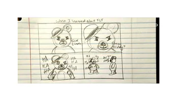
The rest of our team quickly got excited about the potential of comics as a fun and witty way to express the random ideas that bounce around our heads throughout the day. From Calvin & Hobbes to Garfield, comics are a cultural touchstone and a timeless medium that’s relevant whether you grew up reading a print newspaper or were born with an iPad in your hands. Much like memes or a Vine (R.IP.), comics challenge you to get your point across or land your joke succinctly.
As a company with four offices and a mix of fully remote folks spanning Vermont to Hawaii, much of our collaboration and communication happens asynchronously and GIFs, emojis, and memes are often used to react and respond to posts. So we also saw the potential for our comics project to be another visual way to share a laugh with coworkers.
Creating our brand
Even a Pointless project needs a strong brand. We spent some time playing around with different name ideas and messaging that would give our venture a distinct identity and voice. At first, we were all really feeling Drawing a Blank as a brand name. But an outside consultant (a.k.a. Megan's partner) pitched a name idea that was catchy and felt true to the spirit of our project – Vigetoons! Then, we paired that with a cheeky tagline "Graphic content that's fun for all ages."
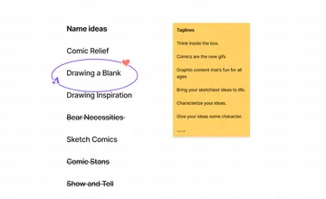
We tied it all together with a logo mark using Viget's signature orange and blue colors, featuring the stars of the show – our mouse and bear comic characters. (Sidenote: Can you spot the double circle Viget logo hiding in our Vigetoons logo?) Now, for more on our furry friends.

Putting names with faces
Like Garfield and Odie, we wanted to create memorable characters for our comics and give them distinct personalities. Inspired by Viget’s history, we also went the animal route and came up with two characters that someone could use when creating their comic. Viget’s original name was Viget Labs, which inspired a lab rat mascot that has made an appearance in Viget branding and a fun little game to help folks learn the pronunciation of Latin company name. The Pointless Corp. brand also has a four-legged mascot – a polar bear sporting a scarf and riding a tricycle. We thought they made a perfect pair to be the faces of our comics.
At first, we had some fun creating low-fidelity comics with our bear and rat characters. Like this one that captured a funny moment from Viget’s virtual winter offsite involving an indoor s’more-making experience that almost went up in flames.
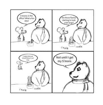
We liked that the rat and bear are rooted in company lore, yet can take on a life of their own depending on the scenario presented in each comic. However, we thought it was important to conduct some research to learn how our peers perceive this rat and bear, and what types of qualities they would ascribe to them. So, we put together a quick survey and asked participants to list three adjectives to describe the bear and rat. The responses were insightful, humorous, and helped inform the outward expressions we designed for each character.
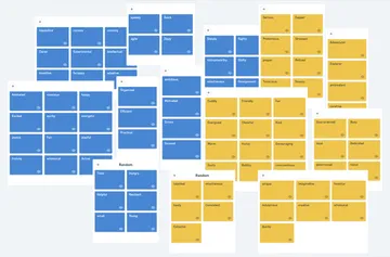
With a comic, you only have so much real estate to devote to dialogue and you can convey so much through body language and facial expressions. We were able to create a range of emotions for the bear and rat to be able to express rage, elation, delight, disappointment, and everything in between. (We even managed to sneak some Viget logo easter eggs into the design of our characters.)
Now, they just needed names. We bounced some name ideas off of each other and ultimately decided on two names that stayed true to our Vigety theme. Vivi the Rat, which uses the first two letters of our company name and also Virginia, the state where our main headquarters is located. Then, there’s Bo Bear, short for Boulder, CO, where another one of our offices is located.
Using Figma to make our own funny papers
Inspired by a pixel pumpkin carving activity at Viget last fall, we decided to use the power of Figma to quickly build a way for practically anyone to become a comic content creator. Here, you can see how we diagrammed the different elements of our comic template we knew we needed to create.
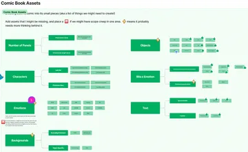
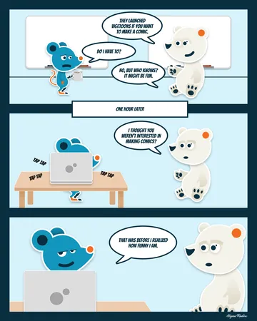
Rather than create ultra-detailed Avatar-level backdrops, we intentionally created open-ended templates so people could apply a wide range of scenarios to their comics. We created a range of different facial expression options like "toothy grin" and "mildly concerned" to give users the ability to communicate things non-verbally with each character. Speech bubbles and a few visual accessories can also be used tell a complete story in just a few frames – or even just one. See our Figma comic creator in action:

And wah-lah! You have a delightful, digital comic that perfectly captures your witty sense of humor.
Drawing our own conclusions
The saying "the whole is greater than the sum of its parts" was certainly true for this project. Much like how a comic needs all the individual components to come together to create a story, a team works best when all the individual members, despite having different domain expertise, can come together to create something unique.
You can quickly bring an idea to life if you have a great team to rally behind it. In just two days, we learned a lot about ourselves and what we can accomplish when we fully commit. Above all, discussion and openness to ideas were crucial in bridging our expertise to create a unique experience
Across all disciplines, our work at Viget is very strategic. We learned that there's definitely a strategy behind a good comic but it’s easier once you hand someone visuals to do it. We were already avid fans and users of Figma; this project proved that this platform is a powerhouse for creating custom visuals and interactions without any code if you harness the capabilities of libraries and assets.
There were some long days on this short project, but the experience reiterated that short visual stories (whether it be GIFS or Vigetoons) will almost always bring a smile to someone's face.
This project was a great exercise in quickly coming up with a branded experience and experimenting with Figma's flexible design capabilities that allowed us to create a dynamic and interactive tool.
So if you're somewhat familiar with using Figma, we hope this project inspires you or your team to explore the platform's more flexible features and see what you can bring to life.