Exploring Our Process: Zymetis Redesign from Start to Finish
Samantha Warren, Former Viget
Article Category:
Posted on
One of my favorite aspects of being a web designer is the opportunity to learn about a wide variety of interesting clients. Zymetis, a company that is as passionate about biotechnology and the environment as I am about design, has been no exception. Every meeting with them was an enthusiastic adventure into the world of science and sustainable fossil fuel alternatives. The project gave me new insight into the world of bio-fuels. 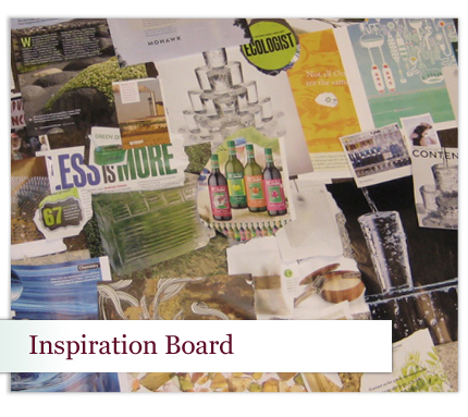
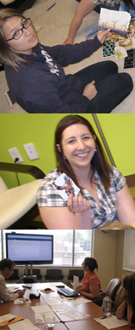
From the very beginning, Zymetis was an active participant in our process; every member of the team played a role. In the early stages of our process, our project manager (April), design director (Tom), and we designers all collaborated intensely through brainstorming and planning sessions before creating inspiration boards as a first step in our design process. We turned to offline sources for ideas, and I all tore into environmental and science magazines to better understand the audiences for this site. We assembled a collage of interesting artifacts and displayed them in our "Inspiration Room," to help guide our process and to stimulate more ideas. April said:
I don't always have the opportunity to see the behind-the-scenes part of the creative process. That space between me asking "please do this" at the beginning and saying "that's fantastic, thank you" at the end is where all the cool design magic happens. I have been really excited to see how our design team is working to bring PMs and clients into that process by breaking it up into several steps with different things to look at along the way. — April Mohr, Project Manager
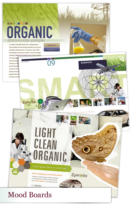
The next step in our process was to create mood boards based on adjectives and themes found consistently exhibited in the "inspiration board." Mindy, Tom and I divvied up the adjectives and feelings, went away for a little while, and came back to the table with mood boards. Having three separate designers participating in the mood boards helps to diversify the styles exhibited between each board. In this case, Mindy took a wonderfully soft and soothing approach, Tom used shapes and graphics, and I used a lot of texture.
We ended up with a composition that used elements of all three and reflected the mission and values of Zymetis as determined by our point of contact there, Scott Laughlin.
April, Samantha and I had a lot of fun exploring design options using a very practical and guided process. Within a week, we had a look and feel that really captured the essence of the company. This made the rest of the project easy. We all knew what we were after and what it would take to get there.
— Scott Laughlin, Client (Zymetis CEO)
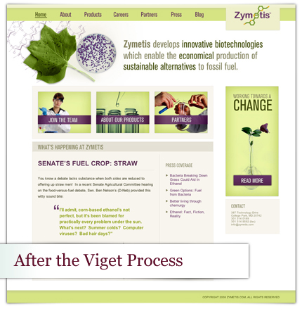
By this time, I had learned a lot about the science behind making bio-ethenol. Accurately reflecting the science behind the product through my choices in imagery was imperative. I wanted to show the marriage of nature and science as the focal point on the homepage, so after a bit of a treasure hunt and several Viget employees checking their yards, we found poplar leaves. Why Poplar leaves? The tulip poplar is an otherwise-untapped source of biomass fuel that can now be efficiently harvested using Zymetis' unique process.
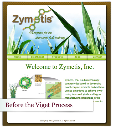
Below is a before-and-after comparison. Please check out the final site here, which was built-out by Keith using mad ninja HTML/CSS skills running smoothly on the Expression Engine CMS.
[VS.]
