Exploring Improvements in Fantasy Football
Ben Eckerson, Former Senior Digital Strategist
Article Category:
Posted on
If you read our blogs, you know I’m the sports fan. Whether this, this, or Omaha that I like to explore the intersection of sports and technology. So, I for one, am very much looking forward to the start of the football season — especially the fantasy football season.

This will be my 4th year as commissioner of the Viget Football League (or VFL), and 10th in my beloved college-friend-laden league known as Cookout Tray (special shoutout!). I’m a veteran of sorts — heck I even did a labshare on the game! And while I’ve had the same impressions about the experience year in and year out, since joining Viget I’ve been even more in tune with some of the shortfalls of the software and user experience. Being around such smart and talented folks, a league full of people who enjoy making the most of experience design and technology, I’ve been more vocal around some of the obvious pain points.
So this year, a few of our league members obliged to break down four facets of the fantasy football experience and how they could be improved. And while I won’t spoil it for you (spoilers here), I will outline some valuable learnings from our exercise.
UX comes from anywhere
Because we are all users of the software and avid fantasy players, all team members (not just those on our traditional UX team) had become experts in the experience, and each of us came to the table approaching problems in different ways.

Nothing beats a nice visual
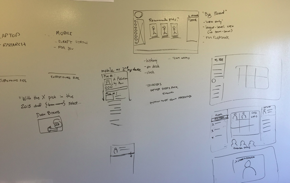
While we all dabbled in wireframing or articulating a concept, challenge, or opportunity, the most compelling opportunities were in visual design. Steve took initial sketches, conversations, or wireframes and immediately started working to get them to a higher fidelity and animating them to demonstrate the idea. This brought a sense of excitement to the team and a yearning for some of the concepts in our own league.

Choose the right medium
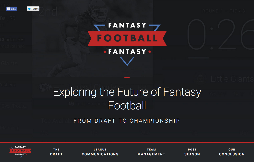
After working in a similar capacity exploring the farmer’s market experience last month, we learned that Medium is a great platform for content, but one that can be limiting when pushing for a more custom design. Billy and Chris put together our own landing page which provided more flexibility for branding and illustration (thanks Joseph!) and really showcased the animations — even allowing us to customize images for smaller break points and devices.
Ultimately, much like sports, this effort was very fun and rewarding. It provided our team the opportunity to dig into something we’re passionate about and explore a way to improve the experience through technology.
But enough of the blog post that talks about the longer piece — go check it out for yourself and let us know what you think!
Happy Fantasy Football Season!
