EarthEcho Gets a New Site for a New Adventure
Anjali McKenzie, Former UX Researcher
Article Category:
Posted on
We’ve been a long-standing friend and proud creator of EarthEcho International and Philippe Cousteau’s sites, so when Philippe called us up to chat about EarthEcho’s new initiative, we were excited to get onboard. EarthEcho International’s latest venture, EarthEcho Expeditions, takes the rich Cousteau legacy of discovery one step further. It brings students from around the world together on a journey to explore aquatic hotspots and inspires them to serve as the next generation of environmentalists.
EarthEcho International was founded by Philippe Cousteau, alongside his mother Jan and sister Alexandra in honor of their father Philippe Cousteau Sr., famous son of the legendary explorer Jacques Yves Cousteau. Philippe first came to us with the intention of adding EarthEcho Expeditions to their existing site as a new program. After we dove into the details of the program and how it was going to change the face of EarthEcho International, however, we learned that a not-so-simple addition would add clutter or worse, get lost. Either way, it just wouldn’t do the program justice.
We went back to the drawing board. We had to figure out how to fold the new Expeditions focus in with the evergreen teacher resources in a way that balanced the unique differences of each while also leveraging the shared assets among them. We also needed a way to artfully incorporate the new Expeditions branding, with its logo and bright colors, with the rich colors and earthy textures of EarthEcho’s core brand.
Most important, however, was the need to simplify the site architecture and reduce the bloat that had collected from years of adding on now-outdated programs and resources. We wanted to allow the Expeditions to take center stage. Such simplification would be critical as we made the site responsive, an absolute requirement for any site targeted toward middle and high school students who are constantly online and on-the-go, as well as teachers who plan to use these resources in the classroom.
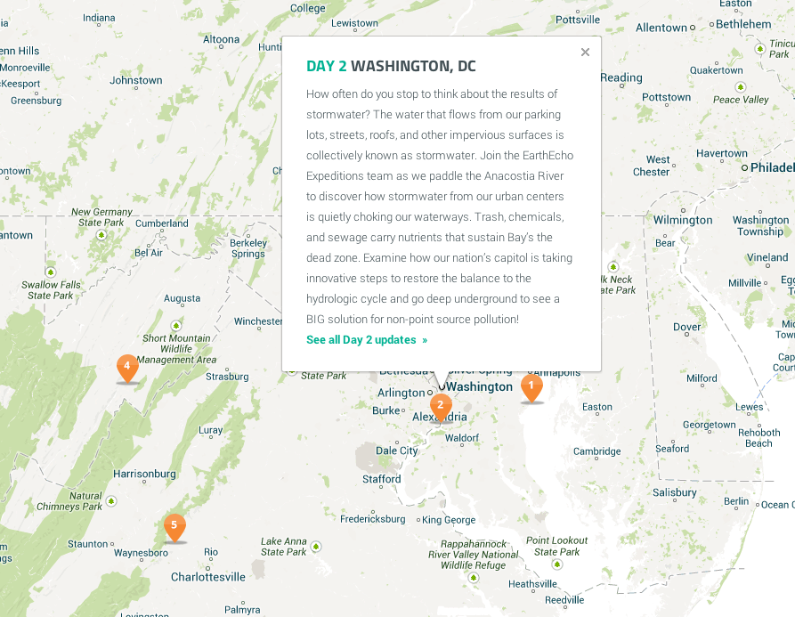
Our final result was a site that's open, clean, ultra-focused, and easy to navigate (and even easier to update on the admin side). Every page has a lot to offer, but our favorite part of the site is the Expedition page itself. It features an interactive map that marks the expedition trail and describes each location. The custom colored Google Map was fun to produce and enables EarthEcho to easily add future Expeditions -- they don’t have to rely on us to design and build a custom map image.

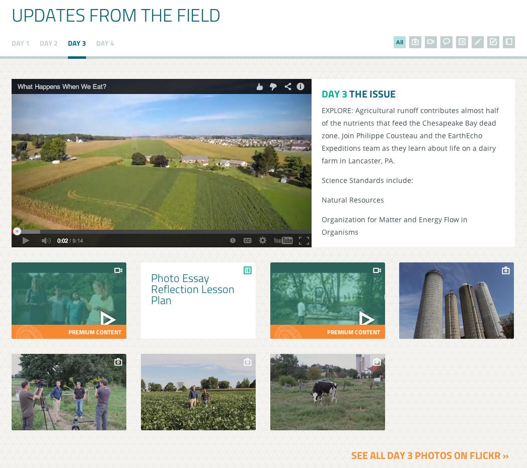
You can either scroll down or jump directly from the map to the updates grid below. The fluid grid, complete with seven filterable content types across each day of the expedition, is filled with slick transitions and interactions that encourage teachers and students to explore more.

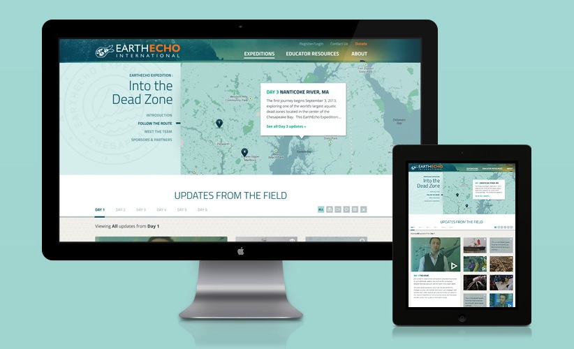
Last but not least, the site’s new responsive design makes it easy to access anywhere, on any device. For teachers and classrooms, this means a beautiful, tablet-based experience, and EarthEcho’s rich content isn’t sacrificed on mobile devices.

It’s been just over a month since launch and we’ve already seen a flurry of registrations and a lift in traffic. We’re excited to have been a part of this new chapter in EarthEcho’s life and we look forward to future enhancements as EarthEcho Expeditions improves and grows. We’re certain this new initiative, and the new website, will help expand EarthEcho’s mission and inspire more youth to get involved and act as environmental change leaders.