Doing the Neighborly Thing: How Viget's Apprentices Helped a Local Nonprofit Amplify Its Impact

Becky Radnaev, Former Content Strategist,
Liz Roknich, Former Digital Analyst,
Maddy Bishop-Van Horn, Former Digital Project Manager Apprentice,
Michael Prechter, Former Front-End Developer Apprentice, and
Reneé Cagnina Haynes, Former Designer
Article Categories:
Posted on
What do you get when you combine five eager apprentices, a conservation nonprofit, and a website in as much need of tender loving care as the polluted creek it depicts? The answer is a pro bono project that our clients said was “like Christmas.”
The Win-Win-Win
Ellerbe Creek Watershed Association (ECWA) is a small North Carolina-based organization that works tirelessly to improve the health of Ellerbe Creek and its surrounding land. Given their modest marketing budget, it soon became clear that they were candidates for the pro bono projects Viget takes on from time to time as part of its mission to make the web a better place.
The timing of the project fit perfectly within our winter apprenticeship, and we apprentices soon realized it was a juicy opportunity to hone our skills with a real-world client for whom there was an established need. We would get to lead the charge on the project and make a tangible contribution to raising the profile of ECWA and its impact. It was a win for us, a win for Viget’s philanthropic endeavors, and a win for ECWA, who would get thoughtful brand and design work at no cost.
We originally promised to take a five-week sprint to develop a “website strategy,” which included high fidelity compositions of three key pages, along with a web style guide, recommendations for an off-the-shelf Content Management System, and guidance on how to use it. Where we ended up was quite different, and thereby hangs this tale.
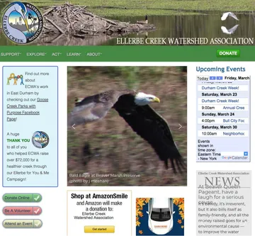
We started by seeking to better understand ECWA’s vision and the drawbacks of its existing website, which was inconsistent, dated, and difficult to navigate. It failed to communicate critical information: What (even) is a watershed? Who is ECWA? What do they do? Why should we care? In short, the website was holding ECWA back, disconnecting it from the community it served.
Our Process
After Senior UX Designer Curt Arledge led stakeholder interviews, we conducted a brand attributes exercise to get a stronger sense of how ECWA wants to be seen in the world. From that, we were able to extract a working set of values—including genuine, fun, accountable, inclusive, innovative—upon which to base our strategy.
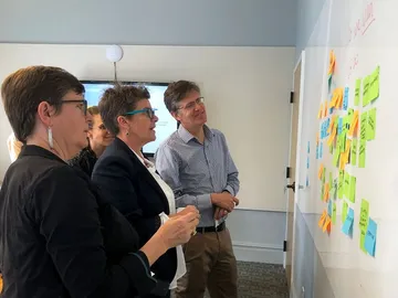
Simultaneously, we carried out an audit of conservation organizations big and small, looking at their websites’ structure and messaging. We also logged every page of ECWA’s website and where it lived within the information hierarchy, and analyzed the data that showed how users were interacting with those pages (thanks, Google Analytics).
We could see which gems of content were being overlooked —articles rich with imagery and storytelling were hidden deep inside the navigation, and as a result got very few pageviews. We also noticed that site traffic was at its highest in late spring and summer, which later influenced our recommendations for verdant evergreen imagery evocative of ECWA’s most popular season.
Armed with ECWA’s value set, data on the current site’s performance, goals for what visitors should be able to do, and insights into how other nonprofits were standing out from the crowd, we began our redesign. We experimented with three different design directions that spoke to brand attributes the ECWA team had identified.
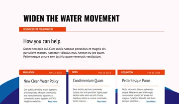
- Widen the Water Movement
This activism-focused approach invited site visitors to jump on board a train fueled by people power. It presented ECWA as a tireless advocate for the watershed, working on the ground to implement solutions with real impact. The brand voice was simple, direct, and urgent. The palette was inspired by the brick cityscape of Durham and the red clay soils of North Carolina.
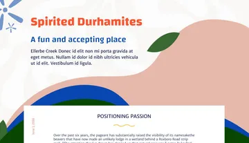
- Spirited Durhamites
This design direction majored on inclusivity and diversity while highlighting elements of the quirky personality for which the city of Durham is admired. It was intended to appeal to people who might not have seen themselves as conservationists but who were looking for an open-minded organization to join. The voice was light-hearted and down-to-earth. Its bright color scheme and playful typefaces were grounded in Durham’s kaleidoscopic culture.
- Do the Neighborly Thing
Our third approach focused on connection and collaboration in the local community. It portrayed ECWA as a way for residents to get to know each other better and preserve the legacy in their backyard. The brand voice sounded warm, positive, and inviting. The palette and imagery drew on the healing influence of the natural world, while the modern typefaces embodied solidarity and friendliness.
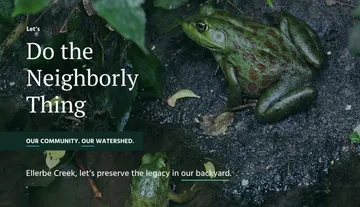
ECWA felt the neighborly angle was closest to their cause, augmented by aspects of the other two approaches.
Next we developed a new information architecture for ECWA’s prospective site, which highlighted their nature preserves as well as the story of how they came to be. We made it easy to find rich information about the projects and initiatives ECWA runs. In the “Get Involved” section, we wanted to make sure a visitor to the site could clearly understand all the actions they might take to get involved with ECWA, from donating money to attending an event, in order to deepen audience engagement.


We designed a suite of brand assets including icons for each of ECWA’s preserves. We also created customized maps, a graphic of a watershed, a wordmark, and a more modern and mobile-friendly version of their logo.
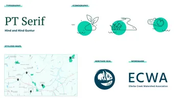
Through this experience, we came to understand that branding can be tricky for nonprofits. They often aren’t used to leaning into an aspect of design/communication as it can feel commercial. Their cause is their purpose, and putting effort into brand work can feel like a vanity project. But ECWA trusted us and our pledge that more consistent branding would be a mobilizing force. They embraced the streamlining of their logo and understood the value of creating a wordmark that gave a site visitor a simple, elegant visual anchor to the brand.
They were also extremely open to our recommendations about how to improve content, which included moving the focus away from news and academic writing in favor of surfacing high quality, accessible, evergreen content.
Going Above and Beyond
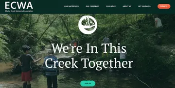
ECWA’s constructive feedback, and the rapidity with which they were willing to give it, meant that we could move fast. It was burdensome for the ECWA team to keep up with our demands for input, but they did, and their contributions gave us wings. Instead of generating three high fidelity page compositions, we got to nine. Our web implementation guide was so detailed that it even contained links to custom tutorials. After careful consideration of the options, we had already chosen a web hosting service, Weebly, and to better understand its constraints, had begun bringing some design vision to life through one of its themes. We realized that we were—despite vowing not to—actually building ECWA a new website.
This led us to a scope reevaluation. We asked our mentors if we could pursue the project for one more week, and ECWA hustled to send us new content for many of the pages. By the time that sprint ended, their website was 70% complete. We delivered customizations to the generic Weebly theme, such as a bespoke donate button and stylish dropdown menus, thanks to some major effort on the part of our front-end development apprentice. Being able to give ECWA a 7-star experience, far surpassing the expectations we initially set, felt satisfying for everyone.
The Legacy
This pro bono project may be unique in Viget’s canon of work because of the value it provided to professionals-in-training, as well as to the client. Apprentices haven’t historically owned a project, nor do they necessarily all collaborate closely together (unlike interns). Both of these things have helped make the apprenticeship program extremely enriching and unifying for this cohort. We look forward to celebrating the site’s launch in May, and are proud to have helped ECWA develop a web strategy that will amplify its impact, now and in the future.