Designers Tooling Around: Principle

It feels like a new animation prototyping tool comes out every week. Principle has managed to grab our attention and rise above the din.
Animation! We talk about animation a lot. It's a great time to be a designer in search of an animation prototyping tool. There is a wealth of choice out there these days, covering a variety of needs and preferred workflows. But I wanted to talk a bit about Principle, specifically. It's become a go-to tool for some of the designers at Viget. There are a number of reasons that, for us, puts it at the head of the pack.
Animation is no longer a nice-to-have
To take a step back first, there’s value in taking the time to prototype animations and interactions, both big and small, from subtle UI interactions to dramatic, wholly unique experiences. An animation prototype gives clients a clear idea of how a design will function before taking the time to fully build it. Five minutes of talking around an animation can be saved by simply showing a five-second animation prototype.
Similarly, when designers and developers collaborate, it's so much easier to share what I'm imagining by animating it and showing it than it is to try to use words and an interpretive dance of elaborate hand gestures, hoping the developer has the same definition of "it whooshes kinda up to the left" that I do. To riff on the old saying, talking about animation is like dancing about architecture.
Why Principle?
Reason #1: Figma
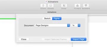
We’ve tried out a bit of everything. Framer, AfterEffects, Invision Studio, etc. But Principle has recently gained the advantage for us over most other tools. Why? Mostly because you can now import Figma* frames directly into Principle. Yeah, that's right.

*Principle has also allowed for Sketch file importing for a while now.
If you're as devoted to Figma as we are at Viget, this is huge. No more recreating design elements from scratch in the prototyping tool. No more manually exporting elements as images and then putting them back together in your prototyping tool of choice like you're making a boyband collage for your middle school locker.
Now you can instantly pull in a Figma design and it's 95% ready to be animated (it appears text layers usually get flattened. And it can take a few tries to get the Figma file to import and not time-out. But neither of those things are so annoying that they’re deterrents.)

Reason #2: It’s One of the More Intuitive Animation Tools
Once your design is in Principle, it's fairly fast and intuitive to pick up. The learning curve isn’t nearly as steep as with more robust tools, like After Effects. And there’s some nice, automatic features built in so that you can very quickly, and without a ton of effort, put together some polished looking transitions. It’s a very visual tool and doesn’t require any coding knowledge, which makes it easy for designers to switch from designing to animating.
Reason #3: It’s the Perfect Fit for UI Animation Prototyping
While it’s easy to pick up, that doesn’t mean what you can do in it is limited. It’s possible to do some pretty robust, very cool animations with Principle. It’s a perfect tool for UI-centered animation at all levels. From small hover states to large parallax effects. (That said, if you’re looking to do a lot of heavy, in-depth character animation, something that’s less UI-driven, then it's probably time to crack open AfterEffects.)
Bonus: Easy Sharing Options
One cool feature in Principle that I only recently learned about, and must therefore share now, is “Export for Mac.” At first glance, it seems like the only way to export your finished prototype is as a video or animated GIF that others can’t actually interact with. BUT! Principle also offers “Export for Mac” which exports your prototype as a small, standalone app that anyone on a Mac can open and use to interact with your prototype. So don’t let the fear that others can’t actually interact with your animations hold you back.
Why not one of those cool new all-in-one design tools?
There are apps now in which you can do both high-fidelity design and rich animation prototyping without ever opening a second tool. For me personally, this has gotten messy fast. Having two discrete tools that work closely together, like the Figma and Principle combo, has functioned better with my workflow. I can keep my design file in Figma from getting too convoluted and gunked up with complicated animation layers. Meanwhile, keeping my animation prototype isolated in Principle keeps it from getting wonky when I inevitably make design tweaks.
Plus, as of March 2019, Figma is still the only tool with multiplayer capabilities and live updating. Going back to a design tool without those features, even one with slick prototyping features, feels like working with one arm tied behind your back.
If you’re curious about Principle, here are a number of resources to help you get comfortable with it and see just how far you can push its capabilities. Happy animating!
Resources to Get You Started
- Crash Course in Prototyping with Principle - Everything you need to know to get started
- Tutorials - Principle's library of tutorial videos with lots of clear introductory content
- Principle Templates - Learn by dissecting what's been done on these unofficial templates and prototypes.
- Principle Repo - Another tool for downloading working Principle files and figuring out how they work
