Designers Tooling Around: Figma

Figma has become our design tool of choice at Viget. We've been using it to work faster and better, together.
There are already several articles out there explaining Figma and its wide array of features. So I won’t spend too much time explaining what it is, except to say it’s an interface design tool similar to Sketch or, to a lesser extent, Photoshop. But there’s something special that sets it apart. It’s based in the browser and allows for real-time collaboration. For real.
We’ve been using Figma more and more over the past several months and I wanted to give a brief breakdown of how we’ve been using it at Viget and what we love about it.
Remote Whiteboarding
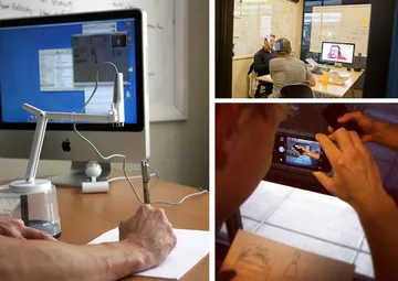
With teams often spread across three offices, we’ve tried everything to make brainstorming, sketching, and whiteboarding without being together in person feel natural and efficient. Thanks to Hangouts, we have talking and seeing each other down. But drawing and writing together has been harder. Working together in a Google Drawing file was too limiting. Writing in the same Google Doc together works for words, but not so much when you want to sketch. Then there are the options that have left remote people feeling powerless: using special cameras pointed at a piece of paper only one person draws on, or pointing the camera at a whiteboard that the in-person team can work on, while the remote person squints to read the whiteboard and yells their suggestions hasn’t been great.

Try, try, try to remotely collaborate again.
With Figma, we may have finally cracked it. The interface is simple and intuitive enough that non-designers can comfortably create shapes, move text, and work with the tool to visualize their ideas quickly. And with everyone in the same live file, working on it simultaneously, it’s easy to have the natural back-and-forth a team would have on a physical whiteboard in the same room.
The whole team working simultaneously on the same file
Okay, this sounds like it could be a recipe for disaster. But so far, the “hey why are you moving my button??”s have been few and far between. And the efficient and effortless collaborating has outweighed those few awkward moments. The copywriter can adjust content directly, while the UX designer reworks a form, while the visual designer tweaks some styles, and the front-end developer can keep tabs on everything. No more front-end developer finding out they’ve been working from an outdated file all week. No more designers spending hours in a PSD just updating copy because they’re the only ones who can open Photoshop. Life. Changed.

Image credit: Figma
No seriously, the WHOLE team working simultaneously on the same file.
Our project managers don’t have Photoshop, so they spend a lot of time having to just trust designers when they say they’ve made those tweaks the client asked for. Or having to ask “is home-final-v5.psd the latest comp, or is it home-final-final-v3.psd?” With one canonical link where a project’s design files are live updated, everyone on a team can stay directly involved and in sync.
Doing Everything Faster
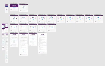
I love artboards. My artboards on a project are extensive and plentiful. Unfortunately Photoshop seems to only love 1-5 artboards at a time. After that, Photoshop often grinds to a painfully slow crawl. But I’ve seen Figma handle dozens of artboards (or, in Figma lingo, “frames”) without so much as a hiccup. It’s been amazing to use Figma to essentially storyboard, or design out an entire flow, or keep all the desktop and corresponding mobile designs next to each other to easily compare and update them.

One file, 26 frames, zero lag.
Speaking of responsive designs, Figma’s constraints feature has made adjusting a comp’s width or height really speedy. With it, I can set items to either stick or stretch with a frame. So when I stretch a mobile comp’s frame to desktop width, a lot of the tweaking and adjusting is automatically done for me. Or stick a footer to the bottom of the frame, and I can make the frame longer as a page’s design gets taller without having to manually move the footer down every time.

Footer goes up, footer goes down. Footer goes up, footer goes down...
These small things add up to a really fluid, efficient workflow.
And so on!
There are more advanced features that I’m still getting the hang of. And Figma has continued to add more and more. They just introduced simple prototyping the other week, which I didn’t even touch on in this post. I’m excited to see how Figma continues to grow.
If you are a lone designer, Sketch or Photoshop are still great. And for teams, the plug-ins and extensions that have come out in the past couple years for Sketch have made it really powerful and fast for collaboration and presentation. But Figma has stolen the Viget design team’s heart with its flexibility, power, and seamless collaboration.
