Conf-essions of a Design Team: The Biggest Takeaways from Config 2023

Jackson Fox, VP of UX & Design, and
Hannah Byers, Former Product Designer
Article Categories:
Posted on
Config 2023 went big with its first in-person conference in several years. Our design team lives in Figma and we're excited about many of the changes that are coming.
Config 2023 is Figma’s first in-person conference since the pandemic and they just announced some huge features that will change the way designers, developers, and other team members interact with the tool. And yes, the pending Adobe acquisition was acknowledged. The design team at Viget has been tuning in to Config remotely and we’re excited about what we’ve seen so far.
Auto Layout Improvements
Adding wrapping and minimum and maximum values to height and width is a big improvement to auto layout. These changes will make it a lot easier to design responsive layouts in a way that aligns with how our developers are building out pages. Anything that reduces the amount of manual tweaking needed to try out a design on different platforms is a productivity win.
Advanced Prototyping
There are some welcome changes in the release of advanced prototyping. First, letting us adjust interactions on the canvas is a nice usability improvement. Second, the combination of variables (more on these later) and conditionals will make some complex interactions a lot more efficient to build. We don’t think this will solve 🔥 Noodle Hell 🔥 completely, but we’ll be able to reflect many more state changes within a screen without having to mockup every possible state. Fewer screens means fewer noodles and less chance we mess up connections.
Since Figma is working on improvements to prototyping, we hope they’ll provide a native text input solution soon :)
Variables
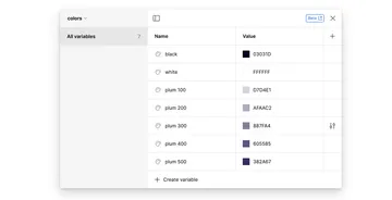
It’s going to take a little while to get a feel for how variables will impact our workflow, but it feels like they could be a Big Deal. We can see that using variables to manage core theme styles will better align our workflow with our developers, especially when using tools like Tailwind.

Having the ability to define different modes will be a boon to product designers who are designing for light and dark modes. They may also help us manage designs for products with complex user permissions. Lastly, we’re curious how variables will make it easier to fill in sample content for designs.
One thing we’re not sure about yet is how styles and variables will work together. At the moment, it feels like they potentially solve some similar problems around theme definition.
While we’re excited for variables, we’re wondering if they show that the current Figma UI is straining to accommodate all these new features. It took us a while to figure out how to access the local variables UI (make sure you have nothing selected, then the link is in the right sidebar). Similarly, it took some time to figure out how to connect a text object to a variable (it’s the hexagon button next to text alignment in the text settings).
Dev Mode
You should really read Eric’s article for the developer perspective on the new dev mode in Figma. We’re glad Figma is working to give developers better tools to work with designs — the old inspect panel wasn’t working very well and most of our developers needed editor access to get all the information they needed to build components.
Quality of Life Improvements
While the improvements and new features announced this week are welcome, we often find ourselves most drawn to “Quality of Life” updates. These are relatively minor changes in the grand scheme of things, but make a huge impact on our day-to-day work.
First, the updates to auto layout are very welcome. These changes will reduce a lot of manual adjustments we’ve needed to make in the past. Another feature update of note is the redesigned file browser. Finding things in Figma hasn’t always been easy; a cleaner UI that gets us where we need to go, faster, is a win in our book.

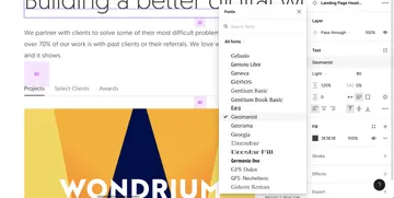
Finally, we can now browse and view fonts from the font picker! Gone are the days where we had to rely on a plugin, or the “guess-and-check” method.

We’re big fans of Figma and are excited they’re making so many improvements to the tool. Many of the improvements released this week will make our work more efficient and that’s a welcome change.
