Getting Systematic About Design Systems
Mindy Wagner, Former Design Director
Article Categories:
Posted on
A solid design system is critical when you’re working on big projects. But how do you make decisions that scale?
By now, I think it’s safe to say we all agree that “systems, not pages” is the way to go when you’re working on big projects. But how do you design something flexible and scalable enough to meet the demands of a massive site or app?
I’ve worked on a number of large content sites in the last few years, and I’ve tackled them with talented Front End Developers who helped me refine my approach to design systems. Here are a few things I’ve learned:
Start with pages
I know, I know - the whole point is to develop components, patterns, and guidelines rather than a set of perfectly polished page designs. But after you've established things like mood, aesthetic, and tone, it's helpful to knock out a few layouts instead of designing components in isolation. I never feel confident about my design decisions until I've tested them across a range of use cases. Instead of jumping right in to parts, I suggest fleshing out a few of the most functional pages on the site.
On Atlantic Philanthropies I chose to start with a basic landing page template, the more specialized Issues and Regions templates, and a few workhorse low-level content templates. Selecting a set with good range helps me figure out hierarchy while also testing things like my grid system and type scale across different levels of the site. I’ve learned the hard way not to make assumptions about what will work.
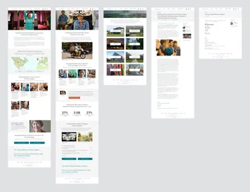
Pull elements into a throwaway style guide as you go
Let it be messy. Don’t bother organizing yet - this is just a temporary dumping ground. It’s a simple way to make sure you’re thinking big picture and using consistent styles from the very start. And it’ll save you from using 13 different shades of light gray that you *think* are all using the same hex #. Not that I've done that...
I use these messy boards until I get further along in the project. No need to waste time organizing and reorganizing a fast-growing system.
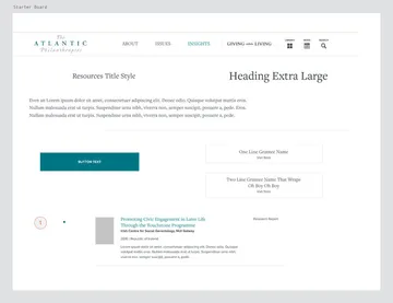
Nail down typography
Type styles are the backbone of most large design systems. That’s why they are typically the first element I flesh out in detail. Jeremy encouraged me to share my type system with him early while working on Rotary.org. I was hesitant to commit, but it turns out this worked really well for both of us. I ended up needing to make a few tweaks as the system grew, but it held up remarkably well and gave him a lot to work with. It also gave me the chance to see these decisions “in the wild” and change anything that wasn’t working before we were too far down the path.

Watch out for things that don’t scale easily
There are a few style choices I approach with extreme caution when designing large sites. Color coded sections or content types, for instance, is a classic example of a design decision that isn’t easily scaled. Maybe you can come up with 6 amazing colors to represent each section. But what if the client decides to add 4 more right before launch? How will you expand the palette to accommodate? The same holds true when using iconography to represent content types, topics, categories, etc. As the icon set gets larger, it gets harder to differentiate them in a meaningful way. These elements can become a maintenance nightmare as the site evolves over time.
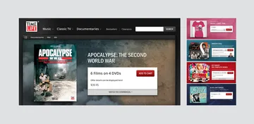
I don’t avoid these things entirely, but I do think hard about how they’ll scale before I bring them in. When I do use them, I try to make future additions easy on the next person who will touch it - whether that’s me, a client, or another designer. A great example is a background element I used on TimeLife.com a few years ago. To invoke some of the nostalgia their late night commercials are known for, I suggested a custom background graphic for all 300+ product pages. Simple textures and color changes allowed us to give the pages personality in a manageable way. Everyone loved the custom feel these backgrounds brought to otherwise highly templated pages, and the simplicity of the solution made the system maintainable.
Document your design thinking
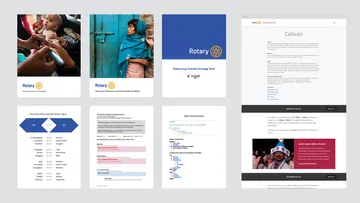
Everything in the system is clear to you because you’ve been obsessing about it for weeks or even months. You can see very clearly the why, when, and how of every element. And you can probably communicate most of this to your project team without getting formal. But the minute that system leaves your hands, all that knowledge goes down the drain if it’s not captured and shared. When we delivered the Rotary.org design system to their internal developers, we also handed off a component library with thorough documentation about style, usage, behavior, and any additional details deemed important. Content producers are able to access the same library, and can easily show the developers which elements they wanted to use.
Our documentation was initially just a bare bones Google doc. We named each component as well as each template, and linked out to visual designs for added clarity. We threw in anything and everything that seemed relevant as we moved through the work, and used the doc as an internal reference point for much of the project. At the end of the project, we transferred the information into a more structured (and more client-friendly) format.
I’ll admit, this isn’t my favorite part of the project. Writing down details about every little element can get pretty boring. And unfortunately, heavy documentation often gets skipped because there’s no budget or time for it. But anything you can do to transfer knowledge will help. Also, bonus - it will help *you* remember how everything comes together, which can be helpful when you get pulled back into an old project.
I've found myself thinking more and more about design systems over the years, but also about building personality and life into these systems - and knowing when to break out to make something unique. The last lesson I'd leave you with is avoid being overly dogmatic. A system should lay the groundwork for good design decisions, not provide a set of hard and fast rules that can never be broken.
Do you have any lessons to share? I'd love to hear them - leave your ideas in the comments.