Taming the Elephant: Design Critiques With Non-designers (plus a printable cheat sheet)
Tom Osborne, Former VP, Design
Article Category:
Posted on

There she is. That's Bertha, the elephant-in-the-room that you call your design. You've been staring at this design for enough time now that you're either satisfied where you are or unsure what to do next.
Without feedback from others, you're counting on yourself to be responsible for questions like: Are you meeting client expectations? Will users know what to do or where to go when they hit your page? Will your web design be easy to build? Will search engines help people find you?
These are questions that we don't always think about when we're designing until it's too late. That's a lot of pressure to rely on yourself for. Maybe it's time to get some feedback from the designer sitting next to you. Better yet, why not get some design feedback from a non-designer?
Cross-disciplinary Critiques at Viget Labs
At Viget, we've been spending a lot of time talking about how best to get feedback from our non-design colleagues prior to showing a client our very best. In doing so, we solicited two sets of questions to everyone to help us on our journey to perfection.
First, we asked our designers what type of feedback is most helpful when receiving critiques. We learned that our designers prefer live presentations with instant feedback when the design is at least 75% complete and that good feedback is well-composed and corresponds to the goals of the design. What our designers don't like is generalizations, personal preferences and laundry lists of fixes.
On the flip side, we also wanted to hear a little about what the rest of our esteemed colleagues want to get out of design critiques. We learned they like to hear more about high-level goals, reasons behind decisions, general inspiration, and considerations about time, technology, and budget. We also learned that there have been feelings that as a whole our designs could improve by being more unique while being less visually-complex and that lighter, faster, and more flexible are desirable qualities.
So with these revelations in mind we set out to try to come up with a better method for creating a feedback loop without compromising budgets or stressful timeframes. After all, pulling several people into a room to discuss design can quickly eat up budgets and production time if not considered closely.
Why Critique
With that in mind, why critique in the first place?
- Avoid mistakes
By letting others preview your design first, you'll get valuable feedback on meeting business, user, and design goals while mitigating careless typos and stupid mistakes that can take the presentation wayward if not caught early.
- Higher quality work
Despite the fact that you're an amazingly talented designer, a wisdom-of-crowds approach can provide valuable feedback especially when it comes from your equally talented team of developers, marketers, and project managers.
- Get team on same page
By sharing your design early with the rest of your team, everyone will feel more confident about showing the work to the client and about the potential success of the project.
- Get your idea heard
Sometimes we come up with good ideas after the client has already approved the design or it's otherwise too late. A change could set the development back two or three weeks, but it might not have if suggested sooner. By sharing the designs early everyone has the chance to offer innovative ideas.
- Influence positive change
Critiques should be more about adding better things to a design than just hacking away the bad things. Critiquers should offer helpful modifications over subjective noise.
Some Guidelines
In thinking about this we came up with suggestions:
General Rules
- If possible, designer will distribute the design in advance
Our tendency as designers is to have a glorious unveiling of the design. Of course, that's what we've been trained to do. When it comes to client presentations, by all means be glorious. When it comes to the people you work with, it's a little different. Chances are they've already been looking over your shoulder anyway. At minimum, they're as familiar with the goals of the project as you are so they'll have at least an idea of what to expect. In the spirit of moving quickly, sharing your designs in advance will help everybody have questions and feedback ready. Once you explain your work, the questions will change accordingly.
- Keep it quick, 15 to 30 minutes
Everyone has other things to do but this is important. Make it happen and then promptly get back to work.
- Offer feedback not discussion
This is time to listen not debate. Consider all feedback and do what you feel necessary to meet the project objectives. There will be time for follow-up discussion after the critique.
- Try to establish a recurring order
While it isn't crucial to the critique, it will help things move along quickly and the repetition will help create a known structure. For us, we like to go in the order of a typical project cycle (ex. PM > UX > Visual > Dev > Marketing). Establish a sensible order and let everyone have equal time.
- Make designs available for follow-up discussion after the critique
The goal is to move quickly. Each person has a few minutes to respond with their feedback. Be sensitive to giving everyone enough time. You can work out the details later.
Designers should...
- Present professionally and quickly
Consider this your dress rehearsal for the client presentation.
- Tell a story about the design (goals, problems, inspirations, decisions)
You must have been thinking about this as you created the design. It's now time to put that thinking into words.
- Clarify critique goals (ask questions, relay time left on design)
What do you want to get out of this? What do you feel is working? What needs work?
- Keep critiquers in the loop as project continues
Once you've applied the feedback, be sure to share the updates with everyone. Your team will be happy to know their feedback was valuable and considered.
- Ask specific people for specific feedback
Each role should represent a different point-of-view. More about that below (see "By Discipline").
Critiquers should...
- Begin with questions
Make sure you understand something before you react to it.
- Provide some feedback based on role
What point-of-view do you represent? Make sure the feedback contains more than just your personal opinion. The feedback should represent the goals related to what it is that you do.
- Relate feedback to the designer’s goals
Did the designer accomplish what he or she set out to?
- Acknowledge what works, what doesn’t, and why
Articulate your thoughts in a way the designer can understand where you're coming from.
- Provide a wide range of feedback
Think about things like UI and information architecture, color and typography, development concerns, potential improvements (development, JS, visuals), simplification, process suggestions, buildout and degradation, and concepts.
- Provide longer feedback or spellchecking by email or on a message board later
Respond shortly after the critique if you have more feedback. Waiting too long will risk incorporating your valued feedback.
By Discipline
At Viget Labs we utilize five web disciplines to provide different perspectives on design. You can substitute other areas for any of these, but we think these five cover things pretty well.
- Project Management
The project manager represents the client point-of-view and should ask questions like: Are business goals represented? Is there anything notable or buzz-worthy about the design? Is the client getting their money’s worth?
- User Experience
The UX designer looks at usability, accessibility and design patterns and should ask questions like: What is the single most important activity for the user on this page and how is it being catered to? Is the design consistently executed? How will this design change over time? What can go wrong?
- Visual Design
Since the lead designer is the one whose work is getting critiqued this is usually another designer on the team. He or she may not be actively working on the project. This person is responsible for looking at the aesthetics and emotion of the design and asks questions like: Is the visual presentation telling the intended story or otherwise communicating clearly? Has time and care been put into the details and nuances of design? Are any opportunities to push boundaries being missed?
- Development
This can be a Developer, Front-End Developer or both. They should look for technical feasibility and should ask questions like: What design decisions are affecting how the site is developed, and why? What could be changed to significantly save time/cost? Are opportunities to innovate within the budget being missed?
- Marketing
The marketing representative looks at the marketability of the design (of course) and asks questions like: Are the value propositions and key call to actions visible and clear? Does the design use phrases users will likely scan/search for? Is the design organized in a way that is reflective of the goals of audience? (hierarchy, calls to action, etc)
Don'ts
- DON'T tell anyone what they can or can't provide feedback on
Don't waste time telling your teammates they can't comment on certain things. It defeats the purpose and lets everyone know that you are not prepared or trying to be too controlling of the design. Listen and respond in kind. After all, you will be the last to touch the design.
- DON'T try to solve problems in the critique room - it's too time-consuming
This is a chance for the designer to hear other perspectives. It's less of a conversation than it is a time to listen. Follow up later for solutions to problems and use email or message boards to share additional feedback with the group.
- DON'T be a jerk, be constructive
This mostly goes without saying. You're all on the same team.
The Goody-bag
Printable Critique Cheat Sheet
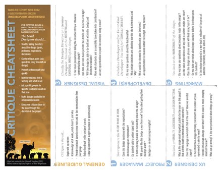
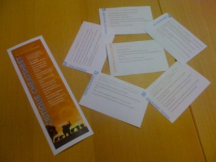
We created a printable cheat sheet (PDF) to help guide regular cross-disciplinary critiques. Simply print out a copy and tear along the dotted lines to give each participant a useful guide. Each card contains about five questions to think about regarding each individual role. Use it until you don't need it anymore.
Full-size printable cheat sheet. Download it!
Sliced and diced printable cheat sheet
Other Resources
There are dozens of other ways to critique and just as many resources to help guide the process. We decided we prefer in-person, verbal feedback but more and more design feedback opportunities are finding their way online in the form web applications. We haven't given any a try just yet but if you have one you like, please let us know we're always looking for good tips. Here are a few known sources:
- http://www.notableapp.com/
- http://www.getbackboard.com/
- http://www.proofhq.com/
- http://www.conceptshare.com/
- http://www.conceptfeedback.com/
- http://www.pleasecritiqueme.com/
- http://www.critiquealldesign.com/
Many thanks to Doug Avery whose dedication to improving our critiquing standards within Viget Labs led to this report.

