Decisive Action
Steve Schoeffel, Former Designer
Article Category:
Posted on
A hallmark of good design is the prioritization of the right things. I’ve been thinking about this as it relates to some interactive design patterns which seem to be gaining traction. What I’m calling “decisive action” (maybe this has another name already?) is when one element is given focus and consequently the other unfocused elements are obscured partially or entirely. It isn’t confined to a certain type of action or a particular element on the page. It can be achieved any number of different ways. It is, however, a full commitment to the focused element which then requires subsequent action—either forward or backward.
Allowing a user to fully commit to an action can actually improve their experience. When done correctly, it gives more room for design, takes away unnecessary clutter and helps to more effectively orient the user. For some, it’s also a bit scary. You mean cover up the big important button that everyone needs to click? You mean our logo won’t be visible every second someone is on our site? Well, maybe. There are different ways of doing this and the pattern is not right for every scenario. When used at the right time and in the right place however, I believe it can significantly enhance and improve the overall experience.
Let me explain further with a few examples of decisive action in three different contexts:
-
Navigation Takeover
-
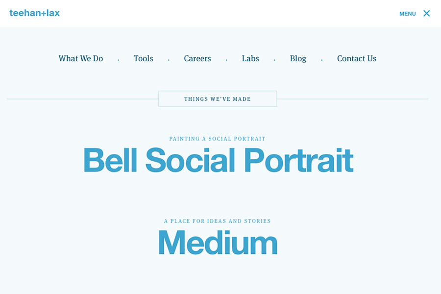
Teehan+Lax: Teehan+Lax decisively displays their navigation by covering over the entire current page. Transitional animation helps the user understand that the new screen has just dropped down from the top of the page. Taking full advantage of the entire screen, we are given the main nav across the top followed by a list of recent work in large type. It’s elegant and well-executed. You can either click a link to move forward or close the menu by clicking on the navigation button again (which has an “x” beside it).
-
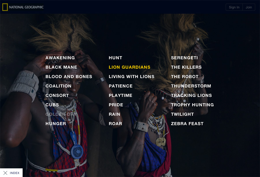
National Geographic Serengeti Lions: National Geographic takes a similar approach with their micro-site for the Lions of Serengeti. They have placed their index button in the bottom left and clicking it overlays the screen with all the different pages of content. This solution keeps the UI elements minimal and out of the way while also allowing for a highly visual presentation of the main content. Once you’ve activated the menu screen, you can exit by clicking anywhere there’s not a link or by re-clicking the index button.
-
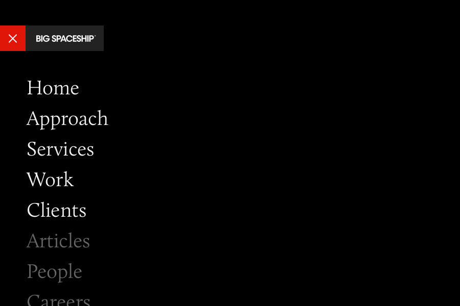
Big Spaceship: A more minimal example of a navigation takeover is on Big Spaceship’s site. They have opted for simplicity here and the result is clarity, beautiful type, and a navigation that can’t be missed. An added benefit is that this particular navigation pattern translates seamlessly to a phone screen. Quite similar to this is the new Huge site, which is somewhat of a hybrid between Teehan+Lax and Big Spaceship. It's nicely done as well!
-
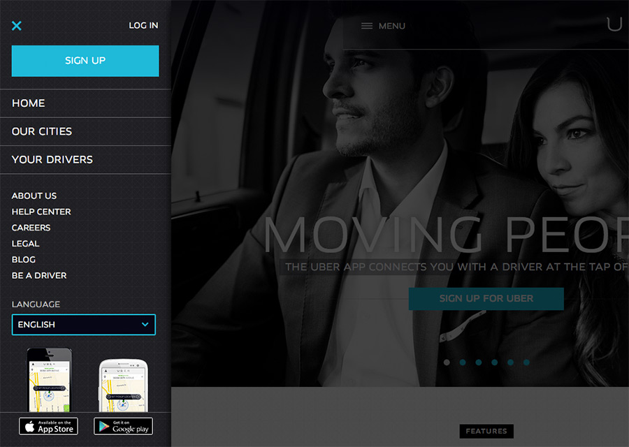
Uber: Lastly, Uber takes a slightly different approach with their navigation. In this case, the left hand nav slides in while the rest of the page (the unfocused bit) dims. This navigation essentially behaves like the commonly seen off-canvas approach in many mobile apps, except here, Uber carries this pattern through to all screen widths.
-
-
Search Takeover
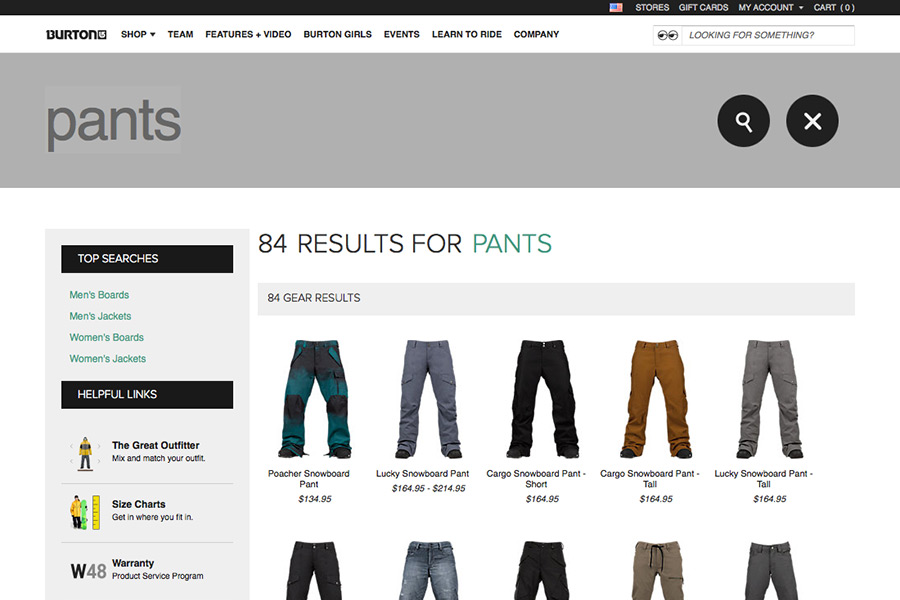
- Burton: Burton has taken on an even larger challenge on their site by implementing a full page takeover once the user starts typing their search. Search results are loaded via AJAX and the result is a smooth and direct way of browsing products. You can close the search out at any time by clicking the large “x” button at the top right and the beauty is that you are just about instantaneously viewing the page you were on before doing the search. One small gripe is the absence of any indication that the search is going on. The process of loading in the content is a bit laggy and at first gives the impression that there aren’t any results. Otherwise, it’s a nice experience and has lots of upsides.
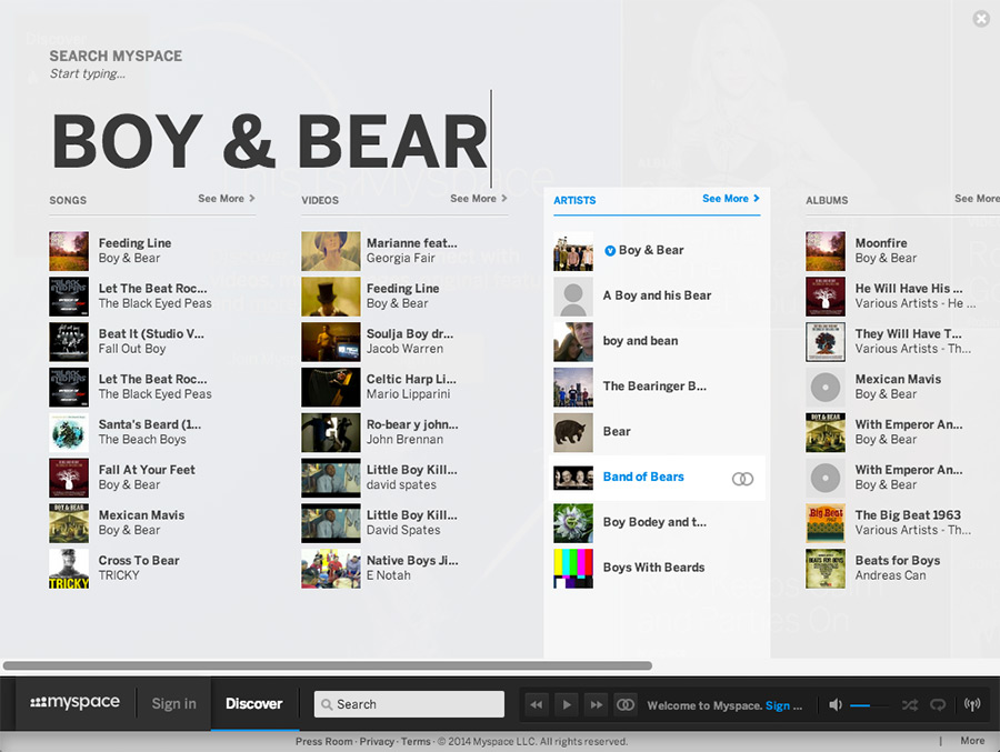
- MySpace: Sharing quite a bit with Burton, MySpace features a similar full takeover search screen which also uses AJAX to pull in results on the fly. Taking advantage of all the newly created space, MySpace uses beautiful, large text in the search field to increase the sexiness factor. Execution here is solid and the overall effect is very polished.
- Burton: Burton has taken on an even larger challenge on their site by implementing a full page takeover once the user starts typing their search. Search results are loaded via AJAX and the result is a smooth and direct way of browsing products. You can close the search out at any time by clicking the large “x” button at the top right and the beauty is that you are just about instantaneously viewing the page you were on before doing the search. One small gripe is the absence of any indication that the search is going on. The process of loading in the content is a bit laggy and at first gives the impression that there aren’t any results. Otherwise, it’s a nice experience and has lots of upsides.
-
Action Takeover
- Medium: Medium’s site is full of thoughtful and original design solutions. This simple action screen is just a small example. For important actions such as publishing or deleting a post, Medium goes ahead and clears away all the clutter for you. It takes the users seriously in their desire to act upon something and so it gives them a very simple page overlay to do so. A nice animation directs the user’s attention to the center of the screen and there’s a little bit of transparency to the takeover background to give the user added context. You also have multiple ways of backing out. This really is just a simplified modal screen but the simplicity and elegance here are so refreshing.
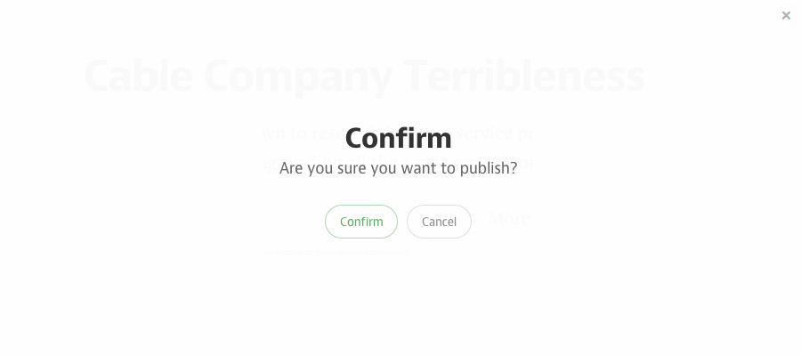
- Medium: Medium’s site is full of thoughtful and original design solutions. This simple action screen is just a small example. For important actions such as publishing or deleting a post, Medium goes ahead and clears away all the clutter for you. It takes the users seriously in their desire to act upon something and so it gives them a very simple page overlay to do so. A nice animation directs the user’s attention to the center of the screen and there’s a little bit of transparency to the takeover background to give the user added context. You also have multiple ways of backing out. This really is just a simplified modal screen but the simplicity and elegance here are so refreshing.
I think there are some very legitimate advantages to this design pattern. I can also see why some might be wary of it. I can imagine this behavior being a bit disorienting to less savvy users who might not know to look to the top right for the close button (or to click the same button again). This behavior, however, is pretty fundamental to using a computer. In a lot of cases, the user doesn’t even have to click a specific button to exit but really just anywhere that’s not a part of the page’s UI.
The concern which I probably hear the most is that this approach covers up vital buttons and/or information. Generally, this is true. Yes, you will cover or obscure some elements on the page. But at the same time, it’s a decision that the user has made and they can always go back. A decisive action simply takes the user seriously and gives them what they’ve asked for (and consequently not the other things on the page). Though what they do get is, in my opinion, frequently better, now that the unnecessary clutter has been stripped away and the page is focused on the main task at hand. So for a moment, you may not have access to that all-important button or you may not be able to see the site’s logo. As long as you are providing clear ways to exit, I don’t think there is legitimate cause for concern and you gain the benefits of opening things up and enhancing focus.
In addition to the previously stated advantages, this pattern of decisive action is often more cohesive and adaptable to the various screen sizes accommodated by responsive designs. As more sites are developed with multiple devices in mind, flexibility is a large asset. Simplifying the content, as is often the case with these types of larger takeovers, frequently allows for these patterns to persist on a larger range of viewport widths. As sites become less fixed and more about a “network of content,” this type of cohesiveness works to unify the overall experience.
While prioritization of the right things is essential, I am not arguing that this pattern is the only way to do it. There’s an inherent tradeoff when you choose to highlight certain elements—there will be less focus on the remaining elements. Given the right situation and implementation, however, I think there are, overall, net gains to be made.