CSS Typography: Kerning, Ligatures, Swashes & Small-Caps

Megan Zlock, Former Front-End Development Director
Article Categories:
Posted on
How to embed your web fonts with all of your favorite font features and use them with CSS.
Looking back on the history of fonts and their relationship with the web, web designers have long been handicapped in comparison to print designers. The surge in font choice due to @font-face and web font services has certainly helped lessen the disparity between typography for print and web, but we’re still missing some key features. Luckily, OpenType fonts and some quick CSS tricks can enable some old print stand-bys: kerning, ligatures, swashes, and small-caps (among others).
Pick the Right Font
First and foremost, you’ll want to make sure you have a font file which has the features and variations you’re looking for. You can’t enable features that don’t already exist in a font.
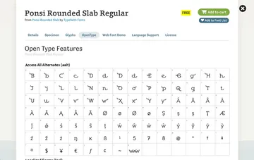
While shopping, take a look at a font’s OpenType features. Ponsi Rounded Slab from Font Spring happens to have a lot of variations available, listed under the font’s details.

Once you find a font that has the aesthetic features you want, also check to make sure you can legally use that font for the web. A quick glance at the License for Ponsi Rounded Slab sadly reveals that it is not licensed for use on the web with @font-face. At least not for free. If you particularly like Ponsi Rounded Slab, you can always contact Font Spring to investigate legal usage further.
While Font Spring has some good full-featured type choices, we’ve had some good luck searching Behance to get amazing font families directly from their creators. To name just a few that we’ve fallen in love with, there’s Argent, Quincy, and Calendas Plus. Google Fonts does also have some fonts available with a least some ligatures built in, though you might spend some time hunting (try changing your preview text to “fi ff fk” to spot fonts with ligatures).
Prepping Font Files for the Web
Once you have a typeface that works for you, both aesthetically and legally, then you can move on to prepping the font files for the web (if it’s not a web font already, like from Google Fonts or TypeKit). So, the catch with all of these OpenType features is they’re only available when working with the OpenType font file type (.otf). Swashes, style alternates, and other font variations won’t work with other font-file types: eot, woff, svg, or ttf. At least they won’t by default.
Woff to the Rescue
The big savior here is the woff file type, which can use all the same font features as .otf files, if the woff file is exported correctly. In order to export your woff (and woff2) correctly:
- Open up Font Squirrel’s Webfont Generator
- Upload the .otf version of your selected font
- Enter “Expert” font-optimization mode
- (Optional) Limit font file types. Woff and Woff2 cover most of your bases these days
- Under OpenType Features, use the Comma Feature List to note all of the features you would like to keep in your font. You could use Keep All Features, but keep in mind that more features mean a larger font file
- YOU CAN LEGALLY USE THIS FONT, RIGHT?
- Download Your Kit
Example:
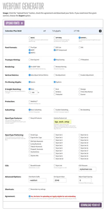
For the White House Historical Association, we used Calendas Plus. We chose to use the ligatures, swashes, and small-caps from the font, so I entered “liga, swsh, smcp” as my Comma Feature List. Most of the other default settings are good to leave alone. Here’s a run-down of the full settings I exported my font files with:

You’ll notice that the text I entered into my “Comma Feature List” is a list of short-codes for the features. CSS Tricks has a full list of these font feature values. These short-codes are also used in your CSS with the font-feature-settings property. We’ll talk about that soon, so keep that list handy.
Before I move on, I’d like to point out another Font Squirrel font-generation feature. Under OpenType Features, there is also the setting OpenType Flattening. Should you like only one or two stylistic sets in a font, like the small-caps version for example, then go with OpenType Flattening instead. You can replace the standard glyphs of a font and just reduce it to the set(s) you desire instead of adding on the sets to the base font. This font file then ends up a good bit smaller than the version exported with OpenType Features.
Kerning and Ligatures with text-rendering
Chrome, Safari, and Firefox all calculate kerning and ligatures automatically because these browsers support the CSS property “text-rendering” which is set to “auto” by default. At least they will calculate these font properties when the processing power to enable these features is within reason. This option doesn’t exist at all in IE or Edge. Here are all the options for text-rendering:
body {
  /* The Browser makes its best guess with its own rendering engine */
  /* results will vary based on the browser */
  text-rendering: auto;

  /* The Browser chooses page speed over font calculations and legibility */
  text-rendering: optimizeSpeed;

  /* The Browser chooses legibility over font calculations and page speed */
  text-rendering: optimizeLegibility;

  /* The Browser chooses exact font calculations over page speed and legibility */
  text-rendering: geometricPrecision;
}
While "optimizeLegibility" or "geometricPrecision" might be tempting, they can really hurt your page load speed. I recommend sticking with "auto" which works surprisingly well.
Kerning, Ligatures, and Swashes with font-feature-settings
The support for font-feature-settings is a bit more promising than text-rendering, with Safari being the particularly odd outlier as of version 9. Safari 9.1 and iOS Safari 9.3 (the next versions for each) should include this feature shortly. In regards to IE, this setting works in IE11 and IE10, but no lower. It works by taking a font feature short-code and then a 1 or 0. 1 turns the setting on and 0 turns it off.
We can enable (and later disable) kerning in IE and Edge with:
/* Enable kerning */
/* Check caniuse.com for current browser prefixes */
body {
  font-feature-settings: "kern" 1;
}

/* Disable kerning */
.heading--no-kern {
  font-feature-settings: "kern" 0;
}
Add on ligatures too just by making font-feature-settings a comma-separated list:
/* Enable both kerning and ligatures */
body {
  font-feature-settings: "kern" 1, "liga" 1;
}
Then we can enable swashes along with kerning and ligatures on a particular heading style with:
/* Enable swashes */
.heading {
  font-feature-settings: "kern" 1, "liga" 1, "swsh" 1;
}
Should you enable kerning and ligatures at all (after all, they’re enabled by default with text-rendering in most modern browsers), then you may want to apply the CSS to the body element to cover all text. Swashes are best applied to large headings since they can hurt legibility at small sizes.

Small-Caps with font-variant
You can certainly enable small-caps with font-feature-settings (with “smcp” as the font feature short-code), but I prefer the older CSS2 property font-variant. This setting can specifically enable small-caps.
/* Enable small-caps */
/* No browser prefixes needed for this property */
.heading-small {
  font-variant: small-caps;
}
The reason I prefer this setting is the browser support. Font-variant will enable small-caps in Safari 9 and lower where font-feature-settings doesn’t work. Also, it has a great fallback for IE9 and down. The fallback renders as if you were to apply these CSS rules to the default font glyphs:
.heading-small {
  text-transform: uppercase;
  font-size: 0.8em; // estimated size difference
}
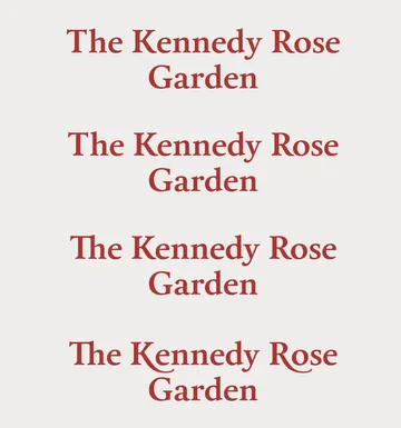
Just for the sake of comparison, here is Calendas Plus as a true small-caps variant of the font versus using the type-transform trick:

A Note on Performance
Before you start using font features willy-nilly, be aware that including these features in your font files does make them larger and take longer to download. But on the other hand, these features do allow you to do more with a single font. Weigh your options and decide whether you’d like to use two limited fonts or if you might be able to use more features within a single font to serve as both a Display and Body font.
On whitehousehistory.org, Calendas Plus ended up being so versatile it was the only typeface that was needed. It justified the increased file size for the two weights we used since no additional fonts were needed (other than the italic variant, naturally). Also, swashes were only needed in bold headings, so only Calendas Plus Bold was exported containing swashes, which kept the Regular font size down.