Creating EcoCart: A Peek Behind the Curtain

Liam Becker, Former Javascript Developer Intern,
Will Dinneen, Former Javascript Developer Intern,
Jennifer Montoya, Former UX Research Intern,
Mika Byar, Former User Experience Design Intern, and
Jack Doyle, Former Data & Analytics Intern
Article Categories:
Posted on
The 2020 internship cohort spent eight weeks researching, designing, and building EcoCart, a web app that allows users to calculate the environmental impact of everyday food choices.
Every summer, Viget interns are presented with a unique challenge. This year, we were tasked with developing a data visualization tool. We created EcoCart, an educational experience that helps consumers visualize the environmental impact of their grocery habits.
According to Our World in Data, the food industry takes up half the world’s habitable land, and accounts for:
- 26% of global greenhouse gas emissions
- 70% of freshwater withdrawals
- 78% of water-way pollution
- Livestock accounts for 94% of mammal biomass, even while thousands of other species go extinct
However, food companies currently aren’t required to be transparent about their environmental impact. EcoCart was made to mitigate this lack of transparency. Drawing data from a study done by Poore & Nemecek (2018), we finished our 8-week internship with an app we are proud of. Below you will learn what each of us did, how (and why) we did it, and what we learned.
Jack (Data & Analytics)
Being the Lone Wolf on the data analysis part of the team, I was tasked with making sure that our numbers were more than just numbers. In order to do that I needed to narrow our focus and create project goals, success metrics, and an overall purpose. Using a large amount of Excel, Google Analytics, and even calculus, I was able to define our scope and make sure our data was as consumable as our grocery items!
Goals & Success Metrics
The purpose of our project was to create a tool that helps eco-conscious consumers reduce their carbon footprint. We wanted this to be an educational tool that could still have the potential to educate our target audience on sustainable shopping behavior, while also having cross-technological accessibility. As an educational tool without, we couldn’t measure success through any financial KPIs such as donations or account signups, so I decided to use customer satisfaction and longer session times to ensure efficiency of our site. These were goals that I could still track through Google Analytics as conversions, which was a great learning experience.
Data Manipulation & Analysis
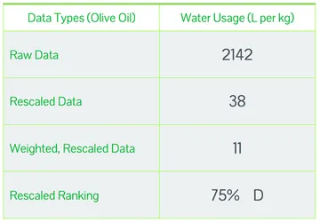
Ecocart has many numbers and grades for every grocery item. With one of our goals being to increase transparency of common grocery items, it was important that the data was organized in a way that users could remember the next time they go grocery shopping. We took our data from an article about the environmental impacts of food production in four areas: Water Use, Land Use, GreenHouse Gas Emissions, and Eutrophication (Water Pollution). After many days of cleaning, rescaling, weighing, and calculating the values in our dataset, I was able to create a grading scale that measured all items on the same conversion scale to produce a letter and number grade for each grocery list item. However, the work did not stop there! I still had to find a way to make sure those items could be totalled on our Impact Receipt to give a final grade. A weighted average calculation made the most sense because it took into account the item conversions in kilograms, the chosen quantity of each item, and its impact grade. After this, I did some tagging on the website once it was developed so we could see more in-depth analysis in Google Analytics on any user behavior.

Not only did I learn many new technical skills throughout this project, but I truly learned how vital time management is. I learned how to communicate my thoughts, difficulties, and victories in a way that could support our decisions and not set us back. I also was able to combine three of my interests: sustainability, math, and data analysis, and it was great to share those interests with a team of highly intellectual fellow interns.
Mika (UX Designer)
As the designer on the team, my responsibilities varied widely. An 8-week time crunch meant I had to cut some parts of the process out—for example, concept modelling. However, the time constraint only added to the challenge and the fun! I was forced to analyze where we were in the process and collaborate with others to decide where I should direct my focus. In addition, stagnancy wouldn’t cut it. Constant feedback and new information pushed me to reiterate on our product.
Discovery
In the first stages, I focused on discovery by conducting an analysis of our competitors. This allowed us to think about a user’s mental model, identify common design elements and themes, and reveal the market gaps. With this information and the research from Jenny’s survey (more on that below), I was able to define user flows. Our holistic flow was a straightforward process for a user, with the exception of a repeatable loop for the act of adding, viewing, and removing grocery items from their list. The information we gained from research, analysis, and creating user flows informed the next stage of our process: prototyping.

Prototyping
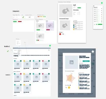
Utilizing what we had learned from the discovery phase, I made the initial wireframes for our tool. The wireframing process continued on for several weeks, with constant reiteration taking place. Insights from user tests and feedback from team members and advisors allowed me to expand my view of the product and see our features from a new lens. Toward the end of our eight weeks, I focused on fleshing out our wireframes in Figma by using components from Material UI. This helped the developers and me identify what was plausible for our final product and what part of the wireframes may need tweaking. Throughout the rest of the project I worked with the developers on QA and made small design tweaks to our tool.

I learned a lot by being a part of this project. Technical skills and specific methods aside, I was able to learn how to work within a cross-functional team, gain a better understanding of the UX process and when to apply different methods, and the importance of reiteration.
Jenny (UX Researcher)
By the time you’re done creating a product, you may understand it well, but that doesn’t mean your users will. That’s where UXR comes in. UX researchers employ a variety of research methods, always making sure to get the perspectives of real people. The methods I chose for EcoCart were really dependent upon our time limit. The first method was a survey, conducted well before there was even an “EcoCart” to speak about. The final method was user testing, which helped us find and iron out the kinks in our product’s design.
Survey
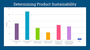
Surveys are easy to make and can provide you with a lot of good data, if you ask the right questions. In my survey, I asked our target audience (i.e. eco-conscious consumers and household decision makers) about their shopping habits and beliefs about sustainable shopping.
As an example, I asked participants about the pros and cons of sustainable shopping. A response like “I’m worried the label ‘eco-friendly’ might just be a marketing ploy” let us know that users would find our educational tool genuinely helpful. We have cold, hard data backing our product. With EcoCart in hand, there’s no need to depend on dubious labeling.
Fun fact: our survey takers voted on a variety of product names. The majority ruled in favor of EcoCart, so that’s what we went with!
User Testing
There’s a lot of variability in user testing. The process often depends on the amount of people you interview, and how you choose to interview them. For EcoCart, I made an interview script full of questions about product designs. I asked users things like “what do you think you would see on the homepage?” and “Where would you go to find your items?” After developing the script, I scheduled interviews with three people who had taken our survey. Each of them had expressed an interest in helping us conduct more research. During our video-chat interviews I recorded their comments while Mika took detailed notes. We moved participants through images of Mika’s early product designs, and they expressed their opinions and provided details about points of confusion. The EcoCart you see today is, in many ways, quite different from the EcoCart we started out with. That’s the power user opinions can hold!

So, what did I learn during my time as the UX Research Intern at Viget? For one thing, I learned that user interviews are much harder than they look! I’d never done user testing prior to this internship, so I found the process to be a bit nerve-wracking. You spend a lot of time developing an interview script that essentially gets thrown out the window the minute you start asking questions. That’s not actually a bad thing though. You often learn more when you go off script. One of my biggest takeaways from researching for our team is that I need to remain flexible. True discovery happens when the unexpected occurs!
Liam and Will (JS Developers)
As Javascript Developers, we were tasked with writing the source code for EcoCart. To accomplish this, we translated Jenny’s research and Mika’s designs into functioning code and integrated that code with datasets created by Jack. This process began with creating the structural foundation for the app. From there, we continued to refine all of the elements until it reached a point we were all happy with.
We used Gatsby.js (built on React.js) as our overall framework. For the actual data visualization graphics we used the Victory.js library. The final product is hosted on Netlify. During development, we also took heavy advantage of Github. Since this was a remote internship, Github PRs were absolutely essential, and we would constantly be reviewing each other’s work. This stack resulted in a seamless development process that overcame all the hurdles of remote work.
What did we learn?
Will
EcoCart was the first project I had worked on with a full team. Working with research, design, and data all done separately from development was new to me, and I definitely liked it better. I learned how to implement wireframes rather than just design the product as I went along. This was a valuable experience that I will certainly try to recreate.
This particular internship was unique in that it was remote, and like many who are experiencing remote work for the first time this year, I feel like I have developed some valuable skills. Asynchronous project collaboration, social networking and connection through Slack, remote presentations, and remaining productive were just some of the many remote challenges we had to overcome. But coming out of Viget, I will feel much more confident in whatever I end up doing.
Liam
I learned more making this product than I ever would have imagined, particularly regarding React. Having never touched it before beginning this internship, I had to quickly ramp up at the beginning of the project to stay on pace with the rest of the team. Every day after that was a learning process where I discovered something new and special about React that made me appreciate it more and more.
To add to Will’s statements above, this was not only the first time I’d worked with a larger team, but the first time I had worked with any sort of designer. Being able to work with Jenny and Mika on the UX team was fantastic, and it really helped show the value of having a diverse skill set when working on any sort of project.
Overall I had an amazing experience working with this team, and I learned so much more than I ever would have imagined. I wouldn’t trade this experience for anything!
Developing EcoCart was an experience that none of us will ever forget. As you can see, we put our blood*, sweat, and tears into this product. We love EcoCart dearly, and we really hope you will too!
*No interns were harmed in the making of EcoCart