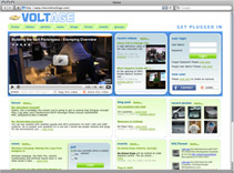
Chevy’s Voltage Site Design Falls Flat
Rob Soule, Former Viget
Article Category:
Posted on
 Yesterday Jen posted a great article on our Marketing Lab's blog, Viget Engage, regarding a new social site recently launched by Chevy. The site, http://www.chevroletvoltage.com, aims to bring people together to discuss and create buzz around their new vehicle, the Volt. After reading through Jen's post it really got me thinking about the design and how, especially in this case, it played a vital role in shaping my expectation of this vehicle before I ever even saw it.
Upon arriving on the site I was immediately confused. First I saw a logo, a prominent video, and a very vague tag line. I then quickly scanned the page looking for something concrete to help explain what exactly this site was. Instead of finding answers, I was left with more questions. What is this site, what's its purpose, and what the heck am I supposed to do? From there my mind quickly jumped to the design and before I knew it I was taken back to 1995 listening to Pearl Jam's Ten in my over-sized flannel shirt and baggy jeans. Needless to say the design is outdated. Not only that, but it also uses almost every web "two point OH(no)" cliché in the book. Excessive rounded corners to the point of distraction, a poorly chosen and washed out color scheme, gradients and drop shadows for the sake of gradients and drop shadows, and social networking badges and callouts everywhere. Not to mention the entire site is built in <gasp>tables</gasp>. In retrospect I'm just thankful I didn't spot the gratuitous wet floor effect or I might have instantly balled up in the fetal position.
Now this is the point where my expectation of this car started to change. The design of this site really started to impact and shape my view of this car — and not in a good way. I've always had the impression that Chevy, and Ford for that matter, were a bit behind the times and lacked innovation in their cars, especially when it came to design. Now, after seeing this site, I started thinking that was the truth. Either that or budget cuts had made it to the design department.
I think Chevy really missed an opportunity here. They had an opportunity to present their product in a positive light, generate some buzz, and create a loyal following. It's particularly unfortunate because the Volt is a cool, well-designed product that is simply presented very poorly. At the very least the design shouldn't get in the way of content and messaging. Sadly, in this case, the design just creates another hurdle for the user.
To me, this site would be a blast to design. With such strong branding and concepts behind the Volt it seems as though the design possibilities would be almost endless. If you were redesigning this site what would you do differently?