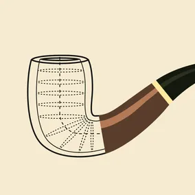
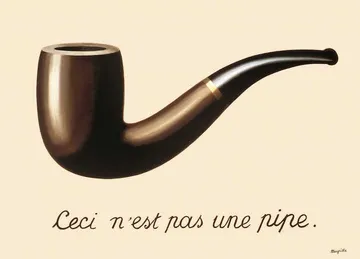
Ceci n’est pas un prototype.

Katherine Olvera, Former Senior User Experience Designer
Article Categories:
Posted on
Have we lost sight of the value of our design tools?
Recently, I’ve been inundated with promotions for new design tools, all promising that they will bridge the gap between design and code. While that is a noble endeavor, I disagree with their premise. Colm Tuitte from Modulz sums up the supposed problem: “Even the most powerful UI design tools are just drawing tools that export disposable assets.” It's a common critique.
Even the most “advanced” digital design tools are based on workflows for drawing mere pictures of interfaces.
— Daniel Eden (@_dte) July 28, 2017
These statements imply that UI design work that can’t be exported directly into code is a wasted effort. I think we’ve lost sight of what design tools are actually for.

What are our design tools for anyway?
Before I entered this field, my professional introduction to product design was not for a digital interface, but for handbags. That’s also where I learned what a prototype is, and what it isn’t.
A prototype is a simulation of an aspect of the product for the purpose of
- working out the design for yourself,
- demonstrating and selling the design to others, or
- communicating the design for production.
A prototype is an internal communication tool, not a product.
This was always clear while designing physical products because the final production medium was distant from the design tooling. We sketched on paper or made a spec in the computer. We made three-dimensional paper prototypes to figure out the volume of the bag or sewed dummies in a heavy white fabric to figure out the details. We’d hack together different pieces of samples to figure out the materials and function: cutting, stapling, gluing, and taping the pieces together. None of these drawings or prototypes would ever be mistaken for a finished product. But just because these representations couldn’t be sold didn’t mean that they weren’t valuable to the design process for both testing and articulating ideas to ourselves and others.
Digital Design Tools
So, how does that apply to UI design? Prototypes should demonstrate an aspect of a product. They aren’t meant to be fully-functional. In fact, last year, I created a prototype in a spreadsheet.
We were working on an interactive website where a user would answer a series of questions to determine a set of personalized results. There could be dozens of results depending on the user's answers. We needed a way to test if our logic tree would work as expected. So, I created a functional prototype in a spreadsheet, using conditions and Boolean formulas. It had a form on one tab, where we could enter different sets of answers, and the results would change, based on those answers, in another tab.
This prototype had nothing to do with what the UI would look like. It was only meant to test and communicate function. Freed from that constraint, I could play with the logic without thinking about the UI. But the reverse is also true. I want to be able to play with the UI without having to define all the data.
Tools, like Sketch or Figma, that allow me to draw a picture of an interface, an approximation, give me that power. As I'm working on UI design, I find myself exploring multiple avenues. Should this be an accordion or tabs? Should this be a modal or a side panel? Should the button go here or there? I can flesh out those ideas quickly without getting distracted by cascading effects. Sketch, spreadsheets, pencil & paper: these tools are all accessible and malleable, which is what makes them powerful tools for prototyping. I can manipulate them easily and directly to test ideas in various states of realization.
The design process is messy. If you were to peek into my working files, you might be horrified to find that the layers aren’t all organized and neatly named. That’s because not everything has been defined yet. It is still in flux. The designers’ job is to create definition where none existed before and feel comfortable playing with pieces that are still ambiguous, that are still liable to change. I want my design tools to accommodate that process. As a designer, I want and need a tool that balances that messy process with efficiency.
Finding The Right Balance
There’s always a trade-off when design tools get too close to code: you often have to define more early on. With handbag design, I often resisted moving into a technical drawing too early. Technical drawings required painstaking measurement down to the millimeter and carefully articulated instructions about construction. Even the most disciplined designers are reluctant to make broad changes or totally rework an idea after investing that much time in defining interrelated aspects of a product.
That’s the problem with these tools. They would require more up-front definition than I’m comfortable with. That may work great for some mature product companies who already have clearly defined design systems. But in an agency design environment, I’m skeptical. For me, design tools hold their value in allowing me to both explore possibilities and communicate clearly with team members and clients alike. Prototypes and UI designs—that is, pictures of an interface—are valuable in that they allow us all to see a tangible representation of a thing, discuss it, and change it, all before we make the heavy investment of producing it.