From Idea to App: Building Spots You

Doug Avery, Former Senior Developer
Article Categories:
Posted on
How do you build and release a side project without getting lost in the details, sacrificing the user experience, or running out of time? Here's how we launched the new Spots You app between projects.
Move fast and make things. In January, we started building a new iOS app that incentivizes fitness by reimbursing employee gym expenses. Completing an internal app has a lot of challenges — scoping, resource allocation, and management — that can bring your side project to a halt. We navigated these issues with a mix of loose planning and constant iteration, leading to a polished, fully-functional beta by late February. Why did we do it, and how?
Building off a good idea
Spots You was launched in 2013, as a company initiative to invest in employee health. It was a Rails app built under our Pointless Corp umbrella, that tracked employee FourSquare gym checkins and reimbursed membership costs after the 8th workout. At its peak, nearly half the company used it, logging a total of over 9,000 workouts.

Sadly, after some breaking Foursquare API changes, the web app stopped functioning. Team members now had to manually file gym expenses each month, and the social component (seeing your friends on the leaderboard) was no more. This was the perfect opportunity to build something new — an iOS app that no longer used a mix of Foursquare and a Ruby on Rails app, but was entirely contained on a user's phone. The value was clear, the risk was low, and we had the time needed to launch a solid product.
Where to begin?
Internal projects only work if you can finish them in your downtime between critical work. At the start of Spots You, we had engineers with free time, but couldn't know how long they'd be free — this made immediate progress a top priority: We had a narrow window to deliver value, and had to start building right away.
We kicked the project off with two documents:
- A design spec (Google Docs), explaining roughly what the app should do, what screens it needs, and the technologies to use when building. This was where we decided to build a native app, allow sign-in with our G Suite accounts, use Firebase for data, and run CI with Visual Studio App Center. Making these calls early allowed devs to hit the ground running while design was still in progress.
- An interactive wireframe (Figma), constructed from simple sketches of the app screens. Even though it was rough, it aligned the team on what data to store/display and how the general flow would work.
Focus your efforts
At launch, Spots You would have at most 50 users. A small count like this meant we could spend less time thinking about things like user management and scaling, and concetrate on aspects the team was excited about: Convenience, simplicity, and polish.

Make lean decisions
The speed of development pushed us into using inexpensive, easy-to-use technologies that we could start working with on day one.
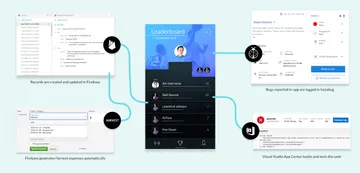
User and workout data was stored in Firebase, which also managed the Google login component. Firebase's Cloud Functions allowed us to automatically create expenses in Harvest once a user reached their goal, without worrying about hosting or uptime. Instabug was a fast addon that let users report bugs in-app, and finally, Visual Studio App Center built our app and ran tests on every Git push. Tickets were triaged and managed with GitHub Project Boards.
These choices were successful for two reasons:
- For an app our size, they're all free. This speeds up one of the toughest parts of internal projects: deciding how much to spend on your hosting, security, and data (and who approves the expense). Without cost constraints, we could start building simple functionality within the first week. We even specced the design in Figma, which is free for a small team of editors.
- They're all fast. Firebase, App Center, and Instabug are all simple to set up the first time. With Firebase in particular, initial setup is intentionally made very easy — as your complexity grows, you can progressively master the tool to fine-tune your work.

Don't get blocked by design
Because developer time was in high demand, we knew we had to start building from the basic sketches to get started. This left time to work on the design as development was in motion — but the design wasn't "final" until the week of the beta release. Instead of buttoning up all of our decisions and handing them off to devs, design and development moved back and forth, with one constantly catching up to the other.
The final UI is the result of this process: Making increasingly more confident decisions as we built and tested. Sometimes this meant quickly updating a design after seeing it perform poorly in the app, other times it meant re-writing a section of UI to deal with design updates.
Sometimes the "everything at once" process led to confusion or re-work, but the benefits were clear: Instead of a frantic two weeks to lock down a "perfect" design, we had two months to slowly improve it based on our observations.

Get everyone involved
People have limited time and attention, so we wanted to make the beta testing process and launch as clear, low-effort, and polished as we could for our internal audience. This meant:
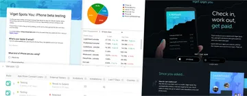
- Collecting beta users with a Google Form
- Writing a guide to beta testing: When to expect an invitation, how to download the app, and how to report bugs
- Providing an FAQ to answer common questions we heard during development
19 users helped us test Spots You in the first week of beta, and they gave us actionable feedback on the design as well as caught some of the trickier bugs that we missed.
Giving users clear avenues for feedback is key — you don't want to miss a bug because someone didn't want to take the time to write emails, and you don't want company-wide discussions about one feature or another to derail you. Encourage feedback, and give everyone the best channels for providing it without distracting the project team.

Promote it!
A common sticking point for internal apps is the lack of clarity around how they work and who's responsible for them. A part of a good user experience is a good launch: Something that catches attention, answers everyone's questions, and lays out details about the purpose and ownership.
With Spots You, this meant planning launch communications in a Rollout Plan doc (Google Docs)
- Giving brief, regular updates during all-hands meetings
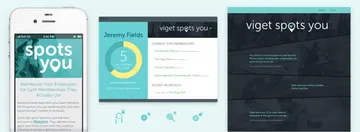
- Building a landing page that hypes the app and explains it to new users
- Update internal pages with details about the technology, accounts/passwords used, and project status
It's easy to let these things slip when you're racing to the finish of the project, but they're small tasks that can make a big difference to the audience.
Do you have an app idea Viget can help with? We have almost 20 years of experience building scrappy MVPs, testing the results, and scaling apps up for huge user bases. Interested? Drop us a line!
To read more about our Pointless Corp innovation lab, check out pointlesscorp.com.