Building Pearl in Two Days
Todd Moy, Former Senior User Experience Designer
Article Category:
Posted on
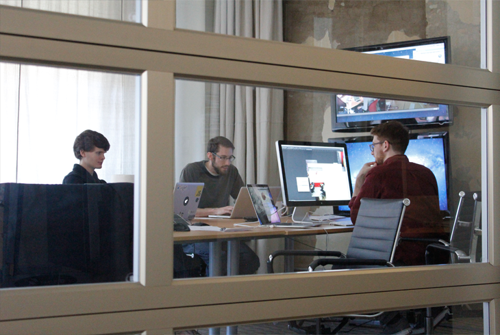
Last Saturday evening, our team of five sat in the waning light of our Durham office, typing away as Justice streamed from Billy’s speakers. Across the table, alongside our laptops: the remains of lunch, some coffee paraphernalia, and a couple plates of donuts. We were putting the finishing touches on Pearl, a product we were building as part of Viget’s latest Pointless Weekend. For the uninitiated, Pointless Weekend is a hackathon of sorts: each office gets two days to conceive, design, build, and launch a product. We were in the last hour, and focus was intense.
Two days isn’t a lot of time to build something, especially if you don’t know at the outset what you’ll actually build. Here’s the story of why we chose to build Pearl, how we did it, and what we learned.

A Modest Proposal
On Thursday evening, we brainstormed about what we should build. As ideas were pitched back and forth, Anna—our Senior Recruiter—jokingly said, “Why don’t you build me an applicant tracking system?”
See, Anna had just spent the past two hours researching tools to help manage our internal review of internship applicants. She and Emily, our People Director, told us of the lackluster tools on the market and their woeful process involving Google Spreadsheets, Gmail, and copious amounts of cutting and pasting.
Hearing these problems and knowing we could improve their quality of life made the decision easy. So, build an applicant tracking system? Challenge accepted.
Finding the MVP
After talking through the applicant evaluation process with Anna and Emily, we realized that a significant amount of time was invested in collating applicant information, sending it to reviewers, and getting their feedback.
Our Pointless project presented an opportunity to streamline the process. What Anna and Emily needed was a single place where all this applicant information could be captured and aggregated.
But there was one hitch.
The full-time applicant review process restricts access to sensitive information like salary requirements on a per-reviewer basis. This is done for confidentiality reasons and to ensure assessments aren’t clouded by this information. Dealing with this would be a hairy issue—the implication was layers of permissions, roles, user accounts, and more.
It looked daunting until we thought, “What if we focused on internship applicants instead?”
Interns are a unique group. Their review is similar to that of full-time employees with one big exception. Their applications don’t include the sensitive data points that affect full-timers. And there’s a major volume difference. Each winter, Anna processes 300-400 internship applicants within six weeks. By comparison, full-time volume is typically on the order of 30-50 applicants per month, fielded by both Emily and Anna throughout the year.
By focusing solely on internships, we could cut out the confidentiality-related complexity, while also addressing the greater need for efficiency stemming from the sheer volume of those applicants.
After a quick definition session, we had a good sense for how this app would function and how it might look.

Introducing Pearl
Pearl is an internal-use tool that runs on our private network. It’s a way for Anna and Viget to evaluate the most promising internship candidates—the “pearls,” so to speak.

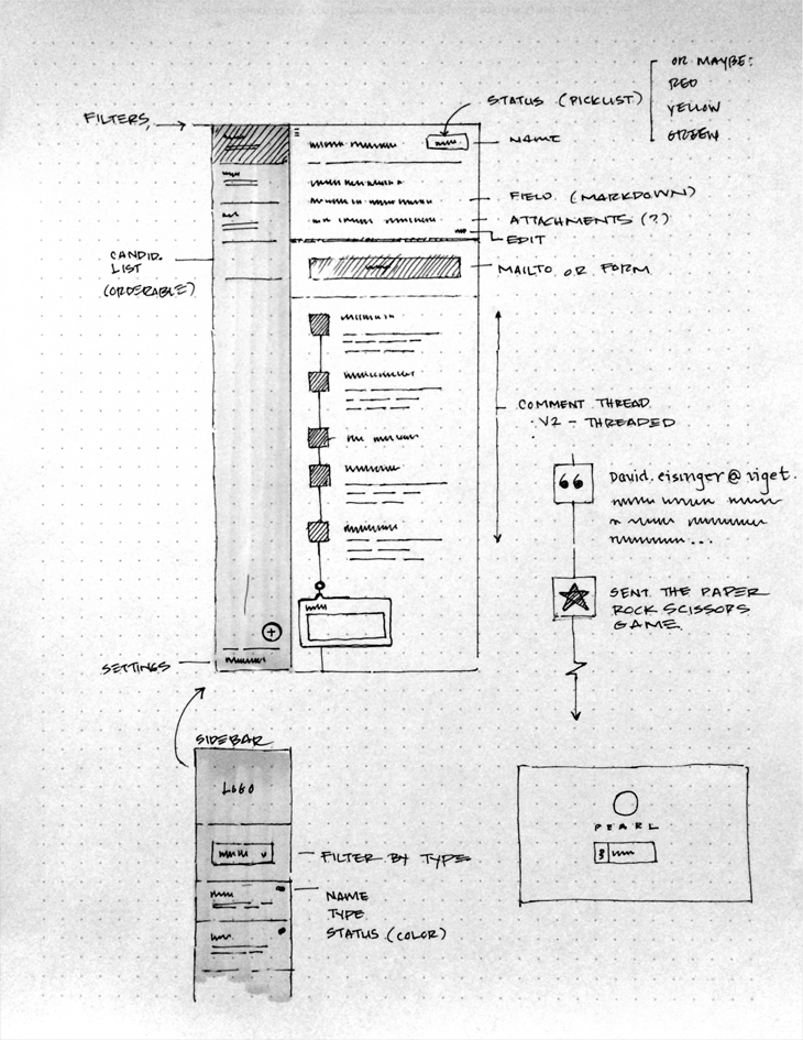
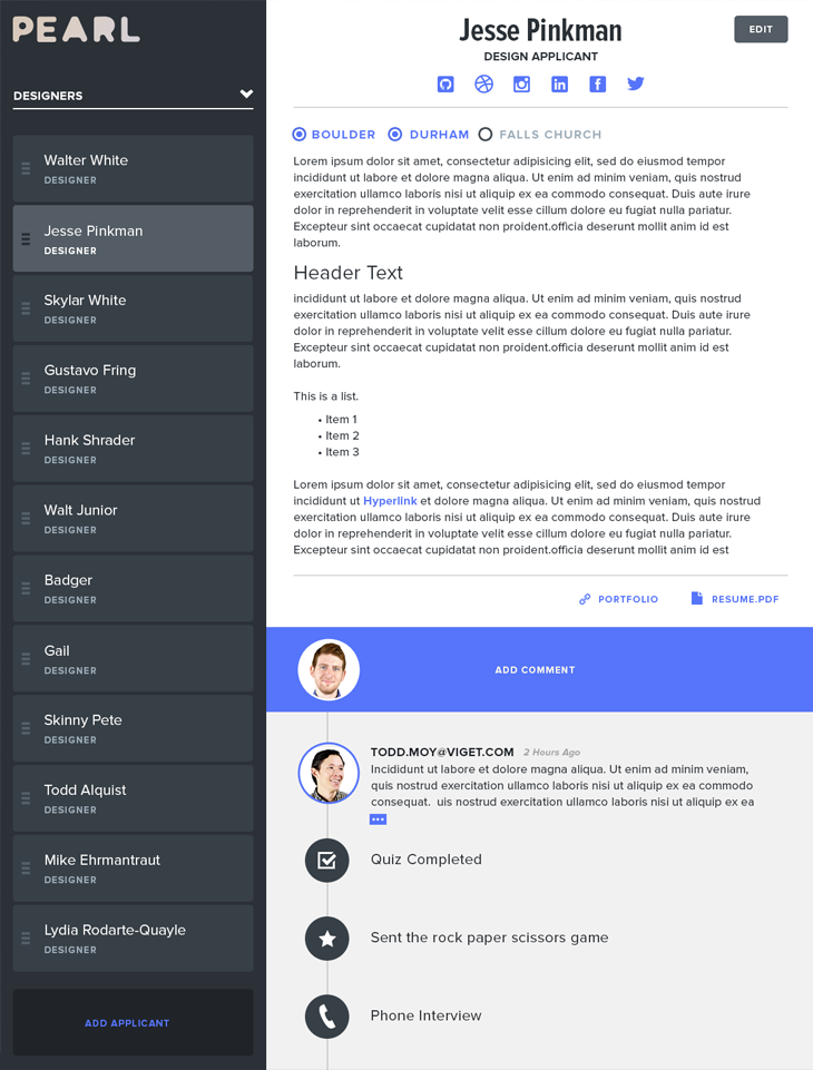
In Pearl, Anna creates a profile for each applicant that contains a cover letter, a résumé, links to portfolios or public repos, and any additional notes. When she’s ready, she sends this profile to reviewers for comment.
Reviewers receive this message, review the the information, and send their feedback. This dialogue is captured in the applicant’s timeline along with process milestones like phone interviews and quiz completions. Together, these pieces provide a comprehensive record of each applicant.
Sitting off to the side is the applicant list. This shows all applicants, grouped according to the position to which they’re applying. For all users, this is a navigation element. For Anna, however, it’s reorderable. This allows it to also function as a ranking tool, helping her manage and communicate the strongest applicants in the pool.

Under the Hood
This project allowed us to experiment with some interesting technology.
On the back end, a view-less Rails application acts as an API endpoint, managing data storage and email parsing. It publishes JSON, which is consumed by a React application running on the client. This approach allowed our developers, Zach and Nate, to work independently of each other using the tools they preferred. This affords us a lot of flexibility in the future for implementing live updates, running tests, and improving the user experience.
Rather than building commenting into the application, we chose to use a medium that reviewers were familiar with: email. In Pearl, each applicant profile has a specially crafted email address. To add feedback to anyone, you only need to cc that email address. On the profile, there’s a prominent mailto link, of course, but reviewers can simply send a message to that address from any email client.
When the reviewer sends their message, Mailgun intercepts the message and forwards it to an endpoint in the Rails application. Based on the cc field, the Rails application then applies the comment to the proper applicant.
Final Thoughts
While we delivered a first round product, there’s still some work left to prepare it for the upcoming intern season. For example, we still need to fully implement the clean, typographic interface that Billy designed and add in some additional functionality we didn’t get to.
In defining this app, we were ruthless about backlogging features that had questionable value. We’re interested to see if any of these will surface as essential requirements once the review process is underway. Having acute knowledge of what to build next will be invaluable to evolving this product over time.
Overall though, Pointless Weekend was a great time for us to get together and build something fast. It was made even more special when we found that we could help improve a fellow co-worker’s life a little bit. So, we’re excited at the work that’s been done and look forward to evolving it more.
Be sure to check out pics from the weekend on Flickr!