Building Motion for the Web: In the 'Zone'

Nathan Long, Senior UI Developer, and
Stephanie Fois, Project Management Director
Article Categories:
Posted on
In the first part of our series on motion, we tackle the challenge of classifying the types of motion in interfaces to better plan and communicate motion in our projects.
This article is part one of a series unpacking how we’re working to define and implement motion at Viget. The other articles in the Building Motion for the Web series are part two: Creating a Motion ‘Volume’ Scale and part three: Recipes for Design Success.
We recently sat down across the different labs at Viget with the following question: How can we better plan for and integrate motion into our projects?
After several sessions of feedback and refinement, we’ve broken it down into 3 key areas:
- How to classify motion types to make them easier to discuss.
- How to create ‘safe-to-play’ areas and communicate levels of complexity in motion.
- How to collaborate effectively cross-discipline and identify deliverables that are most helpful in the pursuit of integrating motion into a project.
In this series, we’ll work through each area and outline our findings and recommendations, starting with our first topic: how to start classifying motion. Through an effort to classify the characteristics of motion, we will establish distinct 'zones' of motion which offer a promising framework to help pave the way for clearer communication, enhanced planning, and a deeper comprehension of the potential held within the realm of motion.
Lost in translation
Motion relies on collaboration between several different disciplines. A designer may provide instruction - or even a prototype - for their envisioned interactions. However, a developer will often be the one implementing the finer details of transitions and timing. These two roles must talk to one another early and often to effectively implement motion in an interface. There’s also the third collaborator, the client, who should be included to ensure that the final outcome hits the mark. This high degree of collaboration requires a shared vocabulary and language that all parties must be able to speak, or at the very least, understand.
Motion is inherently a visual concept with a lot of nuances and can take many shapes and forms. Even when the desire for motion is known from the start, finding agreement on what type of motion is expected is no simple task. The words are often hard to find, and hard to drill down.
“I want some movement on the page, something with a ‘wow’ factor!”
“Awesome…! But when you say ‘wow’—”
“Like have it swoosh in and do a thing!”
“Like what kind of thing?”
“...I don’t know, but it needs to look cool!”
A conversation without clear expectations or boundaries leaves a lot of ambiguity, no matter how early that conversation occurs or with whom. This is why using shared language to talk about motion is so important.
Motion as a communication medium
Motion not only conveys visual information about how something moves; it also conveys a motive as to why.
In a famous study in 1944, experimental psychologists Fritz Heider and Marianne Simmel created a 2D animation of simple shapes interacting and showed it to a group of subjects. After watching the animation, subjects were asked to write down what happened.
The subjects in the experiment interpreted the shapes as characters in a narrative. Subjects assigned the shapes traits like aggressive, heroic, afraid, or intelligent purely based on the way a shape moved in relation to other shapes in the film. Our brains attempt to assign reason and motive behind the movement we perceive.
When applying this theory to a web interface, the way elements move on the screen can communicate meaning and information to a user beyond simple concepts.
Sometimes, the information that motion can communicate is quite literal. Imagine a ball flying fast toward your head. Its quick approach indicates an imminent collision - danger, even - and your body instinctively moves to respond. You (hopefully) don’t have to think about it, you just do it. It’s intuitive.
Other times, motion can infer something more abstract or emotional. Take a person’s body language as an example; one’s posture, facial expression, or small gestures of the body. Even the amount of space between people can convey a lot of emotional information, especially when our brains aggregate the sum of these subtleties into a whole picture. If you tell a joke and witness a sea of flat faces, arms crossed, or lack of eye contact, you can quickly tell you’ve killed the vibe in the room ( ...😅).
Making use of the way we naturally assign meaning or infer intent when it comes to movement is worth considering when applying any type of motion within a web interface. Motion can signal key information to a user that should be aligned with the brand attributes and strategic pillars of the product.
Classifying motion
Part of our work to build a vocabulary around motion was to classify the types of motion we see in interfaces. If someone says an animal is a ‘reptile’, you immediately have a lot of information about what characteristics you can expect the animal to have. It is likely cold-blooded, has scales, and lays eggs. You can also make other assumptions, like that it likely has teeth (unless it’s a turtle… sorry, turtles.). All of this from a single word because scientists have spent centuries discussing and classifying animals.
Now, we’re no scientists, but if we go back to our earlier examples, we can start to pull apart different characteristics that we see in motion.
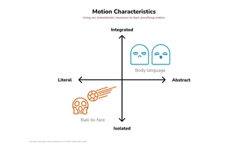
One characteristic we see is the type of information conveyed. It can be literal (like our ball-to-the-face example) showing movement from one area to another, or abstract (like body language) conveying mood, emotion, or character.
Another characteristic is its level of integration. We can see that its place within the rest of our environment makes a difference, whether it’s isolated and does not affect many things outside of itself (like a ball-to–the-face) or integrated across several sources where the meaning is compounded into a larger whole (like body language).
So now we have 2 scales of characteristics:
- Information Type (Literal vs. Abstract)
- Literal: Literal concepts, objects moving from one area to another, directional information (like the ball)
- Abstract: Abstract concepts, mood, emotion, feel, story, concepts (like body language).
- Integration Type (Isolated vs. Integrated)
- Isolated: Relatively confined and direct (like the ball).
- Integrated: Aggregation of signals woven into the experience. Might affect or include multiple elements (like body language).
And if we plot these measures as a chart with our examples:

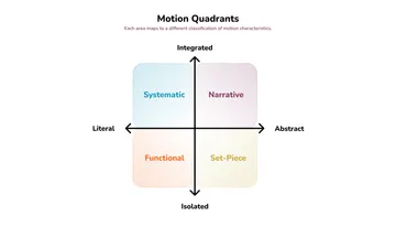
We can also see that quadrants are starting to emerge. With these quadrants, we can come up with classifications of motion.

Literal Classifications
Functional (Literal + Isolated): This is the quadrant that most of interface motion occupies. It conveys information to the user about the state of the system, and updates to it, but is typically contained within an element or component.
Systematic (Literal + Integrated): Refers to a ‘system’ of interrelated or compounding interactions that work together to convey a larger meaning. Pieces of the interface may affect one another. This can work to create a type of internal ‘logic’ to the interface, as the user will start to understand how the different components interact with each other.
Abstract Classifications
Set-Piece (Abstract + Isolated): Set-Piece animations, the next most common after functional, are self-contained and are often used for editorial effect or for elevating the experience aesthetically. Examples can be similar to illustrations but with motion or interactivity.
Narrative (Abstract + Integrated): Like Systematic, Narrative motion builds off several individual motion patterns to create a larger concept or tell a story, sometimes without words. But unlike a Set-Piece pattern, this is not isolated to an area or part but may constitute the entire experience.
Applying classifications to an interface
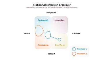
These classifications help differentiate types of motion but they still need to be flexible: not all interfaces and interactions will fall neatly into these quadrants. It might be more helpful to visualize softer edges between the quadrants and an interface as potentially occupying or spanning multiple quadrants.

In this chart, we have two imaginary interfaces loosely mapped:
- Interface 1 contains mostly isolated/individual functional motion patterns but has flourishes that add additional emotional information to the interaction. It also contains a single set-piece animation that doesn’t interact with the functional patterns but still contributes to the overall experience.
- Interface 2 contains a large degree of internal motion logic to its components. Several, but not all, of the components interact with each other but remain mostly focused on conveying system states and updates rather than emotional or conceptual characteristics.
What’s next?
We’ve talked about how motion as a medium can be difficult to communicate, and how ambiguity hinders effective planning. By working to classify some of the characteristics of motion, we now have 'zones' of motion that can begin the work of clarifying intent.
In the next part of this series on motion, we’ll begin to create safe boundaries to play in without accidentally crossing complexity barriers in implementation.

