Building Accessible Public Health Tools

Peyton Chance, Former Product Manager
Article Categories:
Posted on
A look at how we built Vaxfinder – a vaccine locator for the Commonwealth of Massachusetts – with accessibility in mind.
When we set out to build vaxfinder.mass.gov together with Project Beacon, we knew from the start that digital accessibility would be a high priority. COVID-19 has underscored and exacerbated existing barriers to digital access. When it’s safest to stay at home, an increasing share of consumers come to rely on digital solutions to manage their daily lives. We request prescriptions, catch up with friends, order paper towels, and – yes – find vaccines online.
When you recognize that 1 in 4 of the global population is disabled (and significantly more as you consider temporary and situational disabilities), you begin to see how important it is that all of these processes meet the needs of all users and not just those who are nondisabled.
To be clear, this phenomenon is not unique to the current moment. The international standards for web accessibility (WCAG) were first released in 1999. For decades before, disability rights advocates pushed for legislation to ensure that access was enshrined in law as a civil right. That legislation, and the culture of inclusion it aimed at fostering, plays a central role in society’s response to the pandemic.
Disability rights and inclusion activist Imani Barbarin put it clearly in the following tweet:
So, with time-tested standards at our fingertips and the understanding that COVID-19 has disproportionately impacted disabled people from the start, the path is clear. Any digital tools we build to meet the public health challenges of the day must recognize accessibility for what it is: a civil right, and a matter of significant consequence in the lives of at least 25% of the global population.
Digital access is saving lives. Lack of digital access, in turn, has real life-or-death consequences.
About Vaxfinder
Vaxfinder is Massachusetts’ primary hub for vaccine availability information. Users can search for vaccine appointments by a number of criteria, including location, vaccines offered, and availability status. Vaxfinder serves to collate availability information from hundreds of vaccination clinics in one central location. From the tool, users are connected to vaccine providers to schedule appointments.
The platform has served over 125 million user sessions in its brief lifespan, supporting Massachusetts’ rise to a position of leadership in vaccination rates among US states. Use has waned in recent months, but at the start of vaccination efforts it provided crucial real-time availability information to Massachusetts residents in eligible populations.
Areas of Focus
There were three areas of accessibility that were particularly important to focus on as we built a tool for use by the entire population of Massachusetts.
Color Contrast
Ensuring appropriate contrast between text, icons, and their background is crucial to equitable access. Luckily, the Commonwealth of Massachusetts has invested in a robust design system – lovingly dubbed “Mayflower” – and placed accessibility as a core priority in its creation. By pulling in Mayflower components, we could build quickly with confidence that the app would meet the requirements of WCAG 1.4.3 Contrast (Minimum) and WCAG 1.4.11 Non-text Contrast.
Use of Color
VaxFinder’s primary purpose is to communicate availability. When it comes to displaying status, it can be tempting to resort to the use of color alone; green is available, red is unavailable, gray is missing info. This choice, however, can lead to information gaps for those with color blindness and those using screen readers – and it’s explicitly prohibited in WCAG 1.4.1 Use of Color.
As a result, we chose to add supplemental icons to communicate status, paired with plain text descriptions “Available”, “Currently Full,” and “See Details”.

Form controls
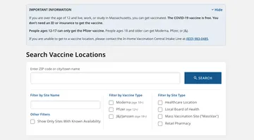
Vaxfinder allows users to filter results by location, current availability, vaccine types, and site type. This functionality was core to the usability of the tool, which currently lists over 950 locations – no one has the time or patience to manually sift through hundreds of locations. As a result, we knew that full access to the forms was key.
In design, we focused on ensuring that form labels were always visible, and that the controls were grouped visually in a logical fashion. The resulting forms, borrowing from Mayflower, are quick to parse and offer consistent information regardless of the user’s interaction.

In development, we ensured that 1) all labels were properly associated with their respective inputs, 2) the multiselect filters were grouped properly using the <fieldset> element, and 3) all inputs were accessible to a keyboard user.
HTML semantics dictate that <label> elements should be related to their respective <input> using the for attribute, with the value matching the input’s id.
<label for="search_input">
   Filter by Site Name
</label>

<input id="search_input" type="text" value="">
Sets of inputs should be grouped using the <fieldset> element, and the <fieldset> should have a descriptive <legend>.
<fieldset class="search-form__inner-container">
   <legend class="search-form__category-header">
      Filter by Site Type
   </legend>

   <ul class="search-form__filters-list">
      <li class="search-form__filters-list-item"></li>
      <li class="search-form__filters-list-item"></li>
      <li class="search-form__filters-list-item"></li>
   </ul>
</fieldset>
Rapid Testing & Benchmarking
The design and development of Vaxfinder, like many things during the COVID-19 pandemic, moved quickly. Automated testing helped the Viget team address high priority issues with speed. We used the following automated testing tools to supplement manual QA testing:
- WAVE - A plugin from the folks at WebAIM, who lead the industry and provide trainings in addition to developing the widely-used WAVE testing tool.
- Lighthouse - A suite of automated testing tools that ships with the Google Chrome browser, and can be accessed via the DevTools panel.
Are these perfect benchmarks for accessibility? Certainly not. But paired with manual QA, they enabled us to push Vaxfinder out to the masses with confidence that the tool would not introduce major accessibility hurdles.
Outstanding Challenges
One of the primary challenges in digital accessibility is that we can only control what we control. In the case of Vaxfinder, users are sent to schedule appointments on a host of platforms. The most accessible vaccination availability locator in the world cannot solve for an inaccessible appointment scheduling form. Some of these platforms were not built with accessibility in mind, and continue to contribute to disparities between disabled and nondisabled populations.
This is why digital accessibility must be a priority for all people working on digital products. When we recognize the role that our tools play in the lives of real users – who bounce from site to site and back again – we realize that we can only build a more equitable digital world when we all are building together.
If you have questions about how to get started, drop Viget a line or find me on Twitter. I’d love to hear from you - even especially if you've got accessibility feedback on this project.