Design with Personality: Updating Brian Regan’s Official Site
Viget's been happy to work with comedian Brian Regan on his official site for several years now. Of course after so many years the site was due for a facelift. Last summer we started the process of redesigning brianregan.com and we're now proud to show off the finished product. This post will focus on the visual design work we did, while Doug will follow up with a post about the front-end development that went into the site.
The goals of the redesign were to create a site that was interactive and engaging, with a visual style that was straight-forward with maybe just a little edge and rock and/or roll to it.
Designing a website for an individual, rather than a product or a company, requires re-thinking your process a little. You aren't trying to bring life to the subject, the subject themself is already alive. Rather, you're trying to capture their personality and their work, and communicate those aspects of the person visually.
Since the project itself was different, we did things a little differently. Rather then the structured moodboards we often do, we created three looser boards where we had room to really explore and play with a few directions. Doing this helped make the mood and meaning of each board the focuspoint.
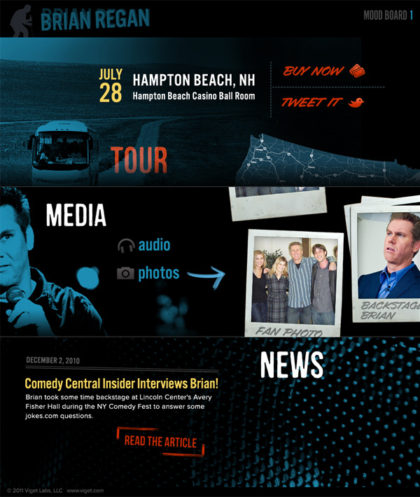
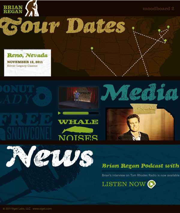
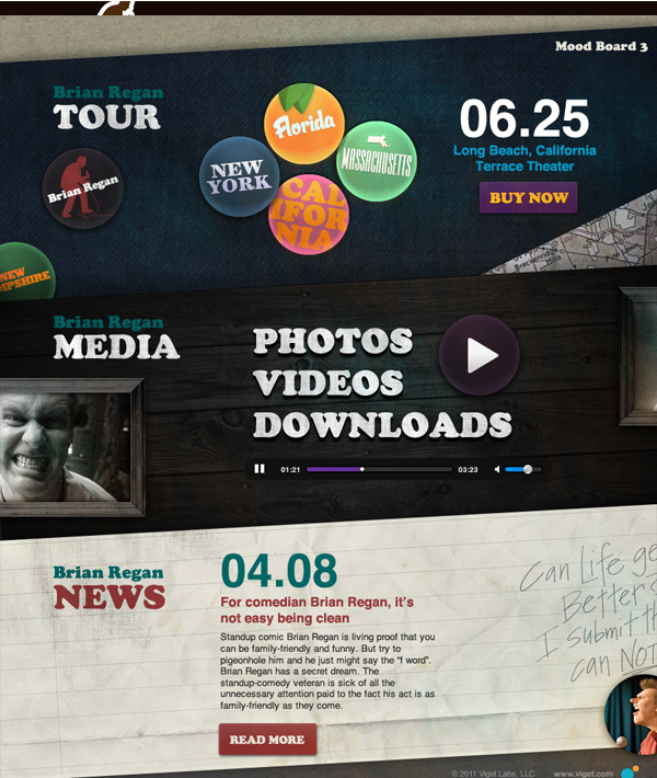
The client ended up really digging the first moodboard for its dark and uncluttered look, bright colors, and grungy touches. "Being on the road" and "late shows at nightclubs" were a big part of the inspiration for the approved style. In the research phase, this meant studying lots of neon signs and gig posters. In the design, it translated to lots of stamps (think getting your hand stamped on the way into a club) and playing with exaggerated type and scale to bring the idea of a big, bold show poster to the site.
We went through some experimentation before settling on the final homepage. The layout of the homepage, with big photography and content fitted around the photography brings a touch of poster design to the page.
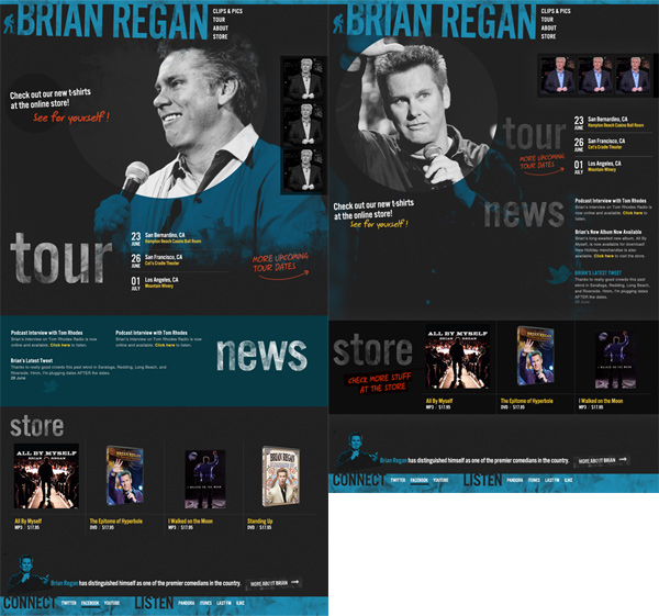
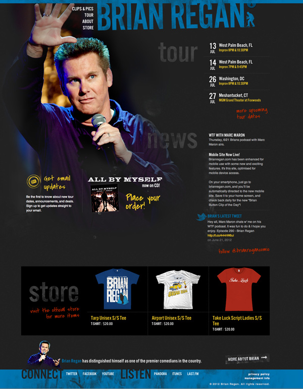
(See the rest of the finished site at brianregan.com)
With this project, the mobile site design came completely after the full site design and implementation. Translating the design for mobile ended up being a fun way to stretch the style in new ways for a different scale. While the desktop-sized site harkened to gig posters and marquees, the mobile site used smaller scale items like ticket stubs and stickers as inspiration.
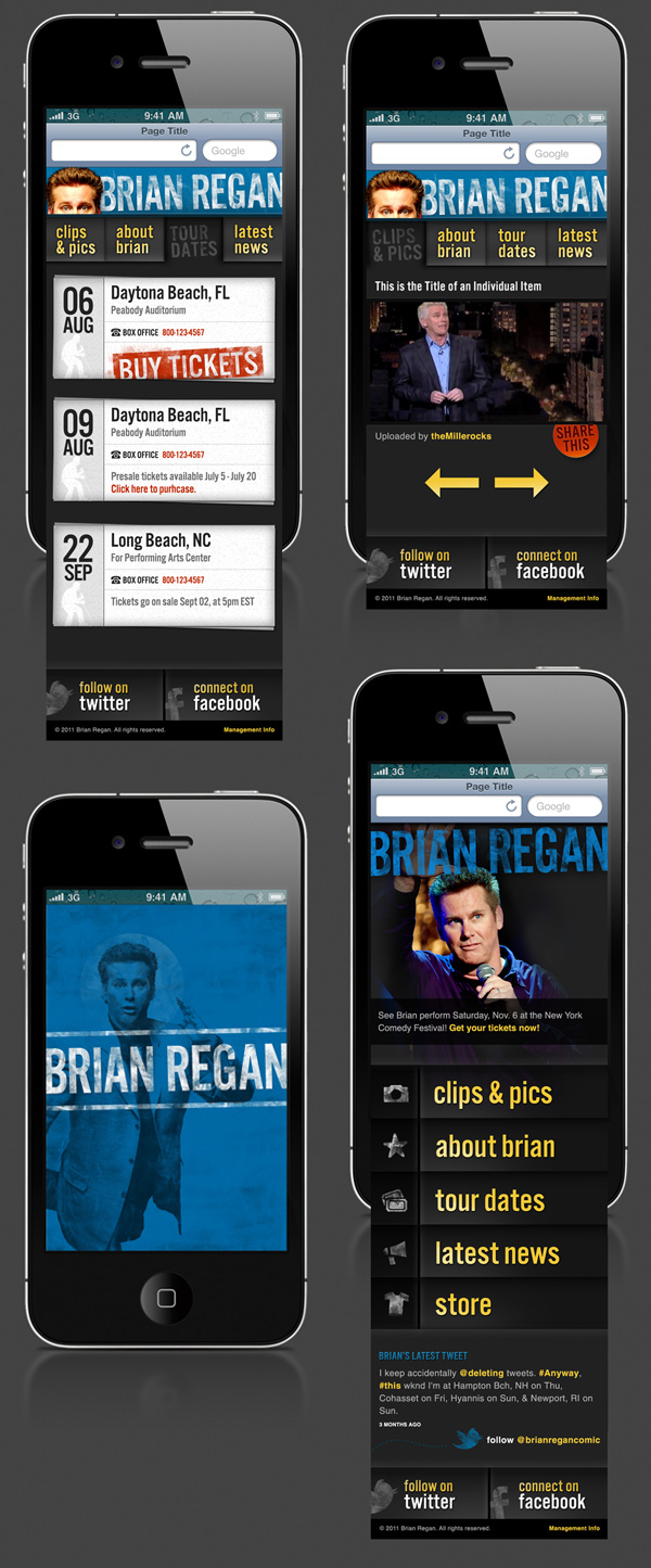
See the full design in action on your phone at brianregan.com
