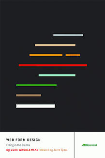
Book Review: Web Form Design by Luke Wroblewski
Mindy Wagner, Former Design Director
Article Category:
Posted on

Web Form Design: Filling In The Blanks
by Luke Wroblewski
Overall reaction: Big thumbs up. Until reading this book, I didn't know how much I didn't know about form design.
One of my goals for the new year is to improve my understanding of user experience design. I was eager to dive in and start learning, but I wasn't too excited to crack open a 200+ page book about web forms. I've slogged through plenty of web dev books that bored me to tears, dutifully taking notes and highlighting long chunks of code. Happily, this one was different.
If you haven't heard of Luke Wroblewski before its time to get acquainted. He's the Senior Principal of Product Ideation & Design at Yahoo! and was also a Lead User Interface Designer for eBay. He writes a blog on usability and interface design found at http://www.lukew.com/ff/. He is a regular at web conferences and shows up in the occasional podcast as well. He knows what he's talking about, and he knows how to talk about it without making your eyes glaze over.
So why read a book about forms? Think about it. Forms are a none-to-fun necessity for nearly any website you touch. From simple logins to multi-step purchasing forms, chances are you fill out a few dozen every day. And some of them are really awful, right? As designers, its tempting to copy a form directly from a client's document, add a few quick styles to pretty it up and let the developers worry about how they actually work. But this book points out how much we can be doing to improve this crucial point of interaction. The author sums it up by saying "Forms suck. We should design accordingly."
Once I finally opened the book, I made an awesome discovery: this is not a book full of code. It is a book full of examples (good and bad) and actionable solutions for common web form problems. There are plenty of screenshots and diagrams that help illustrate his points. Luke's writing style is conversational and approachable, making Web Form Design an easy read.
The book is organized into three sections; structure, elements and interaction. It addresses many different aspects of form design, from big picture ideas like "do I even need a form here?" to small details like the placement and graphic used for an Info button. Each design solution is explained in detail and backed up with results from real-life usability tests, which could come in handy during discussions with clients.
Three big takeaways for me were:
1) Think more about the structure of the form and the questions being answered. Are they all necessary? Could they be simplified or deferred? It is important that the questions are worded in such a way that people will understand why you're asking them. If they don't know why you need a phone number, for instance, they're likely to balk or give you a fake one.
2) Use inline validation to provide immediate feedback for the user. A great example he uses is choosing a username. If someone chooses a username that is not available, the form should alert themright away instead of waiting until they submit the form and then providing an error message.
3) Think more about eliminating big long forms altogether and replacing them with gradual engagement. The idea is to let users start using your product without having to go through a lengthy registration process. Sites like ScrapBlog or Geni allow a user to jump right in and test drive the application. They can play around and see features without a big commitment. Geni, for instance, lets you start building your family tree after filling in just 4 basic fields. Check out Luke's article on A List Apart for more on this topic: Sign Up Forms Must Die
Summary:
I highly recommend this book for both new and veteran web designers. It will help you to think more strategically about web forms, which will make them more successful. Your clients and their customers will benefit from your newfound knowledge and you'll feel like a genius. What are you waiting for?
Special Offer: 15% Off For Inspire Readers!
Rosenfeld Media has graciously offered Inspire readers 15% off of any product, including Luke's book. Just use the code VIGET when ordering. They offer a number of books and webinars on user experience design. Check out their products online at http://rosenfeldmedia.com.