Building the Pointless Corp Logo with The Geometry of Design
Doug Avery, Former Senior Developer
Article Category:
Posted on
Update, February 3rd: Early sketches and an inspiration board added to the end of the post.
LAYOUT. My old nemesis. Comp after comp is the same story: sketch the layout, try it in Photoshop, change it, change it, change it, and change it back until something sticks. It's the tyranny of choice - there are just too many possible layouts and never a good way to narrow the options down.
Even after deciding on a basic structure and beginning it in Photoshop, things never feel right. Is the header too tall? Is there too much space below that list? It's easy to pour hours into decisions like these and forget other, more critical areas of the design.
After a few recent collisions with layout, I decided to pick up Geometry of Design and Elements of Graphic Design, and spend some time refocusing on layout construction. I got through Geometry of Design in one evening, and AWESOMELY, I was able to apply it to my work the next day.
Why Geometry?
"The mathematically expressed module can only act to confirm a spontaneous insight. The golden rule merely defines the ideal proportion previously intuited by the artist, it is a means of verifying, not a system."
That's Adolphe Mouron's way of saying "don't use geometry to restrict, use it to enhance." The human brain already perceives certain shapes and relationships as harmonious, and our layouts (unconsciously, often) play to this fact. Elam's book is about doing mathematically what we already do intuitively, but doing it faster and more precisely.
Some (extremely basic) notes from the book:
- The golden rectangle and its divisions (into more golden rectangles) create harmony
- Sizing objects and curves in relation to a single unit creates harmony
- Using the vertices/corners of shapes and their intersections creates harmony
The book covers a number of fascinating geometric relationships, the most prominent being the golden rectangle (a roughly 5:8 rectangle) and its divisions. Along with an eye for proportions, this knowledge alone can punch up the layout of a design or simple mark, as I'll demonstrate next.
Utterly Pointless
Pointless Corp. (site still under construction) is Viget's new app sandbox. We wanted a logo that was fun and memorable, and simple to place in the footers of Pointless Corp. projects. The concept chosen was a bear riding a bicycle (of course), but I got stuck after the sketching phase. After a few failed attempts in Illustrator, I decided it was time to test some ideas from Geometry of Design.
When Sketching Fails

Fig. 1: Three years of drawing classes, down the drain.
It's not much, but here's what I had after sketches and some quick Illustrator tracing. There were a lot of little decisions to make at this point, with the goal of expressing the bear's posture, demeanor, and making him as identifiable as possible - decisions I wasn't quite sure how to make. So, I pulled out a golden rectangle and started reducing decisions by working on the visual harmony.
Simple Shapes

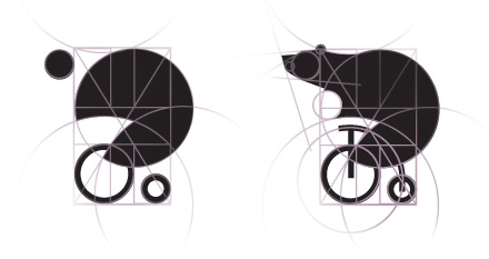
Fig. 2: The basic structure of our bear.
Beginning with an upright golden rectangle, the most visually pleasing of all rectangles (IT'S A FACT), I made a circle for the big wheel that fit into one of the rectangle's divisions. The next two circles were double and half the size of the original. The small one is placed in the bottom right corner of the rectangle, the large centered on one of the golden vertices. (I have to confess that this three-circle approach was a little inspired by Shaun Inman's logo for Mint, but also sprung from my idea of incorporating the Viget logo into the mark [hint, look at the bottom]).
More Circles

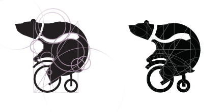
Fig. 3: Sort of looks like a bear.
Placing the head and tail just outside the "body" of the rectangle emphasized just how much bigger the bear is than his bicycle. I also wanted him looking ahead, using a second large circle to add some curve to his spine and straighten his posture.
The corner of the rectangle was a perfect spot for the ear circle, and the same unit was reused to make the curve of the chin. The head needed to taper a bit to make it bear-like, but the angles used are actually divisions of the angle across a perfect rectangle (about 32 degrees). Larger circles, radiating from the front wheel, define the shape of the bike and the curve of the bear over it.
Finishing Touches

Fig. 4: Geometry can even be used for free-flowing elements, like the tie.
The same circles are used again and again to place the tail and a jaunty tie, and another forms the hand. Whenever possible, the shapes I use intersect vertices or fit into other shapes. The bear's knees are made of a cross-rectangle line and another line that moves from the center of the bottom to the intersection of the left side and a contained golden rectangle (okay, it's hard to explain). Probably overkill, but once you get into it, it's fun to see everything lining up so smartly.
OK Now We're Done

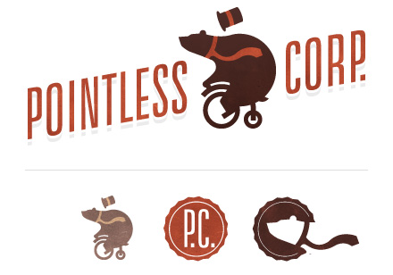
Fig. 5: The final mark and some related elements.
The final result is a mark that seems elegant and readable, even at small sizes. My logos tend to be sloppier, take longer, and look much less finished than this one, so I'd say the geometric process was a huge help on this project. The next test is to see how it applies to an actual comp.
What's This About A Giveaway?
THAT IS RIGHT. Now that I've finished this excellent book, I'd like you to read it. Leave a comment before February 15th and I'll use some random process to select who to mail my copy to, for free. Note: You get a better chance if your comment is a) insightful or b) flattering.
Update: Some More Background

Fig. 6: Some quick sketches from the logo concepting phase. People voted for lots of different ideas, but the votes for the bear seemed to be the most enthusiastic (a good metric for picking a direction).

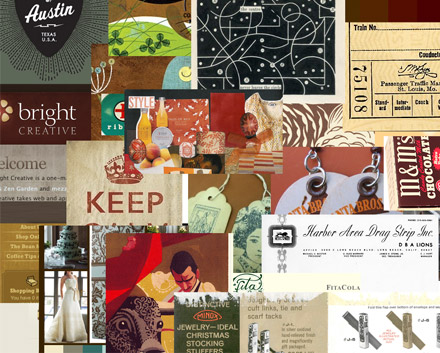
Fig. 7: A quick styleboard I threw together using some favorite links and Google Images. This guided a lot of the more unusual browns in the final logo package, and provides some hints for elements on the Pointless Corp design (still in progress).