Behind the Scenes: Mood Boards
Mark Steinruck, Former User Experience Designer
Article Category:
Posted on
As web sites become more complex, the process that leads us to successfully plan and build a site has evolved. Having multiple designers spend a lot of time creating complete homepage designs with the hope that the client will magically like one is time consuming and risky. Many client budgets can't support this type of overhead, so there has to be a better way.
The Answer: Mood Boards
A few years ago, Tom gave a great primer on mood boards. Since then, they have become an essential part of our process. We typically design three mood boards for each new project. This number can vary based on the budget, how rigid the client's brand guidelines are, or how open-ended the design direction is that they provide. We've found that three is the magic number that allows us to show clients a good mix of styles without going overboard.
I think that it's worth taking a quick timeout to explain how we mentally approach mood boards. For lack of a better way to say it, these are throw-away design pieces. Most are never seen by anyone beyond the client presentation, and only one is picked as the direction for the final design. We do our best to create style elements that can be carried into the design comps, but sometimes only a small percentage of these make the cut.
"So why do them?," you ask. Because they dramatically reduce the risk that we incur when beginning a new design. Narrowing down what a client wants takes less than half the time than it did in the past. This gives us a high degree of confidence that we're headed in the right direction, and the client isn't surprised when we deliver a homepage design that mimics the look-and-feel of the mood board. It's a win, win!
Our Process
After the initial kickoff meeting, the lead designer defines three distinct visual directions. These might look something like this:
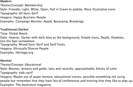
These directions are discussed during an internal mood board kickoff meeting, and the lead designer then picks the direction that feels most comfortable to him/her. Everyone else is left to battle it out over the remaining directions.
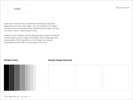
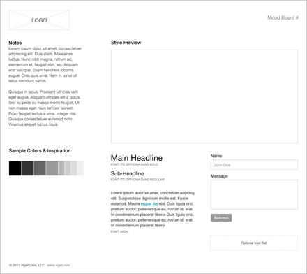
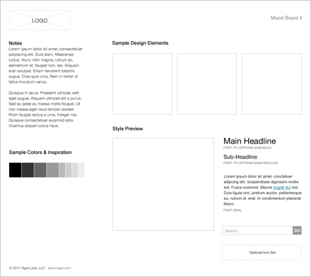
There are several templates that provide a good starting point for each project. We modify these templates based on the design, so these aren't rigid templates to be followed exactly.
Concept Template
Single Preview Template
Multiple Previews Template
Download the mood board template PSDs
We design mood boards while UX designers create wireframes. This may seem odd at first, but remember that mood boards aren't meant to be representative of the content or layout of the actual web site. Any content that we use is dummied in to support the overall design asthetic. The goal is to evoke a mood that ultimately makes the client say, "THAT'S how I want my site to feel." When presenting mood boards to a client, we always make it a point to explain this distinction to avoid confusion.
A typical mood board takes about four hours, with some of the more complex conceptual designs taking a few hours more. A brief review/critique session allows each designer to explain their design decisions. Since the lead designer will walk the client through all of the mood boards, it's important that they take notes and feel comfortable with all of the designs. Finally, the lead designer will make all necessary changes before presenting them to the client.
Once the client selects the mood board direction that they feel the most comfortable with, the mood board phase is done. In the rare case that a client has a committee of people who can't agree on a single mood board, we might create an additional design that helps solidify the direction.
What You Don't See
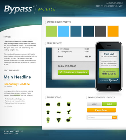
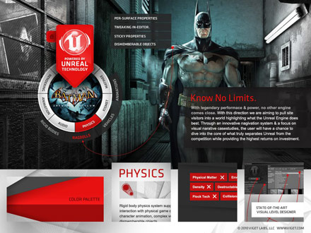
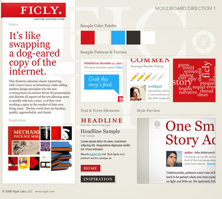
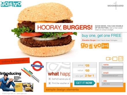
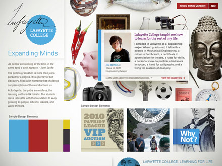
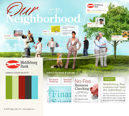
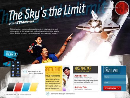
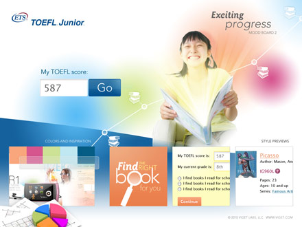
The Viget design team thought that it would be fun to pull some of our favorites out of the archives and show them off. Here are a few of the many that make us proud.
Bypass Mobile
Compassion International
Epic Games
Ficly.
GoFivo
Lafayette College
Middleburg Bank
STEMworks
TOEFL Junior
