Behind the Design: Cheetah Day Poster
Joseph Le, Former Designer
Article Category:
Posted on
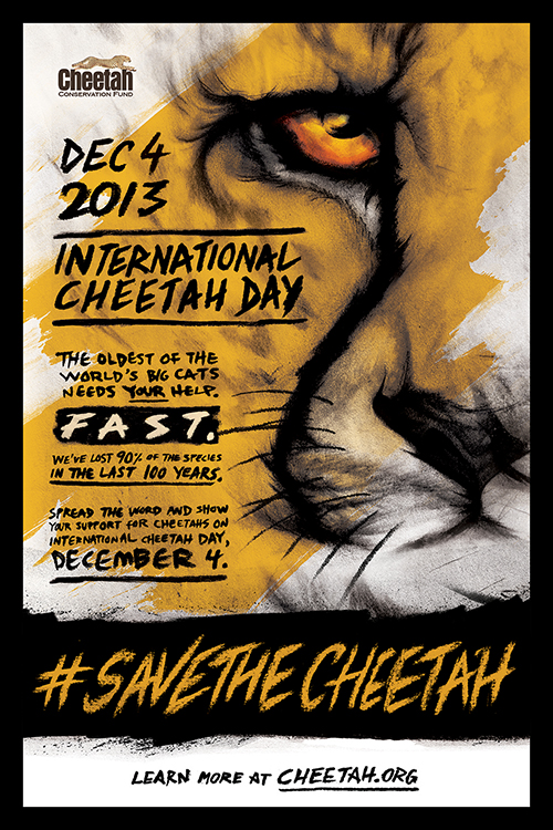
In October, the Cheetah Conservation Fund (CCF) asked us to design posters for International Cheetah Day (December 4). The purpose of this event is to spread awareness about the rapid decline and near extinction of cheetahs. To express this important message in a visceral manner, we decided to step away from the computer and use traditional art media.
GOALS
Owen Shifflett thought it would be best to treat this project more like an art piece than a design flyer. We wanted the poster to be iconic, memorable, and recognizable from afar.

For inspiration, Owen and I looked at several propaganda posters that engaged audiences with a call-to-action.
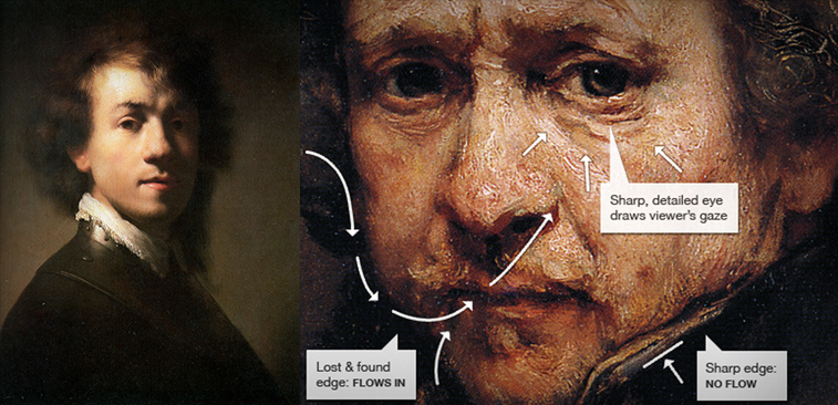
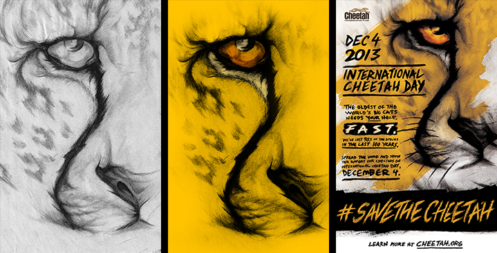
Also, Owen showed me some Rembrandt portraits and explained how the subjects in Rembrandt’s paintings evoked emotion simply with their eyes and posture. We thought it would be interesting to have the poster show primarily the cheetah’s face, to emphasize its unique facial markings. For a more memorable look, the color palette was kept minimal with black, white, and yellow/orange colors. Instead of using Photoshop or Illustrator to create the main graphic, we decided to play with graphite, ink, water, and charcoal to achieve a raw and aggressive execution.
ROUGH DRAFTS
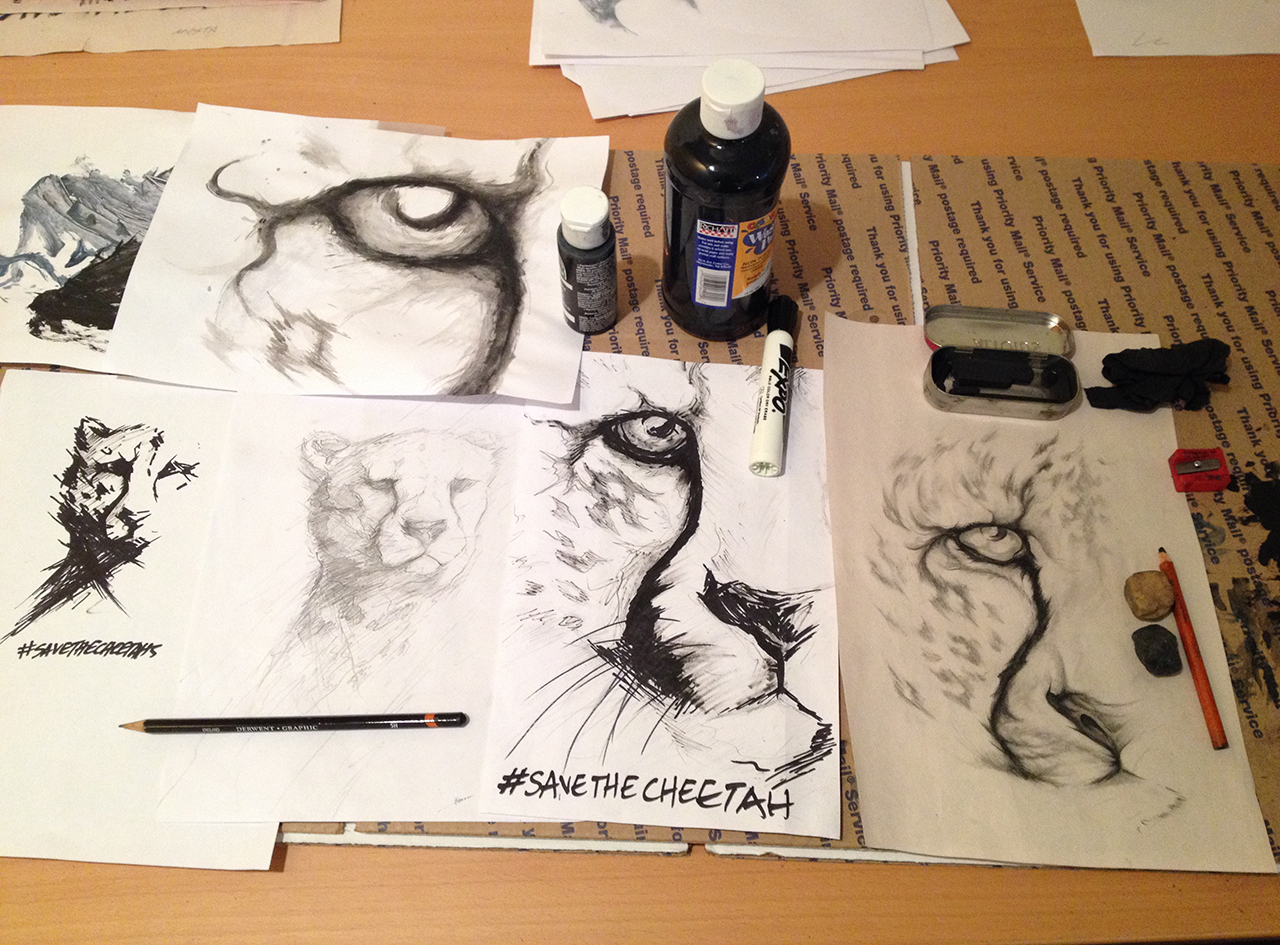
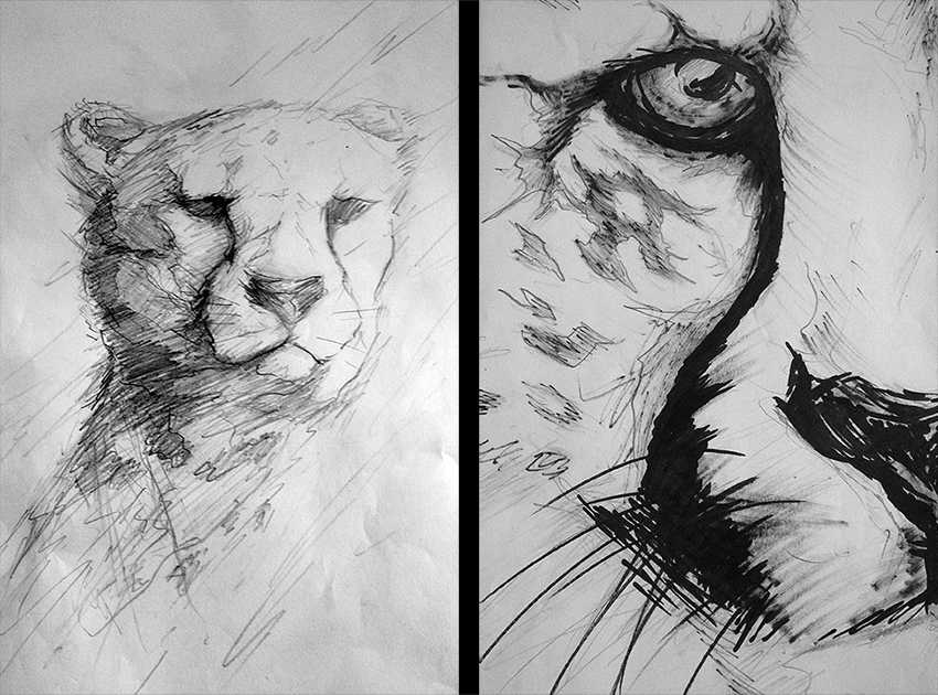
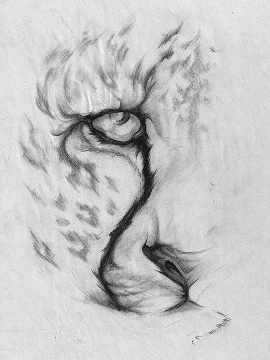
To start, I drew several cheetahs from different perspectives with pencil. After choosing the right composition, I drew the same face several times with graphite, ink, water, and charcoal. Out of all of the mediums, charcoal was the best for conveying the type of raw look I wanted.
I drew the cheetah’s black, teardrop-shaped line in a smooth, rough, and somewhat chaotic manner. In some areas, the black line blends in with the image’s shadows and extends to other features of the face.
HAND LETTERING
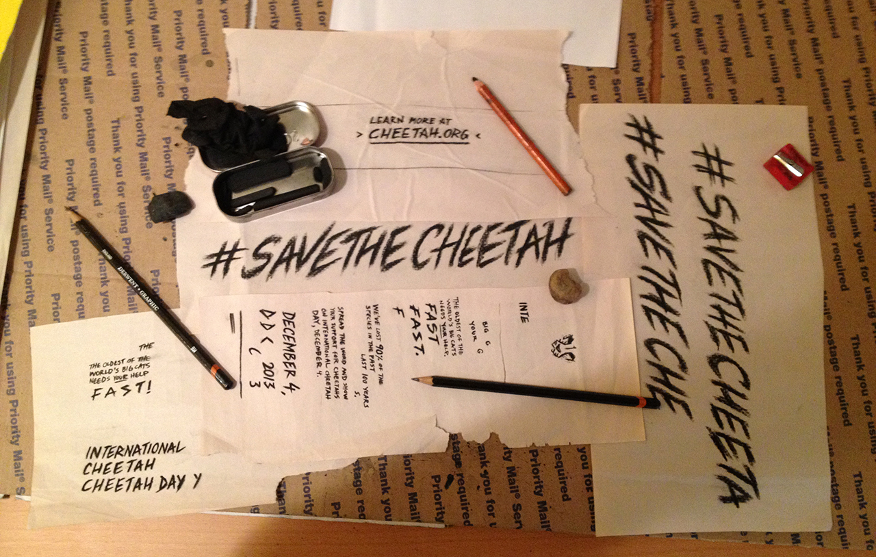
I chose to do the typography by hand in order to achieve a rough and unadulterated look that would match the visceral quality of the cheetah image. The copy was subject to change, so I decided to do the hand-lettering on separate sheets of paper so that it wouldn’t interfere with the image of the cheetah’s face.
PHOTOSHOP
Once I was satisfied with the drawings, I scanned them onto the computer. The scans were placed into Photoshop where I arranged the different elements together and added color. At first, I placed the typography on the right, but that didn’t allow for much hierarchy and spacing.

IT’S IN THE EYES
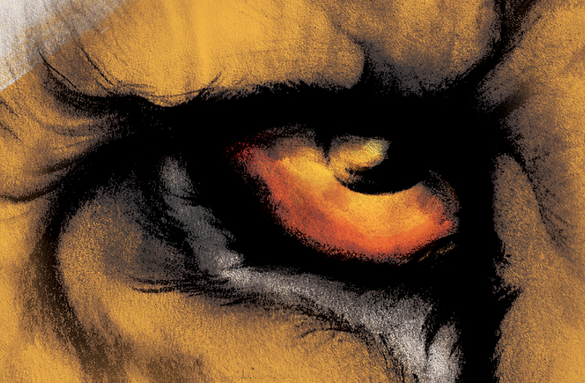
I decided to convey a wide variety of strong emotions in the cheetah’s eye. The deep orange value hints at the animal’s pride; deep black values around the eye represent strength and boldness. To draw the viewer’s attention to the eye, the black lines curve inward towards the focal point. Light highlights show vulnerability and a need for help. Adding depth and vibrant colors help make the viewer feel more emotionally drawn to the cause.
MORE REVISIONS
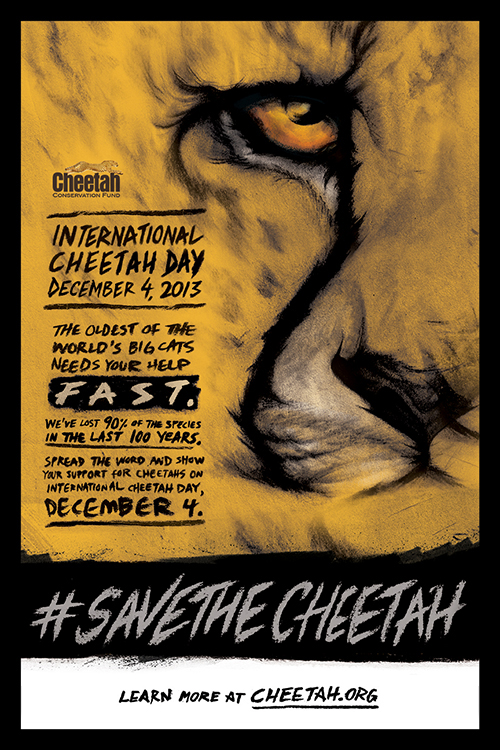
I moved the typography and logo to the left to create breathing room and better composition. To establish hierarchy, I increased the scale of the International Cheetah Day title and date. Key words like “fast” and #SAVETHECHEETAH were emphasized in bold black rectangles. I opted not to smooth out some of my charcoal marks—for example, on the edges of the #SAVETHECHEETAH black rectangles— to hint at the charcoal medium I used and to show roughness.
FINAL PRODUCT
CONCLUSION
It was a refreshing experience to go back to my roots and do something that was raw and organic. Knowing that this project was for an important cause motivated me to exceed expectations. You can learn how to help spread the word and save these marvelous big cats from extinction by visiting the Cheetah Conservation Fund site. Long live the cheetah!
