Beginner's Guide to Variable Fonts: Part 1

Julia Thummel, Former Designer, and
Ola Assem, Former Front-End Developer
Article Categories:
Posted on
What are they? How do they work? And what's so good about them anyway?
Imagine a future where you could throw caution to the wind and use as many different font weights on a web page as your heart desired. One where you could easily create clever but simple animations using a single font file. Now, imagine you could do these things while reducing page load time. Well folks, we have arrived. The future is now.
Variable fonts allow us as designers and front-end developers to create highly responsive and engaging interfaces that also cut down on load time. The best part? They’re super easy to use. Essentially, variable fonts are one font file that behaves like multiple font files.
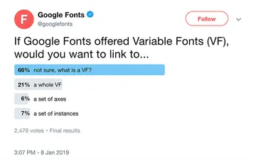
Despite some of the clear advantages of variable fonts, it turns out a lot of people don’t know about them yet.

As it stands today, most websites load individual font files in order to render them on a page. This can sometimes have a limiting effect on the design of a website, because each new font used increases load time. The good news is that in 2016, Google, Microsoft, Adobe, and Apple, announced the release of version 1.8 of the OpenType font format, bringing with it OpenType Variable Fonts.But by using a variable font, we are able to access any number of variations in the typeface— like weight, slant, optical size, and many more— all using just one font file!
So, how exactly do variable fonts work?
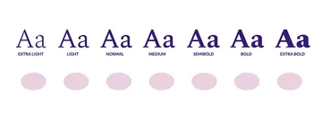
So glad you asked. As you may already know, a font family usually includes a handful of different weights, or interpolations. Think of interpolations as individual stepping stones.

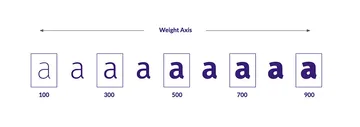
A variable font, on the other hand, stores one outline, including the points that create that outline and information on how the points should move to create other outline styles—like another weight or width. Using a variable font, we can make bold each letter not by downloading a separate font file, but by referencing precise mathematical instructions on how to turn a thin letter into a bold letter. This is what is referred to as the “weight axis.”

You can see we still have named instances we are familiar with (medium, bold, weight 700), but also all the styles in between. We can now access weights like 101, 245, or 888. This means we can slide between the weights and have really smooth transitions. Thus, the “stepping stones” between the two ends of the spectrum become a seamless spectrum, with no space in between the steps.

Axes of variation
Weight is just one of many style axes that a typeface designer can include. When creating a variable typeface, designers can include two types of axes: registered (also referred to as common) axes and custom axes. Registered axes include weight, width, italic, slant, and optical size, whereas custom axes can be anything created by the type designer. There are no restrictions on the scope, definition, or number of custom axes, which opens up endless creative possibilities. Note however that registered axes are not a required feature of all variable fonts. The typeface designer may or may not choose to include them.
Axes are defined by four-character tags in the code, which are pre-defined for registered axes and always in lowercase letters. Custom axes tags are defined by the typeface designer and are always in uppercase letters.
| Registered Axis | 4 - Character Tag | Font Property |
|---|---|---|
| Italic | ital | font-style: italic |
| Optical Size | opsz | font-optical-sizing |
| Slant | slnt | font-style: oblique + angle deg |
| Weight | wght | font-weight |
| Width | wdth | font-stretch |
The optical size axis is a useful feature when creating responsive designs, because we can now correlate the optical size to the dimensions of the viewport and increase legibility at smaller point sizes. Shown below is the variable font Voto Serif oscillating between low and high optical sizes (low meaning it can be read at smaller point sizes without the thin lines hindering legibility).
And don’t worry designers- the font-stretch property does not mean that we’re stretching fonts. Just like with all other axes, we are simply interpolating along the font’s italic axis.
Performance budget savings
One of the main reasons we were keen to explore variable fonts was the fact that they include multiple font variations in just one file. This means we could greatly reduce the number of HTTP requests for font files and exponentially save on retrieved data. Fewer requests to the server and smaller files allow us to spend our performance budget on other areas, like animation, videos, etc.
To test this out, we conducted a comparison experiment using regular (Google) fonts and variable fonts to build out the same design. For our variable fonts build, we used two variable fonts, Jabin by Frida Medrano and FF Meta Variable Demo by Monotype Imaging Inc. For our regular fonts build, we used two Google typefaces, Lato and Cormorant Garamond. Right away we had to download eight different separate Google font files worth 712.8 KB of data to achieve all the font weights and styles in our design.

The two variable font files on the other hand, included all the font weights and styles we needed– and much more for just 117.5KB of data!

Note that as we were examining several variable fonts’ file sizes, we realized that while the majority of files are considerably small for how much bang you get for your buck, it is not true for all cases. Variable font file size and therefore savings varies significantly depending on the number of encoded input fonts and axes.
Drawbacks
Considering all of the cool things we're able to do with variable fonts, one big question we had while conducting our research into the topic was "why are we not seeing these fonts everywhere?" Well, despite all of these really cool things, there are of course some drawbacks that might be preventing people from working with VF more often. Fortunately, a lot of these current limitations might not be problems in the imminent future. For example, finding readily available variable fonts can be somewhat challenging. There's no Google Fonts for variable fonts yet where designers can endlessly scroll through free font after free font. We're facing a bit of a choice underload when it comes to selecting a free (or at least cost-friendly) variable font. However, it appears that Google is aware of this and already has something in the works that could lead to the first free Google variable font.
A great way to find variable fonts now is by browsing Axis-Praxis or V-fonts.
Another major limitation is that variable fonts currently aren't supported in commonly used design tools like Figma, although it seems this is on their radar and could be remedied in the near future as well. Some Adobe products like Illustrator and Photoshop already support a handful of common variable fonts. At Viget, we mostly work in Figma, which made designing a webpage using variable fonts extremely difficult since all the designs were essentially just hypothetical.
One of the coolest things (we think) about variable fonts is that they really lend themselves to be animated in unique ways. However, this actually ends up being a limitation because designers can't prototype animations without jumping straight into code. This requires a lot of communicating with the front-end developer about what you want your animation to do– which isn't necessarily a bad thing, but does take extra time.
And speaking of front-end development, check out part 2 of this variable fonts breakdown, where we explain how to actually use this stuff in your code!