Balancing Image Speed and Quality with imgix

Properly sized and optimized images aren't just important, they're vital. They are the cornerstone of a successful online presence, directly influencing search engine ranking.
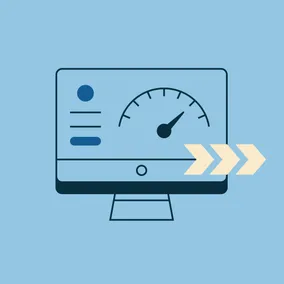
Users expect a website to load fast. An average web page loads in about 2.5 seconds. The longer the user has to wait, the higher the user bounce rate. There are a lot of factors that go into site speed, but images account for about 75% of the page weight on an application or website. Google’s Core Web Vitals uses several metrics to rank sites. Visual site speed or largest contentful paint affects ROI as slower sites have fewer repeat users and fewer sales.
Without properly sized images, both site speed and image quality are affected. Accordingly, we use several methods to deliver properly sized images. Our primary solution is imgix because it is easy to implement and saves managers and clients time and effort.
Imgix Key Features
Imgix provides a lot of features — some we consistently use on projects, and others we use in very specific situations.
Responsive Images
Setting up responsive images can be complex. As the variety of devices and their screen resolutions continue to expand, managing all the different image requirements is increasingly challenging.
Consider this scenario: a website’s images look crisp and clear on a high-resolution monitor. When that same page is viewed on a mobile device, the images are so large the page takes forever to load. A solution could be to upload a smaller image for mobile, right? It's not quite that simple. We need eight or more different sizes of the same image to account for different screen sizes and retina screens. Keeping track of all the image sizes and saving each size gets complex and would be nearly impossible to do manually on a site that has hundreds or thousands of images.
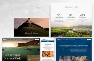
One of our clients, National Park Foundation (NPF), wanted to clarify its message to better target major donors. Their gorgeous, large scenic images are essential to their website strategy. NPF needed the images throughout their site to be crisp and clear at all screen sizes. Using imgix, NPF content managers can load high-resolution images to the CMS and not worry about the site's speed or performance. They rely on imgix to deliver the correctly resized image for any user's screen.
Imgix does this with their Device Pixel Ratio and Client Hints which automatically sets the pixel density for the image based on the user's device. Those API parameters can be easily set in the URLs for the image’s `srcset`. This allows developers to set an image width for an image `srcset` and then imgix delivers the right pixel ratio image to the user. We use `srcset` with imgix on other client sites like Bezos Earth Fund and Human Rights Campaign as well.
Resize and Cropping
Imgix allows you to crop images in addition to setting an image’s focal point. So, only one image needs to be uploaded and it can be used at multiple sizes and croppings throughout the site. Let's say we upload a large landscape image, but on some pages we only need to use a portion of the image cropped as a square. Imgix will crop the image and deliver the smaller versions on the pages we need while persisting the larger versions on other pages.
At Viget we use resizing and cropping on our own website, including our articles, to crop the staff photo to a smaller size at the top of the articles. This makes it possible for us to upload the staff photo once and the article image gets created automatically.

Color Palette
Another feature that we've used on client sites is the Color Palette API which allows you as many colors as you want from an image. For example, the Shedd Aquarium website that we built uses this feature by pulling a vibrant color from the image and setting it as the background color for the page hero. Aside from taking the manual work out of closely aligning photography with a page’s design, there’s an additional benefit: if you are on a slow connection, you will see a dynamic colored banner at the top before the image loads.
Image Upscaling
Another valuable feature is the ability to upscale images. Even if you upload an image that is low resolution, it can still be used at a higher resolution. This is especially useful for e-commerce sites or applications where users are uploading their images. The upscale feature uses Generative AI to take a pixelated image and create a higher-resolution image. The final image will not be perfect, but it looks more professional. See the upscale demo on imgix.
PDF Preview Images
There is also a PDF page to image option in imgix. The API enables the generation of a page-specific image preview from the PDF, which can serve as both a thumbnail and a full-size preview. When we built AHIP.org, they had a resources section for their members containing quite a few PDFs. To help with clarity and findability, we used imgix to show previews of the PDF documents to non-members. This feature allows AHIP to upload resource PDFs without having to also upload any thumbnail images.
Face Detection
Another nice feature is a face detection parameter that you can pass to the API. This allows you to upload a photo and no matter the cropping or size it will keep the face as the focal point of the image. We used this feature on NEA for their team member page. It's great for user profile images that are used in different contexts throughout the site.

Video Streaming
Videos have become a key design element on websites. However, determining which service to use for embedding those videos is an ongoing topic of discussion. Video platforms enable you to integrate the video onto the page, yet they introduce scripts that may impede page loading speed. Imgix offers a video embed service that allows content managers to keep all the images and videos in one place. The videos are automatically encoded to Adaptive Bitrate Streaming to get the best compression and video quality. So, videos load fast and look great on mobile and desktop.
Performance
A lot of CMSs have image transformations built in. An image transformation encompasses everything for that image including responsive sizes, cropping, resizing, and face detection from the original. This is great for small sets of images, but transformations quickly get out of hand the more images there are on a site. For example, the homepage of the National Park Foundation has a minimum of 96 image transformations.
Processing all of those image transformations uses a lot of server resources. Imgix saves the images and delivers them through their CDN. The imgix image CDN has an average of 0.15 milliseconds return on requests which enables images to load as quickly as possible. The CDN also caches the images on CDN edge nodes making them immediately available for future requests.
Flexibility
Imgix is flexible enough to work with almost any site structure; including WordPress, Craft CMS, Shopify, React, Ruby on Rails, Python, and more (see the full list). So, whether a site is a WordPress site or a Rails application, imgix fits right into the ecosystem. And, even better: you don’t have to rebuild your web app or website to gain the benefits of image performance, which can save you a lot of time and money.
Setting up imgix on an existing website is easy. Imgix can connect to existing asset storage sources like AWS, Azure, or a web folder on the same domain. Once the image source is set up, a developer can start passing parameters to the API.
Cost
Imgix is free for 1,000 images which makes it easy to integrate and grow with your site. Pricing goes to $750/yr for 5,000 images and $3,000/yr for 25,000 images. In their pricing structure, “images” are categorized as origin images, so the count only includes original images and not transformed ones. So, you could have hundreds of images and thousands of image transformations all being delivered through a CDN for free.
Conclusion
Ensuring fast site speed isn't just important. It is vital. It's the cornerstone of a successful online presence, directly influencing search engine rankings, user satisfaction, and ultimately, your return on investment. Properly sized and optimized images are key to ensuring your site loads quickly and displays correctly for users across various devices.
We have found that imgix enables our team to efficiently create projects with diverse image options, saving managers and developers valuable time. Our clients benefit from reduced server space and an increased site speed. Imgix’s API is comprehensive, so you can use one tool for all features and options around site images — from cropping and resizing to face detection and automated color palettes, to video and beyond. Having used imgix for the past five years to support the wide-ranging needs of our clients, we feel confident recommending it and using it again and again.
Users expect a website to load fast, and imgix is a reliable way to make sure that happens.