The Balance of Design Requirements and Tech Constraints

Tyler Berg, Former Senior Product Designer
Article Categories:
Posted on
As a designer, how do you navigate designing to a strict set of constraints versus taking a more custom approach?
The process of designing software and apps is always a balance between complete creative freedom, business requirements, and technical constraints. Designers are rarely creating UI without any constraints at all – every project has some type of guardrail. That could be a specific heuristic or pattern you’re designing for; you could be designing an e-commerce flow and don’t want to reinvent the wheel. Or maybe you’re designing hand-in-hand with a very specific API or data library that limits what the front-end can look like. Perhaps there are simply strict business process requirements that you have to follow.
Regardless of the circumstance, sometimes as a designer you may find yourself in new situations where you are unsure of the constraints, especially when they are often out of your control. Here are a few common scenarios you may find yourself in and how you can work effectively, no matter the constraints thrown your way.
Fully custom approach
This one is a little bit of a double-edged sword. Designing with no obvious tech constraints or restrictive business requirements can feel liberating, but it can also feel intimidating if you aren’t sure where to start. How risky of a conceptual approach do you take in these situations? A common example here is when you are designing a static prototype. Maybe you’re working with a startup who plans on using it for a pitch for a new seed round. The product isn’t getting developed yet, but it might one day down the road.
Any time you are designing a website, application, or product that is purely static or conceptual in nature – and may not be getting built right away, there is always a risk of functionality getting lost in translation between design and development. So even if your design team isn’t involved with the development, you still want to design with an eye toward UI patterns that most users are familiar with, and create something that is realistic for developers to actually implement.
How to work effectively in this environment
A good starting point here is leveraging a parts kit or design system. Even if you’re not intending to use the components exactly how they came out of the box, they can serve as a useful structural or visual reference just to get your initial concepts moving in the right direction. Material UI, IBM Carbon, and Atlassian’s Design System are good resources to guide your own UI components when you aren’t sure what your constraints should be.
This seems obvious, but if you’re working on highly specific UI patterns (like a check-out flow, for example), it’s helpful to re-examine some common examples of that exact pattern in other products or apps you’ve used. When designing functionality that is familiar to users, you don’t want to stray too far from their expectations, even when you have no design constraints. In this sense, creating some guidelines for yourself can make a completely greenfield project seem more realistic and manageable.
Where to focus your time and energy
Starting your work in lower fidelity (or with the help of a parts kit) can help you worry less about the minutiae of visual design when you’re just getting started. Focusing most of your energy at this juncture on the core functionality of the app or product will keep you on track and avoid getting distracted by details you can refine later.
Most of the app is custom, but some pieces are affected by the tech stack
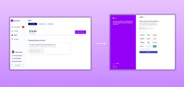
This one is probably the most common situation you’ll find yourself in. You may have control over most of the design requirements, but there could be a few defining guidelines, like a pre-existing design system that you have to use, or an API with some firm constraints. A recent example of this was our work with SwayDM, where we built a platform that allows you to get paid while answering your direct messages. We utilized Stripe’s Payments integration to connect the user’s checking account to the app, in order to cash out payments they receive.
While the integration was instrumental to building the app’s main functionality (getting paid to receive and respond to messages), a usability side effect was that we had to redirect the user outside the Sway app to Stripe’s native UI to enter their checking account information. A relatively small tradeoff given Stripe’s credibility in the minds of consumers, but it wasn’t ideal to have to leave the app and come back again during initial onboarding. We wanted to limit any opportunity for dropoff as much as we possibly could.

How to work effectively in this environment
These types of instances where you have some design flexibility, (but are still designing against constraints) are where having a technical understanding of the software you’re building will set the stage for a development process with less friction. Understanding the capabilities and limitations of traditional web, client side, and native mobile applications makes it more likely that you’ll design features that are feasible within the time allotted for building them. It also makes it less likely that you’ll compromise usability.
More specifically, learning what the third party systems you’re using provide (like Stripe in this example) provide and what they don’t will allow you to make more informed design decisions.
Where to focus your time and energy
Working closely with engineers to understand what the impacts of using the third party tool are, as well as anticipating potential issues a user might run into while using the tool can make sure your design decisions are backed in best practices for usability.
Back-end almost completely dictates what the front-end will look like
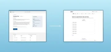
Lastly, there are prescriptive situations where you may be designing against multiple constraints with very little room for interpretation or design flexibility. When our team built Beacon Testing’s vaccine finder software, we set out to design and build an app that locates all available vaccines in the area, leveraging retail pharmacy websites and state-supported mass vaccination sites to scrape the most up-to-date availability in one place.
Even though all of the availability data was sourced through our vaccine finder, we had to redirect the actual vaccine registration elsewhere because the level of effort to build a custom registration tool from scratch was not feasible given the amount of time our team had to spare – and the existing infrastructure already in place. Additionally, since this was being built directly for the state of Massachusetts, we had to use the state’s design system, Mayflower, to fit in with the rest of the state’s web properties.

How to work effectively in this environment
In these types of project scenarios, it’s less about coming up with the most creative design solution and more about how you can seamlessly integrate a design concept into an existing data model – which, sometimes can be creative in a different type of way.
Where to focus your time and energy
It’s even more important to frequently seek input and review your design concepts with the development team on projects where you’re so closely designing to an existing data model. Focus on designing core pieces of the application first that developers can start implementing right away, and circle back to more ancillary pieces afterward. This can prevent your design work from getting too far ahead of development.
In short
Constraints are a constant in software development, no matter what you’re building. As a designer, knowing how to navigate these situations even when they are out of your control, will allow you to produce work more efficiently – and create concepts that are well-suited for development.